Best Color & Stock/Coating Pairings For Print
In printing, stocks and coatings have different properties that affect print color results. Some colors will look better than others on certain stocks and coatings. This is not to say that printing other colors will necessarily look bad, but it does mean that there are certain pairings that work better.
So, here are some suggested combinations to help the design in your file look its best when printed.
Black + Spot UV

We admit that black isn’t technically a color, but it is in print. The darkness and uniformity of the black (make it a rich black comprised of all 4 CMYK values), will emphasize the spot UV.
What about white? Some UV coatings have a slight color, which could make the white not as pure as your clients probably intended their white to be.
Low Coverage Colors + Uncoated Stock
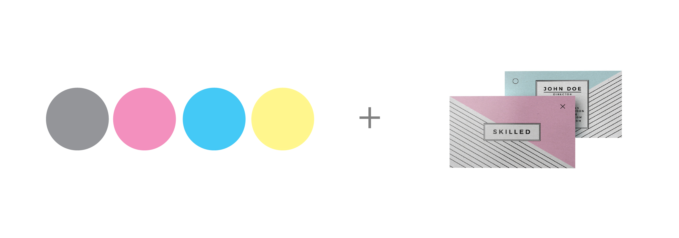
Uncoated stock tends to soak in the ink, which can make the colors look muddier. Offsetting is also a common issue, especially where ink coverage is high. To minimize this, use lower values for each CMYK color that is in your artwork. If possible, use fewer color values. For example, instead of using all four CMYK colors to create your gray, opt to use just a K value.
Dark Colors + Metallic Foil
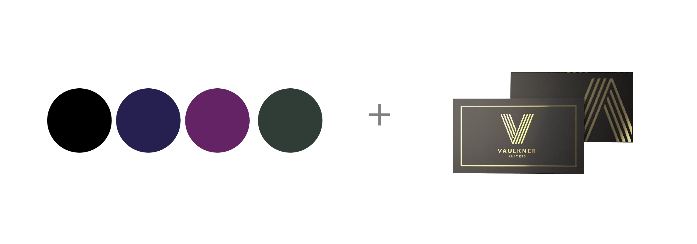
Metallic foil is not exactly a stock or coating, but it does deserve its own color pairing. Two of the most popular metallic foils are gold and silver, and they make a design pop because they’re not regular CMYK colors. Contrast these reflective metallics against dark backgrounds such as black, dark blue, dark purple, or dark green.
Light Colors + Pearl Paper
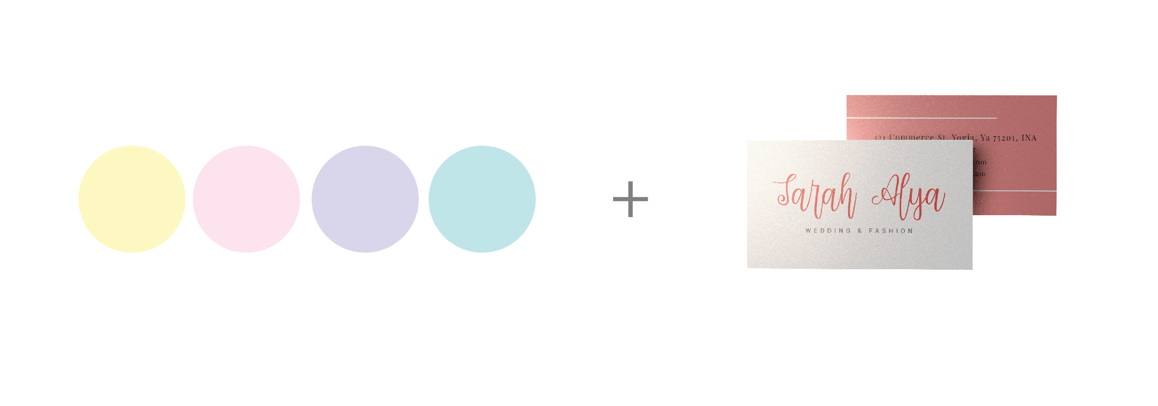
Pearl paper has a special shimmer when you view it at certain angles under the light. The shimmer of pearlescent stock has a color of its own, often a slight beige-and-silver or a pinkish hue. This stock will show a little through the ink, so we suggest colors that make the most of the stock itself. Pastel colors such as light blue, pink, and pale yellow do the trick.
Black & White + Kraft Paper
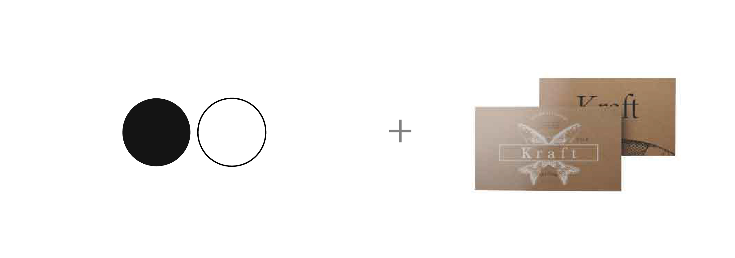
Kraft paper is brown and textured. Made from recycled paper, it will likely contains bits of materials in the stock that are not the same color as the rest of the paper. Since the stock color is not uniform, you’ll need high contrast colors without losing the intended homemade look of Kraft paper. For this reason, black and white work best.
If you’re going to print white ink, be sure to set your file up properly according to your workflow or the requirements of your print supplier.
Bright Colors + UV Coating
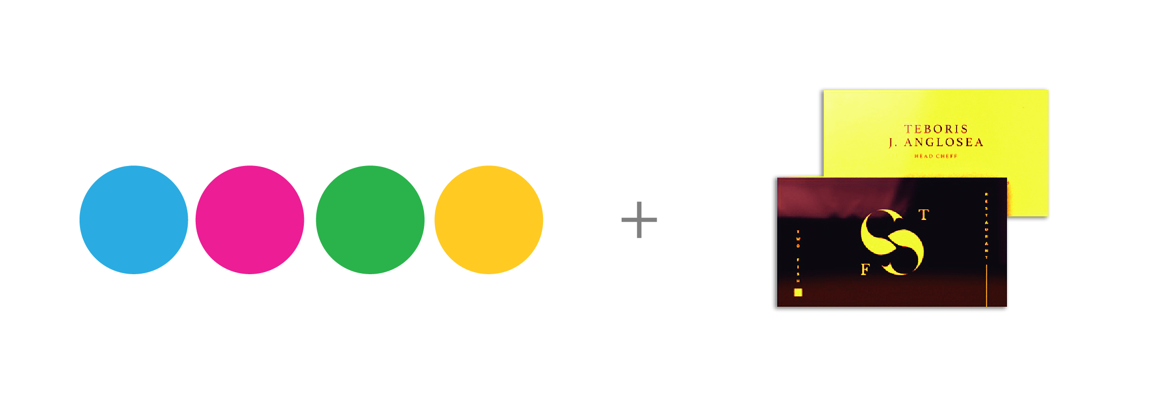
UV coating adds a smooth, shiny layer to the surface of your print. This layer reflects light to make your artwork look brighter. Take advantage of this light-reflecting property by using bright colors. Some of the brightest colors are solid CMY values: 100 cyan, 100 magenta or 100 yellow.
I want to print these products!
If you don’t currently offer these stocks or coatings, you can. You don’t even need to invest in any new equipment. The Print Cafe of LI, lets you test out how well products sell
without risking thousands of dollars. You can order business cards in
any of the stocks and coatings mentioned in this article online when you create an account. Go To:https://www.printcafeli.com/account/login.html
Trial & Error
We’ve suggested some pairings that produce the best print color results, but just as machinery differs as do human eyes, you may need to try different colors on various stocks and coatings to find what works best for you and your clients. Pulling physical samples is perhaps the best way to show yourself and your customers how inks interact with different substra.
For Information On These Topics And Many Others Go To: www.printcafeli.com


