The Print Cafe of LI, Inc.
For All of Your Marketing Needs
The Print Cafe of LI, Inc. is your Premier Long Island Printing Company.
We provide Marketing Products and Services throughout Nassau
and Suffolk Counties, as well as the 5 Boroughs. We service areas such as Mineola, Garden City, Hempstead, Lynbrook, Rockville Centre,
Westbury, Farmingdale, Manhasset.
We are the Company that comes to You !
Call for an Appointment 516-561-1468
Print Cafe of LI, Inc
Logo
Showing posts with label #booklet #catalog printing #printing long island #printingnewyorkcity #advertising #design #logo's #marketing. Show all posts
Showing posts with label #booklet #catalog printing #printing long island #printingnewyorkcity #advertising #design #logo's #marketing. Show all posts
Tuesday, June 21, 2022
7 Top Design Decisions Direct Marketing
and Web Designers Share
You might think that web design is entirely different from direct mail marketing.
But there are many things web and offline print marketing designers can learn from one another.
7 Top Design Decisions Direct Marketing and Web Designers Share
1. Create a compelling message.
According toDavid Ogilvy, five times more people read the headline than the body copy. It’s essential to use a powerful, bold headline telling your story and describing your offer or service.
2. Be clear and concise.
Avoid jargon in the body text or on the webpage. Remember that being transparent and avoiding jargon doesn’t necessarily mean talking down to your audience.
Be sure that the product or service is appropriate and compelling to your target audience.
Understand who is in your audience – what are the demographics of the new homeowners? This information may influence your design.
4. Branding, branding, branding.
A brand is more than just a logo on your direct mail piece or website.
It involves your online experience, your retail or workplace environment, the tone of your copy, and everything that relates to the “personality” of your business.
Use your logo consistently on every online and offline component you create.
Use a strong sans-serif font like the Helvetica or Frutiger families for your headlines and a softer serif font like Times, Goudy, or Palatino for your body text.
It’s best not to mix two sans serif typefaces, or two serif faces on one piece. Go for the contrast between sans serif and serif.
6. Make a unique masthead.
The designs that work or catch your eye will have a point of difference by instantly communicating their tone and mood from their masthead, cover line typography, and image choices.
7. Follow a style guide
Comprehensive style guides define the company image from a visual and editorial perspective to ensure a unified brand. Style guides define the company image from a visual and editorial perspective to ensure a unified brand.
Make sure you have a style guide to keep things consistent.
Great design, especially for direct mail marketing pieces, can put you ahead of your competition and in front of new customers.
We’re here to help you get there. Check us out today! Call 516-561-1468 or FOR MORE INFORMATION ON ANY OF OUR MARKETING PRODUCTS GO TO: www.printcafeli.com
Tuesday, November 2, 2021
3 Powerful Tricks to Learn New Skills Faster
3 Powerful Tricks to Learn New Skills Faster
“Change is the law of life. And those who look only to the past or present are certain to miss the future.”
– John F. Kennedy
Though few people like it, change never stops.
Success in life requires the ability to adapt. As one Chinese proverb quips, “the wise adapt themselves to circumstances, as water molds itself to the pitcher.”
Whether you enjoy change or not, the pace of change marches ahead at an ever-increasing pace. Here is astatistical snapshotof what that looks like:
94% of the internet workload will be processed on the cloud by the end of 2021
It is estimated that 70% of all automobiles will be connected to the internet through the Internet of Things by 2023
By 2030, the fully and semi-automatic car market will be worth $26 billion
Artificial Intelligence is slated to replace around 85 million US jobs by 2025
The world has produced 90% of its Big Data (or extensive data sets) in the past two years
Does that feel overwhelming?
It can be. But humans are change experts. We are master adapters! People adapt when they enter a new life stage, take a new job, when abrupt social change occurs, or when faced with a health crisis.
Simple Skills that Increase Retention
As you are prompted to innovate, create new jobs, or develop new ways of working, you can learn faster and retain more information. Want to be more efficient in learning new skills? Here are a few tips:
1. Rehearse Aloud
When trying to learn someone’s name, people often speak the name aloud two or three times in the initial conversation.
Research shows that, compared with reading or thinking silently, the act of speech is one of the most important mechanisms for retaining information. Want to retain and solidify something in less time? Rehearse it aloud.
As psychologistColin MacLeod says, "learning and memory benefit from active involvement. When we add an active measure or a production element to a word, that word becomes more distinct in long-term memory, and hence more memorable."
2. Link New Ideas with Familiar Concepts
Mentally connecting concepts is a fantastic memory hack.
Associative learning takes place when two elements are connected in our brain in a way that links seemingly unrelated things. For example, a science teacher might set out an ice cube, a bowl of water, and a steaming pot to link something kids are already familiar with (common forms of water) to explain a new concept (the phases of matter).
In simple terms, whenever you say, “Oh, I see . . .thisis basically likethat,” you’re associating something you currently understand with something you’re trying to learn. By mentally linking things, you learn and categorize quickly and remember them more easily.
3. Practice Varying Skills in Succession
Interleaving is a learning technique that involves mixing different topics or forms of practice to facilitate learning. For example, if a student uses interleaving while preparing for an exam, they can mix up different types of questions rather than study only one type of question at a time.
This varied practice (as contrasted with the specific practice of one skill) focuses on multiple tasks at once. Interleaving blocks you from slipping into mindless muscle memory and forces continual adaptation and adjustment. When you quickly switch between practicing piano, typing, and marimba – or speaking Spanish, German, and Italian – it helps youreallylearn what you’re trying to learn because you must concentrate at a deeper level.
Need to learn something new? Try these tricks to become more lean and efficient in the process!Need some fresh ideas? Contact us today to get started! 516-561-1468 or FOR MORE INFORMATION ON ANY OF OUR MARKETING PRODUCTS GO TO:www.printcafeli.com
Tuesday, October 26, 2021
5 Print Marketing Pieces that will Woo Your Corporate Clients
Some of the most effective ways of communicating value don’t require looking up a website or downloading a mobile device teaser program.
In fact, non-digital marketing activities win over corporate clients regularly without ever needing to be plugged in. Here are five of them.
1. Business Cards
Yes, those traditional business cards are still winners.
Business cards provide critical contact information and enough detail on how to connect with an organization quickly. Whether by email, text, phone, or mail, the info on a business card is powerful.
People love business cards because they are easy to transfer, pack, save, and reference. In the corporate world, business cards still resonate.
2. Letterheads and Stationary
In a day and age when so much communication happens by email and texting, the traditional letter stands out, even in a mail pile full of folders and generic material.
Best used when conveying a personal connection, professional letterhead is loved by corporate leaders everywhere and often seen as a sign of respect to the reader.
3. Add to Your Digital Slidedeck
Digital presentations can be so commonplace that people are often bored to death by the lack of engaging multiple senses.
A quick fix? Add printed materials people can hold in their hands that support your digital presentation. A beautifully printed presentation contained in a clean and stylish folder is easy to carry and review hands-on later. Combine a print version of a presentation with a digital slidedeck, and you’re hitting a home run with both formats simultaneously.
4. Company Information Brochures
A tri-fold company brochure is a convenient marketing tool that easily fits in a jacket pocket or folder. And, like business cards and presentation folders, brochures engage multiple senses of sight, touch, and even smell.
Unlike digital PDFs, professionally printed brochures can be visualized and held easily. They don’t get lost in files like emails and tweets. A well-done brochure with high-impact visuals gets shared with those who matter as well. They are often shown as an example of what’s possible with the right skills hired.
5. Everyone Loves Catalogs
Today, digital menus and scrolling lists have tried to replace catalogs online.
However, the traditional catalog publication stands firm because of its tremendous impact.
Sometimes, folks like to leaf through a well-designed paper catalog to relax and pass the time, which often triggers more sales.
Additionally, companies that provide catalogs are becoming more unique and a stand-out factor from the crowd. Folks do not always remember a general product, but they definitely remember who has a catalog.Need some fresh ideas? Contact us today to get started! 516-561-1468 or FOR MORE INFORMATION ON ANY OF OUR MARKETING PRODUCTS GO TO:www.printcafeli.com
Friday, October 22, 2021
Grow Your Business Through Instagram Marketing
If you're looking for a way to boost the results of your print marketing, integrate your next campaign expand your reach with Instagram!
Instagram is a cost-effective marketing tool that houses many resources to help your business grow.
As the second most accessed network behind Facebook, with 1 billion monthly active users, Instagram boasts highly engaged users, browsing an average of 53 minutes per day.
Instagram can be a handy tool if you’re trying to reach ages 18-44, as 45% of Instagram users are within this age group.
4 Tips to Get Your Business Started on Instagram
Before initiating an Instagram business profile, it’s important to develop a marketing strategy.
1. Know Your Why.
Why do you want your business on Instagram?
For example, are you there to sell products, share portfolio content, build brand awareness, share user-generated content, and/or use Instagram’s analytic tools? When you discover your why, you’ll have a beneficial framework for moving forward.
If this is challenging, try looking up competitors on Instagram to see who their audience is.
3. Conduct a Competitive Analysis.
A competitive analysis is when you research your competitors to see how they are doing.
Then, using this data, you develop a plan to improve your own business. When doing this through Instagram, see what and how often your competitors are posting, what posts are getting the highest engagement, what they are using for captions, how quickly they are growing, etc.
Acquire data that can then be used as a benchmark for your business. You can also brainstorm ways you can stand out from your competitors.
4. Create an Editorial Calendar.
An editorial calendar is a visual representation of your workflow.
You can develop a plan for when, what, and how often to post on both your main Instagram feed and Instagram stories.
5 Tips for Gaining Instagram Followers
Now that your marketing strategy is in place, you can get on Instagram to grow your follower base and engagement. Here are some tips to get you started.
1. Create a Business Account.
Perhaps obvious, but make sure your business is under a business account.
Go to your profile page, click the three horizontal lines at the top, click settings, account, then scroll down.
If it says, “Switch back to Personal Account,” then you have a business account. If it says, “Switch to Professional Account,” your business is under a personal account.
No worries! Just click “Switch to Professional Account,” follow the prompts, and now you have a business account. This is important because it will give you access to useful features, including analytic tools, promoted posts, and a contact button.
Instagram’s analytic tools allow you to see who (age and gender), when, and where you generate the most engagement. You can also see data for follower growth.
2. Make Sure Your Instagram Bio is Strong.
Your bio is your potential client’s first impression.
Add all the necessary information and use keywords that will draw in your target audience.
Your bio is also the area where you'll put your call-to-action URLs. Because Instagram is image-based, URLs don't work well on each post. Instead, update your bio URL to correspond with anything unique you're posting.
3. Create a High-Quality Instagram Feed.
Ensure that your Instagram feed flows nicely by choosing consistent editing styles and adding filler photos.
Filler photos are posts that serve to improve your Instagram feed’s aesthetic. They are important because Instagram is such a visual app. Space out busy photos with minimalistic ones. You can even try posting six to nine photos in a row to create one large picture on your feed.
4. Don’t Forget to Use Your Stories.
Because Instagram stories disappear after 24 hours, they’re a great way to post various content and drive engagement.
Plus, thanks to Instagram’s stickers, you can create quick polls to drive follower engagement while simultaneously receiving follower feedback.
5. Add Instagram to Your Networking Cards.
Networking cards are business cards that highlight your social media presence. They are a great way to increase your follower base and sales.
Instagram is a wonderful tool to grow your business. Apply the above advice, so you can stand out and increase sales.
Need some fresh ideas? Contact us today to get started! 516-561-1468 or FOR MORE INFORMATION ON ANY OF OUR MARKETING PRODUCTS GO TO:www.printcafeli.com
Tuesday, October 5, 2021
7 Steps to Overcoming Decision Fatigue
Just like any muscle in the body, the brain can also get tired.
According toMedical News Today, a human’s ability to make decisions can worsen after making many decisions, as their brain will be more fatigued. This can lead to an emerging phenomenon called decision fatigue, which can cause mental fatigue, increasingly worse decision making, impulse buying, procrastination, decision avoidance, lack of focus, pessimism, and lapses in judgment.
And it could be the reason you find it hard to get stuff done. It’s not your fault. It’s just your brain’s natural defense mechanism.
When the brain becomes depleted, it shuts down non-essential services, including the prefrontal cortex, which is the area of the brain responsible for complex decision-making.
Unfortunately, entrepreneurs can be affected by decision fatigue because they make many decisions throughout the day, feel greatly affected by the decisions they make, and make stressful and complex decisions.
Luckily, there are steps that you can take to alleviate the mental toll of constant decision-making.
7 Steps to Overcoming Decision Fatigue
1. Simplify
Find ways to reduce the number of decisions you have to make in a day by simplifying your life and creating habits.
For example, create a minimalistic wardrobe. Food prep or form consistent meal plans. Develop habits, so you no longer have to decide whether or not to do something. You start to do it automatically.
2. Plan Ahead
Plan the night before for the day ahead.
This will limit the number of decisions you’ll need to make during the day. You’ll no longer have to decide if you should do this or that. It’s prewritten. You just need to follow the script. Much easier.
3. Hard First, Easy Second
Tackle the hard stuff first when your brain is the most energized.
Some may find it tempting to take on the easy tasks first in order to ease into the day. But, when you reach the more challenging items, it will be much harder to complete because your brain is already depleted. You’re not doing yourself any favors.
4. Take Breaks
Small breaks energize your mind and make you able to continue working optimally for longer.
These breaks could include a meditation (focus on breathing for a set period of time), a short walk, or even a power nap. You’ll come back energized and ready to conquer the rest of the day!
5. Self-Care Matters
Take care of yourself.
Your brain and physical body function optimally when you are eating right, sleeping well, and not overworking yourself.
6. Don't Go It Alone: Outsource
Reduce the number of decisions you must make by outsourcing them.
For example, hire virtual assistants to cover the simple business decisions or hire extra employees to tackle more complex decisions.
7. Stand Firm
Once a decision is made, stick to it!
You already spent quite a lot of energy making that decision. There’s no need to go back, spend more energy, and change decisions. You’re just increasing your workload and decreasing your mental energy.
It's Start with Your Mindset
Interestingly, it could be beneficial to change your view on how mental energy is used.
A study was conducted comparing Westerners and Indians. The Indian participants believed that exerting willpower was energizing, while the Western participants believed that exerting willpower was draining. The Indians performed better. Therefore, perhaps just changing your mindset regarding the brain’s energy could affect your energy levels.
A world full of decisions can be draining, but luckily there are multiple strategies to help you combat decision fatigue.Need some fresh ideas? Contact us today to get started! 516-561-1468 or FOR MORE INFORMATION ON ANY OF OUR MARKETING PRODUCTS GO TO:www.printcafeli.com
Friday, October 1, 2021
Increase Customer Engagement with Out-of-the-Box QR Codes
Not long ago, scanning books or groceries by a rectangle barcode seemed quite novel.
It was fast, convenient, and just a little fun. But as society’s pace accelerated, so did our need to read barcodes efficiently. In 1994, Japanese auto-makers adopted “Quick Read” QR codes (square matrix barcodes that could be scanned from any direction) that stored a hundred times more information than conventional barcodes.
Enter QR Creativity
In this micro-attention age, QR codes can catch the fleeting attention of your audience by adding both efficiency and quirkiness to your designs.
Today’s customers love to actively participate – not just passively consume – so why not take people on a “digital scavenger hunt” you’ve created by leading them to a URL for your landing page, a direct link to your social media page, or to retrieve personalized texts from your team?
While many QR codes are bland, they don’t have to be. Here are just a few out-of-the-box ways businesses are using printed QR codes to build bridges with clients:
WiFi Network Sharing
Want to make your network accessible and convenient for your guests?
Simplify this step by building a QR code that allows them to connect to your WiFi with just one scan. Instantly connect users to the network and make their lives more simple and stress-free.
Surprise Gifts
Gifts are a treat, but surprise gifts are even better.
When you want to thank a VIP customer or impress a first-time client, offer them a printed thank you postcard with an unexpected giveaway they can access by scanning the QR code. This builds emotional engagement by adding both participation and a greater level of surprise.
Menus
Try replacing bulky tri-folds with simple table tents or bookmarks when you want to keep your menus crisp and current.
Customers can scan the QR code to read the full menu, view seasonal or daily specials, or even pay after completing the order.
Invoice Surveys
When you ship goods to your client, offer a discount if they complete a quick survey after scanning your QR code.
Happy clients are more willing participants. Grab them on the spot as they unbox their new purchases!
Die Cut Overlays
If you use plain brown gift bags or simple white boxes, you can add color and charm with die-cut labels that double as a funky patterned QR code (like this playful QR valentine).
Who says beauty and functionality can’t co-exist? Have some fun taking people on “the code less traveled.”
Captivating Colors
Why live in the monochromatic when you can design in color?
Modern QR code generators allow you to add zest to your QR code based on your aim, style, and brand theme. Some software even allows you to choose patterns, build logos or faces into your code, or add sophisticated gradients.
Bridge the Gap Between Print & Digital
Nielson foundabout 56% of consumersrely on printed matter for sales information, specifically when seeking information on a purchasing decision.
Print is seen as a concrete, reliable source, especially for prospects nearing a decision. By including QR codes in print marketing, you increase the potential for landing a valuable client. Consider using QR codes for:
Product packaging, invoice stuffers
Printed menus, business cards, or rack cards
Store promotions with discounts available at checkout
Promotional games, puzzles, or scavenger hunts
Stickers for merchandise, packaging, displays, or cards
Increase your conversion rates while coaxing prospects further down the sales funnel in a fun, effortless manner..Need some fresh ideas? Contact us today to get started! 516-561-1468 or FOR MORE INFORMATION ON ANY OF OUR MARKETING PRODUCTS GO TO:www.printcafeli.com
Friday, September 17, 2021
Delicious Fonts: The Bread and Butter of Appealing Designs
For every Olympic Games, there has been an accompanying logo that brings a unique identity to that particular year while allowing the host country a special place in the global spotlight.
A good Olympics logo should reflect both the host country’s culture and the time period of the games. The 2012 Olympic logo caught a lot of flak for failing in both of these goals. Composed of bright pink and yellow colors, weird shapes, and a jagged, angular typeface, it smacked of an 80’s funk vibe rather than British culture or the London lifestyle. When it was revealed in 2007, a petition circulated Great Britain (signed by over 48,000 citizens) to have the £400,000 logo scrapped a redesigned.
Ije Nwokorie, managing director at the design firm that created the logo,defended the bold look:
“We wanted the logo, in particular, to make people reconsider Olympics, to think about them in a different way,” he said. “London is this kind of dissonant place that you discover new angles and new dimensions to things. In its highest level, this brand was an expression of that.”
Overall, the logo and font sparked more dissonance with the viewers. Many believe it went down in history as a failed experiment.
How to Pick the Best Font for Your Page
Typefaces are the personality on the page.
The way you represent words shapes the style and readability of your content. A font choice can have far-reaching effects, which is why brand style guides are extremely helpful.
But if you don’t have a grid to work from, the endless choices can feel daunting. Not sure where to start? Here are a few tips:
Set the Tone
What is the style of the document? What vibe should the content communicate?
Often the audience you target will shape the personality of your font choice.
Keep it Simple
Unless you are designing an art piece, stick to one or two typefaces. If you are designing for a document, like an annual report, you might need a sans serif and a serif for variety and legibility.
If you need lots of different headings and subheads, choose a font with a variety of weights (like Bahnscrift or Sabon). Display fonts are fun but don’t offer many choices when it comes to weights.
Make the Best Even Better
Want to inject personality in your text without getting too weird?
Customized fonts work beautifully for logos, headings, or a tagline splashed across the page. Try customizing your favorite fonts with tiny alterations, like this:
Shorten the descenders on letters like y, p, and q
Make the crossbars on a letter stop short on one side and cut the corners off letters at an angle (like a capital ‘A’ or a lowercase ‘e’
Use a bold header and a blurred, slightly transparent subhead
Erase or add to the font by uniquely featuring something relating to your brand (for example, a baker might use a font where a bite is taken out of every ‘B’)
Don’t Be Trendy
Marketers often choose a typeface because it seems cool at the moment, but the flair can quickly fade.
Like bad wallpaper in your grandma’s kitchen, faddish designs don’t age well. One rule of thumb is this: “If a typeface is quirky, your design might be a turkey.”
Classic fonts that have endured over decades include Bodoni, Bembo, Caslon, Clarendon, Helvetica, Gill, Univers, Baskerville, Perpetua, Futura, News Gothic, and Optima.
From selling products to creating brand loyalty, fonts create a smooth, intuitive journey for people to follow. A little adjustment to your fonts can go a long way!
Need some fresh ideas? Contact us today to get started! 516-561-1468 or FOR MORE INFORMATION ON ANY OF OUR MARKETING PRODUCTS GO TO:www.printcafeli.com
Friday, September 3, 2021
Add Depth and Drama to Your Page with 4 Riveting Techniques
Tension. There’s just nothing like it to prompt emotion in relationships, film, and art.
Steven Spielberg demonstrated this masterfully in the classic 1993 filmJurassic Park. While young siblings Tim and Lex hide in an industrial kitchen, two raptors creep inside and begin prowling and sniffing the perimeter. As the children silently crawl on their knees and cower under stainless steel countertops, the toenails of the raptors click . . . click . . . click . . . along the floor behind them.
Though some would classifyJurassic Parkas a children’s film, you can be surethe tension of this scenehad every adult breathless as the raptors prepared to pounce.
Create Rhythm and Release in Your Page
As plot twists are to a story, visual tension is to design.
Visual tension is an aspect of composition that uses unexpected color, shape, or scale to create energy. While visual tension can be used to evoke anxiety, typically it is used to add depth and create a more dynamic viewer experience. This pattern of building and releasing tension is one of the most ingrained patterns of human experience.
Here are four ways to weave visual tension into your next design:
1. Go Off the Grid
Most shapes or pages have a sort of “structural skeleton” running through them.
In a square, the axis points would form a letter X through the center of the page. Elements placed along any major axis (or in the center) will appear more stable. Objects placed outside these major grid points will carry a greater sense of tension. If you place a logo underneath the invisible X of a square page, your design will feel a bit more exciting.
2. Use Jarring Color Combinations
While monochromatic or complementary colors are soothing, dissimilar or bold combinations create a unique energy in your designs.
The possibilities here are endless! Try gray suede and cheetah print mixed with white and gold. Or electric orange interspersed with neon pink. A rule of thumb is to favor one color over another (like using a dominant color for the background and the secondary color for accents). To tone it down a bit, use both colors for accents against a neutral shade.
3. Try Something Unexpected
Is the sky always blue?
It doesn’t have to be! Designs spur emotion when you do something unexpected, like adding a hot pink filter to a nature landscape. Try something surprising, like placing a giant head on a tiny body, coloring a chicken blue, or creating a visual puzzle (using concepts fromthe Gestalt principle) within your logo design.
4. Employ the Spatial Properties of Color
Colors create movement and affect the way we perceive an image.
Did you know that warm tones appear to advance in three-dimensional space? If you want to highlight a focal point in your image, you can increase the size of this object or also use a warm color such as red, orange, or yellow to bring it forward. If you want to reverse this effect, use a cool color (like blue or purple) on the closer, larger object and a warm color like red on a distant, smaller object. Viola! Tension created.
Engaging, Irresistible Images
Balance and tension are at the heart of every creative endeavor. Build hierarchy, focal points, and flow as you create a visual tension that makes your image irresistible!
Need some fresh ideas? Contact us today to get started! 516-561-1468 or FOR MORE INFORMATION ON ANY OF OUR MARKETING PRODUCTS GO TO:www.printcafeli.com
Tuesday, August 17, 2021
Do Your Print Marketing Materials Need an Upgrade?
There is a great deal of time, effort, and energy placed into updating your print marketing materials.
You need to cover all the relevant information in a very limited space. This means you need to fully optimize your messaging and make sure your materials attract attention.
With all this thought going into ensuring packaging and flyers and postcards are fantastic, you may be unwilling to make regular updates. Unfortunately, this can allow your message to become stale or even allow inaccurate information to be shared with customers over time.
Time to Make a Change!
Donna, a local florist, realized it had been more than 6-8 months since she reviewed and revised the messaging on her printed materials.
She knew it was probably time to make some tweaks. Businesses can change dramatically over time, with shifts in hours of operation, updated special offers, and more making an appearance.
Regular reviews to ensure your messaging is still on point helps keep your marketing materials fresh and interesting for repeat customers. Plus, it ensures that any new prospects have your best offer in front of them at all times.
Donna worked with her local print shop to update her messaging, and her customers certainly noticed! She received many positive comments and new clients from an updated postcard and flyer combination that she designed and had printed locally.
Update Graphics and Colors
Has your logo evolved a bit over time?
It's not unusual to spread out all of your marketing materials on a table and find that you have several iterations of logos or color schemes represented. Viewing your marketing materials together as a whole can add necessary cohesion to your brand.
While you may not want to follow on-trend color schemes or make changes based on the seasons, you may want to do a quick update to your color palette. Ensuring that your brand look stays fresh and current is an important part of brand management.
Put Your Best Offer Forward
Are you placing your very best offer in front of clients and prospects? Do you need different offers for individuals at various stages of the buying journey?
Now is a great time to look at your audience segments and see if you can fine-tune any graphics for eye appeal while meeting their unique needs.
Whether you're looking for options to create branding materials for a new company or simply refreshing your current options, your local print shop is here for you! We work with organizations of all sizes to ensure you have access to exceptional resources to promote your brand. Need some fresh ideas? Contact us today to get started! 516-561-1468 or FOR MORE INFORMATION ON ANY OF OUR MARKETING PRODUCTS GO TO:www.printcafeli.com
Tuesday, August 10, 2021
The Importance of Organization When Meeting Deadlines
Some are lucky enough to have natural organization skills; others have to work at managing their time in order to work quickly and efficiently.
In general, organization will help manage your time, and it will also ease the stress of having deadlines. Having a clear-cut plan with driven direction will help conquer any and all deadlines thrown your way.
Prioritizing is Key
Larger projects that have a quicker deadline should be the ones you’re working on first.
Many people want to put off larger projects because they seem intimidating. Make a plan to break down the larger projects into smaller ones and accomplish one at a time.
Conquering smaller projects at a time will seem less intimidating and less stressful. Sometimes you might be working diligently on a project and -- in the middle of it -- get thrown a project that has a quicker deadline. Dropping the current project can be hard to do but is necessary for meeting deadlines.
Identify Your Productive Time and Use It
If you’re a morning person and motivated with a cup of coffee to start your day, use the morning to accomplish those intimidating tasks.
Or if you’re more motivated in the afternoon, then use that time. Working within your productive time will help keep you on track and get important tasks accomplished. In the less productive times, concentrate on checking emails and doing research -- the things that ease your brain.
Another key to factor into your productive time is making sure that time is uninterrupted. Set aside time that you know will be quiet to work on things, and make sure that time is within your productive time of the day. Fewer interruptions will help keep your focus streamlined.
Embrace the Lists
The largest benefit to writing your lists on paper is the gratification of checking things off.
Once an item is checked off as complete, your brain realizes that it doesn’t need to think about that anymore. This can relieve the stress of feeling like your to-do list is never-ending. Writing it down shows you that there is an end to the list and will keep you focused on what’s important.
Keeping these things in mind will create an efficient and stress-free atmosphere when working on projects and meeting important deadlines. If organization is not your cup of tea, working with someone who is organized can help balance your routine. Need some fresh ideas? Contact us today to get started! 516-561-1468 or FOR MORE INFORMATION ON ANY OF OUR MARKETING PRODUCTS GO TO: www,printcafeli.com
Friday, July 30, 2021
How to Inspire Action with Highly-Engaging Postcards
What do dentists and direct mail have in common?
New clients! Direct mail has proven to be a remarkable investment for small businesses of many kinds, especially for entrepreneurs looking to grow their client base.
Dr. Diep Truong (of Viva Dental) gave direct mail postcard marketing a try in 2011. After streamlining a process for mailer design, demographic targeting, and ROI reporting, thisIndiana-based facilityconsistently experienced a 400% ROI on their postcard campaigns, with a 50% conversion rate of inbound calls for scheduling appointments.
As 2020 kept people closer to home, attentiveness to direct mail has grown. As a result, response rates are high, and now is the time to invest in sharp, unique direct mail campaigns! Postcards are a particularly good investment, with oversized postcards garnering one of the highest direct mail response rates.
According to recent statistics, 23.4% of consumers say they would respond to relevant postcards of interest to them (compared to 7.9% for letter-sized envelopes).
Ready to wade into the water of a new postcard campaign? Here are a few steps to success in 2021:
Take a Multi-Pronged Approach
One of the biggest trends direct mail is seeing is the consolidation of online and offline advertising.
Take a multi-pronged approach to generating leads, so your social media ads prompt curiosity, but your print ads pack some punch with greater neurological impact.
Keep it Simple and Succinct
People are busy, and if they’re going to look at your mail, they’ll need a good reason.
Make sure your postcard leaps off the counter with unique imagery, splashy colors, a memorable catchphrase, or an unbeatable offer. And remember, when it comes to direct mail, less is more. Postcards that are sharp and straightforward will communicate much more than those packed with content.
If people’s hearts are in the driver’s seat, then direct mail should aim straight at this target. Research shows that the primary emotional appeals that prompt action are:
Fear
Greed
Anger
Guilt
Flattery
Exclusivity
Salvation
Experiment with Specialty Branding Features
Because postcards are so economical, there’s lots of room to add embellishments.
Try haptic coatings, embossed logos, foil-flecked accents, or even scents. When Sunsilk co-creations wanted to snag more customers, they decided to add an experiential element to their designs. Its gorgeous lime and hot pink postcards came with a tiny shampoo sample attached and a scented trial as well: “scratch to smell the new fruity fresh fragrance of this apple-coconut shampoo!” Customers may not sniff shampoo in the store aisle, but a scented postcard is irresistible!
Specialty branding makes a stronger impression on readers as they physically interact with your marketing. So build curiosity and engagement with these fresh, creative designs.
Postcards Inspire Action
Postcards are distinct, direct, and easy to read.
50.9% of people say they find postcards useful, and direct mail as a whole is especially inspiring to young people. Because many people today are glued to their phones,millennials, in particular, say that postal mail inspires them to action much more often than email (in fact, 30% say direct mail is effective in getting them to visit a website, go to a store, or make a purchase).
When you are ready to take your postcard marketing efforts to the next level, sign up for a personal consultation with one of our mailing experts. Our work-in-progress partnership will simplify each step and position your business for maximum impact!
Need some fresh ideas? Contact us today to get started! 516-561-1468 or FOR MORE INFORMATION ON ANY OF OUR MARKETING PRODUCTS GO TO:www.printcafeli.com
Friday, July 23, 2021
How Print QR Code Cards are Marketing Genius
Business cards, postcards, and other print marketing pieces with QR codes can be extremely effective in developing support for your business, especially when starting from the ground floor.
Utilizing the Graphic Ease of a QR Code
The QR code is ideal for an immediate and instant connection to a large range of audiences because it doesn’t require a lot of comprehension.
Instead, the technology behind the QR code uses what people are already carrying, a smartphone or image-reading mobile device. So, all that needs to be done is for your audience to use the mobile device camera and capture the QR code. Then, it automatically provides a hyperlink to the given digital information associated with the specific image.
Effective Communication
Unlike QR images on doors, posters, or websites, did you know the QR code on a card or postcard can actually be retained better?
While one QR code can easily be scanned right away, the problem is when a viewer has multiple QR codes to deal with. They start scanning and clicking, and soon enough, the first code is forgotten, and the second or third becomes the attention focus.
However, with a business card or postcard, one can store it quickly and then remember it again later when there’s more time. That retention often makes printed QR code handouts far more effective overall from a marketing perspective.
Affordable and Budget Competitive
One of the best advantages of printed QR code postcards and business cards is how cost-effective they are.
Small businesses and cost-conscious larger players can all take advantage of print orders for low market expenses and high-impact results. Need some fresh ideas? Contact us today to get started! 516-561-1468 or FOR MORE INFORMATION ON ANY OF OUR MARKETING PRODUCTS GO TO: www.printcafeli.com
Can you believe that by this October, it will have been a decade since Instagram was first launched? Graphic designers, in particular, have been using this popular social media platform to promote their design services since the beginning. Over the years, however, Instagram has become saturated with talent, and now it’s a real challenge to stand out.
Countless social media gurus have taken it upon themselves to provide Instagram tips for graphic designers, but as times change, so do strategies. In our article, we’ll take some of the most outdated, clichéd Instagram tips for graphic designers and transform them into practical strategies that are perfect for standing out.
7 Clichéd Instagram Tips for Graphic Designers
Write a bio
Show off your best work
Write captions for your images
Use popular hashtags
Post often
Switch to a business account
Connect with influencers
7 Useful Instagram Tips for Graphic Designers
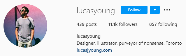
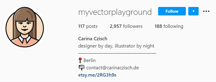
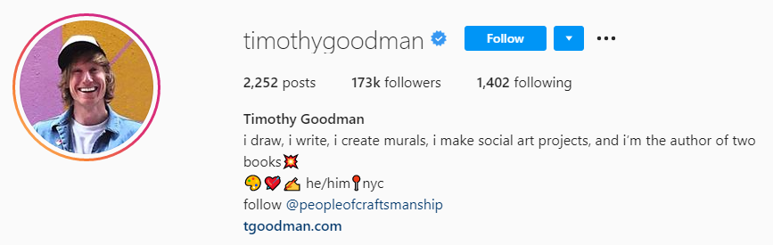
1. Write a clear bio that resonates with your audience and include a link.
It’s not about whether or not you have a bio (you should know already that you need one). Rather, it’s about what you put in it. You have a 150 character limit, and it’s the only place you’ll be able to link to anywhere. Here are the top 5 things you need for a standout Instagram bio:
Your name. If your Instagram handle doesn’t make it clear what your name is, include it in the bio.
Your services. Tell them what kind of designing you do.
Something personal. This should be something that people can relate to, or something quirky that makes you stand out.
Link to portfolio. This is preferably your website instead of just another social media account.
A city. This is becoming increasingly common because Instagram users want to know where you’re based.
Other optional things include a hashtag (no more than one) and emojis (best used as bullet points).
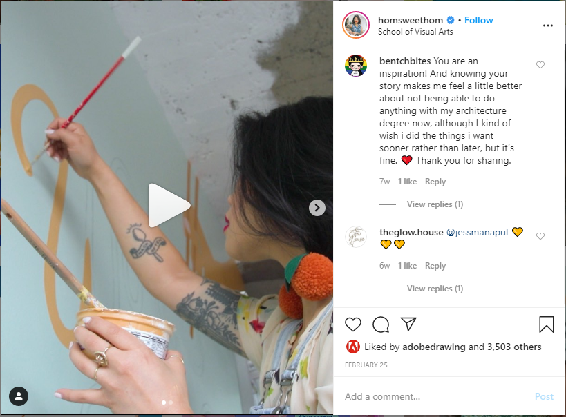
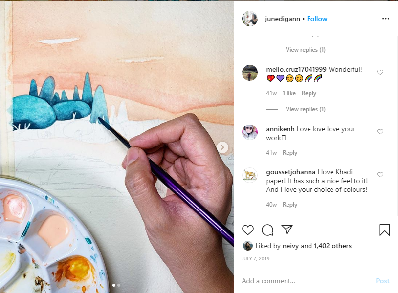
The old advice of showing your best work is good, but just like a portfolio, you should also show images and/or videos of your processes. Between your completed masterpieces, you can post other things (including Instagram stories) such as:
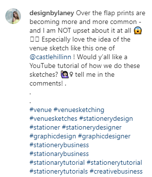
3. Write captions that bring value to your audience.
Like your bio, your captions need to do more than just exist. They need to exist for a reason.
Here are some good reasons for your caption’s existence:
Getting your audience to interact (through swiping, comments, going to bio, etc.)
Teaching your audience something that they wanted to know
Entertaining your audience so that you get more followers
Here are some bad reasons for your caption’s existence:
Explaining what the picture is (if they can’t tell, that’s not a good sign)
Telling your audience what the design is for (usually they won’t care unless it’s for a very high-profile company)
Telling everyone to follow your account (you can do this in the caption, but there should be more than just this or else nobody will bother)
There are three very important things to keep in mind when writing captions:
Keep things easy to read. This means splitting up long sentences and paragraphs, using emojis, etc. Don’t write novels because your audience will generally not read them.
Make things interactive whenever you can. Get your audience to comment when possible to build community and loyalty. Just make sure you respond to their comments too.
Keep it relevant to the picture or video. Not only is a disconnect confusing, but it also makes the audience feel like they’ve been ripped off.
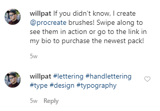
4. Use relevant hashtags that range from popular to specific.
Hashtags are ultra-important in Instagram, but that doesn’t mean you should just use as many as you can and always aim for the most popular ones. You should use both popular hashtags and ones that are more specific.
Popular hashtags help you show up on more feeds, but you’re less likely to get noticed because those feeds are refreshing regularly with hundreds or thousands of posts. Specific hashtags may show up on less people’s feeds, but they help you get noticed more because there is less competition.
5. Post regularly with a predictable schedule.
People like knowing what to expect, and when to expect it. If you’re posting daily, choose a consistent time of the day. If you’re posting a few times a week, choose the same days of the week for doing that.
Space out your posts so that it looks like you are posting regularly instead of dumping all your posts and then disappearing for three weeks. It helps you look more active, which will encourage people to follow you. It also keeps people following you because you don’t spam their feed.
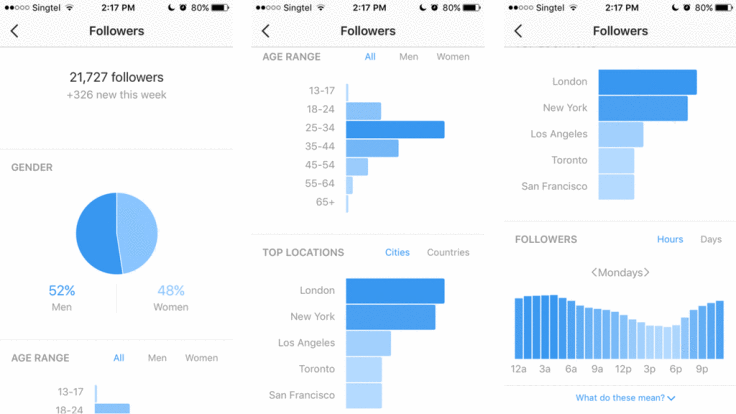
6. Track your results
If you just want to track likes, comments, and follows, you can do that without a business account. But if you’re serious about growth and track more metrics, then an Instagram business account is a must-have. It allows you to track the following:
Post reach (how many people see it)
Post impressions (how many times it has been seen)
Profile visitors (how many people visit your profile)
Link clicks (how many clicks the link in your bio got clicked)
Having this information helps you make wiser choices about which posts to promote and what kind of posts to publish in the future.
Here’s what you can expect to see from Instagram analytics.
7. Connect with relevant influencers (and think like one yourself).
Don’t just reach out to any and every influencer. Instead, ask these questions first:
Would I actually enjoy working with this person?
Would my target audience like this person?
What value can I provide to this influencer?
What value would this influencer provide to me?
And last but not least, think like an influencer yourself. Support brands and issues that you care about. Choose who you say “yes” to carefully. Think about how your audience would react to your content. You may not have the same number of followers as some of the big name influencers on social media, but you have some followers, and that means you still wield a degree of influence. Use it wisely and resourcefully.Need some fresh ideas? Contact us today to get started! 516-561-1468 or FOR MORE INFORMATION ON ANY OF OUR MARKETING PRODUCTS GO TO: www.printcafeli.com