The Print Cafe of LI, Inc.
For All of Your Marketing Needs
The Print Cafe of LI, Inc. is your Premier Long Island Printing Company.
We provide Marketing Products and Services throughout Nassau
and Suffolk Counties, as well as the 5 Boroughs. We service areas such as Mineola, Garden City, Hempstead, Lynbrook, Rockville Centre,
Westbury, Farmingdale, Manhasset.
We are the Company that comes to You !
Call for an Appointment 516-561-1468
Print Cafe of LI, Inc
Logo
Showing posts with label #booklet #catalog printing #printing long island #printingnewyorkcity #advertising #design #logo's #marketing. Show all posts
Showing posts with label #booklet #catalog printing #printing long island #printingnewyorkcity #advertising #design #logo's #marketing. Show all posts
Thursday, July 8, 2021
Employ This Unique Question-Storming Technique to Drive Creativity in Your Team
A well-known pastor once said this: “It takes guts to get out of ruts.”
In truth, it takes more than just guts. It takes inspiration, which is what drives courage and fuels life and new energy. When your team wants to create brain flow or stimulate innovative ideas, asking the right questions and getting others to ask them with you is one way to start.
The Question Formulation Technique
Most people spend a lot of time worrying about giving the right answers.
But an answer can only be as powerful as the question it addresses. If you work with teams, one of your goals should be to draw on each person’s unique strengths and creativity. But this can be a challenge if you can’t get the ball rolling.
If you want to try a different launch point for your next creative gathering, consider the Question Formulation Technique (originally formulated by theRight Question Institute). Here’s how it works:
Design a Question Focus
Pick a problem or challenge that is important to you. It should be clear and stimulate new lines of thinking. It should not be a question.
Establish Rules
Start by setting a time limit of around 5-15 minutes. Agree on this ahead of time and set a list of parameters before brainstorming begins. Brainstorming rules could include:
Encouraging people to ask as many questions as possible
Refraining from stopping green light thinking to answer, judge, or to discuss the questions posed
Asking everyone to submit at least three questions
Writing down every question exactly as it is stated
Produce Questions
Now it’s go-time.
Use your question focus to formulate as many questions as you can. Aim for 50 questions in 15 minutes to give your team a brain jolt.
Improve Questions
Once you have a list of questions, the next step is to try to improve them.
For example, you could change yes/no questions into open-ended phrases. You could modify a generic question by adding specifics (changing “how can we preserve heat loss in drafty spaces?” to “how can we increase heat efficiency by 20 percent?”)
Sort Questions
After brainstorming, your list will seem a bit jumbled.
Drill down by sorting questions into common themes then prioritizing the most critical areas. Choose 3-4 categories with the most potential and rank them by importance.
Take Action
Now ideas can take flight.
After ranking your categories, decide what you need to do next to generate creative solutions. Do you hand off a concept to a design team? Work with a consultant to flush out possibilities? Maybe you want to take the top-ranking question and have another “question-storming” session to flush out specifics for this concept.
Reflect and Reframe
Before closing your session, reflect on what your group learned and how you might assimilate these insights into your work. This may uncover hidden assumptions or reframe the way your team approaches its next obstacle. And give positive feedback on the discussion that just happened.
Teaching people to ask questions and partner in decision-making can fundamentally change the synergy of your team!
Need some fresh ideas? Contact us today to get started! 516-561-1468 or FOR MORE INFORMATION ON ANY OF OUR MARKETING PRODUCTS GO TO: www.printcafeli.com
Tuesday, June 15, 2021
3 Ways to Create Pictures that Pop
Have you ever heard the expression, “a picture paints a thousand words?”
It’s true. While words can limit our ability to effectively communicate ideas, even a split-second glance at an image can convey volumes of information. Whether you’re a marketer or design specialist, it is important to employ tactics that add power and clarity to your communication.
Creating Dynamic Images with a Singular Focus
Experienced graphic artists have many tricks of the trade. Some like to blur the background of an image to draw central focus to one element. Others add texture to flat graphics by adding bevels, text shadows, or blended layers.
But on an even more conceptual level, you can communicate boldly and clearly with signs and symbols. Looking to simplify – while adding complexity? Here three techniques you can experiment with in print marketing to amplify your visual messages:
Signs
On a basic level, signs are the combination of a word and a picture to create meaning.
What comes to your mind when you see a bright yellow triangle, an image of a dog with a slash through it, or a photo of a distressed person clutching their neck with two hands? Signs convey simple, universal ideas that viewers can understand immediately. Even colors themselves can have inherent meaning!
Like a cross and skull poison symbol, signs can stop people in their tracks. Signs are especially helpful when communicating with mass audiences at a glance.
Typograms
A typogram refers to the deliberate use of typography to express an idea visually.
For example, the word “half” displayed with only the top half of each letter showing might imply an eraser effect. The word “volleyball” with the “o” popping out above the text brings a playful, spirited message. Want inspiration? Check outthis 365-day challenge, where Daniel Carlmatz created a typographic logo for every day of the year!
Typograms use basic visual enforcement to add subtext to the words you display. Logos, taglines, or custom envelopes are a great place to put typograms to work.
Symbolic Imagery
While signs communicate a very straightforward message, many images have connotative meanings with far more complexity.
While a house denotes a place where you live, a home has far greater connotations (like family, security, and love). A subject, the objects surrounding it, and the editing techniques we use can all play a role in the cognitive messages we bring. Consider these examples:
Cropping a woman’s face to only the eye can make viewers wonder what she is thinking
Cropping a man’s body to only his head and shoulders may suggest he’s leaning in to hear more
Inverting colors may insinuate a flashback scene or a memory
Increasing contrast between the back and foregrounds might suggest the object behind a person is about to surprise them
Larger contrasts or color saturation can elicit feelings or arousal or cheerfulness
Increased sepia tones can give an aged or vintage look (like a photo carried in wallet)
Add Clarity and Complexity to Communicate on Many Different Levels
While language can limit our ideas, an image communicates on many different levels. Proficient designers know the more clarity or complexity you bring to your print pieces, the greater impact you will have on your target audience.
Use signs, typograms, and symbolic imagery to add emotional weight, to increase the efficiency of your communication, and achieve a greater return from your marketing dollars.
Need some fresh ideas? Contact us today to get started! 516-561-1468 or FOR MORE INFORMATION ON ANY OF OUR MARKETING PRODUCTS GO TO: www.printcafeli.com
Monday, May 24, 2021
Use Every Inch for Impact with Creative Custom Envelopes
Do you want to grab attention or showcase your brand? First impressions are vital!
When it comes to reaching your clients and prospects, envelopes are the unsung hero. Envelopes act as a silent messenger, building a very personal bridge between your company and its core customers. Great packaging can enhance emotional engagement and increase response rates, and envelopes are an easy place to start.
Direct mail stats show the value of a well-designed envelope. While response rates for email or social media advertising are typically less than one percent, direct mail generates a rate closer to 4.5%. And oversized envelopes are the most productive, witha response rate around 5%, generating a whopping 37% return on investment!
While not all mail is opened, 100% of recipients will interact with your envelope. Want to put your printed real estate to work? Here are some clever ways to add panache to your envelopes:
Craft A Monogram to Match Your Return Label
Like a royal signature, monograms use two or more letters to form one symbol.
Monograms can be used as a logo itself (like the overlay of the letters “NY” to form the New York Yankees icon, or the blended letters “VW” to form the classic Volkswagen symbol). But monograms can also be used in addition to a logo, and look great as a design motif next to the return address section.
The return address is one of the first places a reader will look, so why not spruce up this corner with a graphic or a monogram motif?
Add Color with Back Panel Art
Want to send a memorable message?
Add depth and dimension with back panel art. There are so many fun ways to do this. Try full-color accents to the top triangle, write your slogan in script text across the bottom, add custom stickers as fasteners, or design your logo into the closing flap (so it looks like a wax seal).
Creative envelopes are very pleasing to the eye, so take your back panel to the next level with full-color photos, playful text art, or contemporary custom labels.
Create Mirror Images in Opposite Corners
When you want to think outside the box, don’t limit your signature to the return address section.
Instead, create a mirrored design between the top left and the bottom right corners. A brand named “Matrix” may have this name in small script font next to their return address but add a larger script “M” bleeding off the bottom right corner of the envelope. A skyscraper logo may be printed as a thumbnail in the top left corner but as a larger symmetrical reprint in the bottom right quadrant.
Try Teaser Text
When you want to entice first-time prospects, consider teaser text phrases on one or both sides of the envelope.
Teaser text should compel readers to open your envelope by promising something of value like, “Receive a Free Map Set,” “Your Recipe Booklet Enclosed,” “Just for You,” or “Your Exclusive Offer of ____ is Here!”
Nonprofit organizations use teaser text to invite prospects to be part of a greater vision. For example: “A Lasting Legacy: Connecting People to Nature Since 1920,” or “She survived war. She needs YOU to survive COVID-19.”
When you want to add impact to your marketing, the envelope is a simple place to start. Amplify your image and add confidence to your communication today!
Need some fresh ideas? Contact us today to get started! 516-561-1468 or FOR MORE INFORMATION ON ANY OF OUR MARKETING PRODUCTS GO TO: www.printcafeli.com
Friday, May 7, 2021
Add Unity to Your Design with Clever Repetitive Elements
Do you ever find pleasure in the chiming of a grandfather clock or in honking geese as they migrate for the winter?
Repetition is therapeutic.
Rituals provide structure and something to hold on to, and they free us from the tyranny of choices and chaos. Repetition can help complicated pieces of music, movies, or books reveal the depths of their richness. And repetition in design adds consistency, beauty, and unity.
Strong designs repeat some aspect or element throughout the entire piece. The recurring element may be a bold font, a thick line, a snappy bullet icon, a repeating color or page layout, or anything that a reader will visually recognize.
From business cards to complex multi-page booklets, subtle repetition is a visual cue that ties every piece together. Want to be more intentional in your repetitive elements? Here are some options to try:
Headlines and Subheads
All text starts somewhere, and text banners are a perfect way to add graphic unity.
Are all the headlines in your newsletter 14-point Times Bold? How about investing in a very bold sans serif and making all your heads something like 16-point Mikado Ultra? Take the repetition that’s already part of the project and elevate it, making it stronger and more dynamic.
This adds beauty to the page and anchors readers in a framework of ideas.
Rule Bars or Page Numbers
When creating multi-page publications, it should be perfectly obvious that pages 2 and 12 are part of the same piece.
Beyond similar layouts, adding simple elements like rule bars and page numbers can bring harmony to your design. Try a thick, heavy rule bar on the top of each page and a narrow bar of the same color at the bottom. Label your pages with more than just numbers; design these digits with heavy fonts, fun shadow boxes or slashes, or print them vertically by rotating them 90 degrees.
Recurring Shapes
Patterns are a pleasing way to add visual continuity to flyers, reports, or even product packaging. Here are three ideas:
If you choose a branch as one of your central graphics, you might add smaller leaves throughout the document (as column markers, page number outlines, or bullet icons, for example).
Add colored waves behind the text that repeat in variations of your color palette or in repeating style (like a freeform eggplant shape) throughout the document.
Splatter your text across a subtle background of grid and dot patterns.
Playful Characters or Color Matching
Not everything needs to be serious!
Have a little fun by adding repetitive elements that have nothing to do with your page’s purpose. Add funky bird caricatures, petroglyph characters, or a toss of confetti. Borrow the colors in these images and match or complement them with handles in your text.
Feel free to add something completely new simply for the purpose of repetition!
Consistency Counts
Don’t underestimate the power of the visual interest of your pages.
The repetition of your work will eliminate chaos and add beauty to your work. Think of repetition as consistency, but push those existing patterns a bit farther. Can you turn some of your repetitive elements into a part of the conscious design strategy? Take a unifying graphic and create spinoffs of this concept to bring subtle accents to each page.
Sound time-consuming? It’s worth the effort! Repetition matters because when a piece looks more interesting, it is more likely to be read.
Need some fresh ideas? Contact us today to get started! 516-561-1468 or FOR MORE INFORMATION ON ANY OF OUR MARKETING PRODUCTS GO TO: www.printcafeli.com
Tuesday, April 13, 2021
5 Strategies to Overcome Nerves in Public Speaking
From Abraham Lincoln to Winston Churchill, some of the world’s greatest leaders had one thing in common: the fear of public speaking.
Glossophobia, or speech anxiety, affects 77 percent of the population at some level. This can range from sweating and an accelerated heart rate to dizziness, nausea, or a “fight or flight” response.
As a shift to remote working has become more prevalent, more communication is taking place online rather than in-person. And video chatting can make many people (who aren’t normally nervous)more anxious whenever they speak up.
Want to conquer your butterflies or gain confidence when you’re on the big stage? Here are five tips from the public speaking experts:
1. Practice Aloud in Advance
The best way to reduce your anxiety is to rehearse until you feel comfortable, and you will really settle into your message if you share it aloud several times before the big day.
Practice by yourself, before a mirror, in front of a video camera, or even with a friend, colleague, or coach who will give you constructive feedback.
2. Be at Your Best Physically and Mentally
In the turmoil of speaking preparation, this key to optimal performance can get lost in the noise.
Get enough rest. Avoid too much caffeine or alcohol. And give yourself quiet time if you need it (i.e., if you're an introvert), or mix-and-mingle time to get your juices flowing (if you're an extrovert). Look out for yourself BEFORE you speak to ensure the best outcome when you do.
3. Breathe
Breathing from your stomach muscles, not your chest, naturally calms the nervous system.
When you want to reset yourself internally, take a few deep breaths before and even during your presentation. As you inhale, say to yourself, “I am . . .” As you exhale, say, “relaaaaaaaaaxed.”
4. Don’t Be Nervous About Your Nervousness
Singer-songwriter Bruce Springsteen, who was legendary for his live concert performances, once observed that if he felt completely relaxed before a show, he wouldn’t perform as well.
Speakers who lack confidence often feel nervous. Then they feel anxious about the fact that they’re nervous, which compounds the anxiety. Remember, nervousness is just your adrenaline flowing. It’s a form of energy. Bruce Springsteen doesn’t get nervous about his nerves – instead, he channels this into excitement and power on stage. Successful speakers know how to make adrenaline work for them and turn nervousness into enthusiasm, engagement, and charisma.
It’s okay to have butterflies. Make the energywork for you!
5. Practice an “Others First” Mindset
During public speaking, you feel “all eyes” watching you.
This can be painfully vulnerable, like a caveman exposed in daylight. While you may want to shrink back, calm your anxiety by focusing onyour desire to encourage others. Sarah Gershman, President of Green Room Speakers, says this:
“The key to disarming our organic panic button is to turn the focus away from ourselves — away from whether we will mess up or whether the audience will like us — and toward helping the audience. Studies have shown that . . . showing kindness and generosity to others has been shown to activate the vagus nerve, which has the power to calm the fight-or-flight response. When we are kind to others, we feel calmer and less stressed. The same principle applies in public speaking. When we approach speaking with a spirit of generosity, we counteract the sensation of being under attack and start to feel less nervous.”
Need some fresh ideas? Contact us today to get started! 516-561-1468 or FOR MORE INFORMATION ON ANY OF OUR MARKETING PRODUCTS GO TO: www.printcafeli.com
Friday, April 2, 2021
Use Customer Lifetime Value to Plan Your Direct Mail Marketing
What is the value of a customer?
What profit can they bring this week? This year? Over a lifetime? It may seem like a simple concept, but many small businesses have no idea what a regular customer is worth to their business. This creates two problems:
1. Ambivalence about customer retention.Many businesses are uncertain about how much to spend on customer retention. With a metric for measuring customer values, you can navigate appropriate parameters for retaining these people or expanding their business. Research shows that increasing customer retention rates by merely 5% increases profitsby 25% to 95%!
2. Uncertainty about effective marketing.What is the number of new customers you’d like to attract, and what is an appropriate budget to do that? Defining customer value will guide your marketing strategies.
When acquiring new customers, estimating Customer Lifetime Value (CLV) provides a way to estimate their future revenue contribution to your company and how to use direct marketing to your advantage.
Take the Long View
Need an example? Here’s a sample:
In this scenario, a CLV of $150 estimates what one customer will spend after one year. When you send out a direct marketing campaign and $150 CLV customers respond, it’s important to remember that a client’s $50 initial purchase during this campaign may not seem profitable (due to the extensive mailing costs).
But rather than looking only at the figures for this initial campaign, you must consider the $150 these clients are going to spend over their lifetime.
Here’s the breakdown of those stats:
Mailed/Cost Orders Received Initial Loss CLV Over 3 Yrs
10K @ $5K 100 ($2,500) $10,000
25K @ $15K 300 ($7,500) $30,000
45K @ $25K 675 ($8,125) $76,250
In the first mailing, was the loss of $2,500 worth the time and expense of one campaign?
Not upfront, but viewing this investment as a loss is shortsighted. With an understanding of Customer Lifetime Value, smart entrepreneurs can see that each mailing produced a response of customers who had a CLV that would bring net profits in the long run. In other words, investing $5,000 in a 10,000-person mailing (to eventually earn $10,000) brought a return of 100%.
Keep Them Coming Back
One thing smart marketers know is that, by increasing a customer’s CLV, they can earn more profits faster.
Here are just a few ways to do this:
Keep customers engaged through value-packed content (e.g., educational newsletters, social media chats, personalized ad campaigns, or direct mailings that promote the tangible value of your latest products)
Offer loyalty rewards programs or “special status” sales events targeted to the niche markets within your base
Upsell more luxurious versions of your customers’ current products or packages
Cross-sell similar (or complementary) products or services
Incentivize annual billing cycle payments to reduce the churn rate of customers lost month to month
Increase sales by bundling products and selling them at a lower price than what they would cost separately
Increase pricing over time; or offer to “grandfather” current clients by keeping them at the existing rate as you raise prices for new customers
Your Customers Are Your Future
A customer represents the future of your success and your livelihood, and it will be difficult to thrive if you aren’t willing to risk or invest to attract new business.
Has the uncertainty of direct mail marketing kept your business from growing? Rely on our expertise! We offer simple ways to reach a mass audience for a price point that works with your budget.
Need some fresh ideas? Contact us today to get started! 516-561-1468 or FOR MORE INFORMATION ON ANY OF OUR MARKETING PRODUCTS GO TO:www.printcafeli.com
Friday, March 5, 2021
Winning the Name Game: What We Can Learn from the World’s Stickiest Brands
Have you ever wondered how the most iconic brands got their names?
The Lego story is as elegantly simple as the blocks themselves.
The Lego company began in the workshop of Danish carpenter Ole Kirk Christiansen in 1932, where he crafted wooden toys. Christianson’s inspiration for the brand name came from the Danish term for “play well” – leg godt. By combining the first two letters of each word, he created a unique and meaningful brand name that has transcended countries and generations.
In 2016, Lego’s turnover grew 6% to 5.1 billion euro, surpassing Mattel’s measly $4.9 billion, making them, for the first time, the world’s largest toy company.
Making Your Name Stick
A great name can make a brand.
In today’s expansive global market, it gets harder and harder to win the name game. If you want your name to be known and respected, you have to pick a winner and make it stick.
What makes a great brand name? The “stickiness” of the word can make all the difference. Names that closely align with the service they offer are especially memorable (like Twitter, Smuckers, Naked Wines, SnapChat, Netflix, PayPal, Red Bull, Dollar Shave Club, and Snuggie).
Names with engaging metaphors are powerful too. When paired with a clear graphic device, names that suggest something beyond their literal meaning create some of the most evocative brand identities.
Take Amazon, for example. When Jeff Bezos was looking to carve out space as the biggest bookstore globally, he wanted to convey his company’s sense of mystery and endless possibility, available to any customer with an internet connection. Bezostried two or three namesbefore settling on “Amazon.”
The metaphorical impact of this name had great appeal: the Amazon River was the biggest in the world, home to a vibrant ecosystem as exotic and different as Beso’s dreams. It was the ideal metaphor for his new venture. The Amazon was striking and boundless, just as he wanted his online store to be. It was also the largest river in the world, 10 times larger than the next contender – perfectly fitting the vision for Amazon’s status today!
Growing Top-of-Mind Awareness
Once you’ve found the right name, it’s time to get it in circulation.
Brand awareness is the extent to which a brand is recognized by potential customers and correctly associated with its particular product or service. When your name becomes familiar, you will enjoy all kinds of perks:
-- People will know who you are and what you do
-- A viewer will be more open to reading your ads or mailings
-- Search engine users will be more likely to visit your website
-- Prospects will be warmer toward a referral from one of your current customers
-- Customers will be more likely to choose your brand over others, even if there are cheaper options available
Looking for ways to get your name out in your community or industry? Here are 10 ideas:
1. Create a custom hashtag that plugs your unique selling proposition
2. Participate in or sponsor local events
3. Build bright, colorful infographics
4. Post regularly to social media using your brand voice
5. Sell your name through special shapes (i.e., die-cut postcards, magnets, or key chains)
6. Go mobile by creating colorful decals for vehicles
7. Hang full-size posters in “can’t miss” locations
8. Add a blog to your website and feature it in printed inserts or newsletters
9. Invite your employees or VIP customers to wear branded clothing at key community events
10. Design beautiful labels for all your products
It’s a good idea to use a mix of online and offline strategies to build awareness in most cases. The more customers see your company, the more likely they are to think of you when they’re ready to buy.
FOR MORE INFORMATION ON ANY OF OUR MARKETING PRODUCTS CALL: 516-561-1468 OR GO TO:www.printcafeli.com
Thursday, February 25, 2021
How to Double Your Sales with Successful Catalog Marketing
Do printed catalogs still work?
The Harvard Business Review (HBR) worked with a U.S. based specialty jewelry company to find out.
This e-commerce retailer (which had no physical store presence) typically generated an annual operating profit of $12 million, with a database of approximately 28,000 customers. This companypartnered with HBRto study the impacts of bi-monthly print catalogs through field experiments involving 30% of its customers over a span of six months.
Of those customers, 5% received neither email nor catalogs, 55% received a weekly marketing email, and 40% received the new bi-monthly catalogs in addition to the weekly email marketing. Over 90% of photos and product descriptions were the same between emails and catalogs to control the content's effects.
The results were impressive. Compared to the Control group, the “Email + catalog” group experienced a 49% lift in sales and a 125% lift in inquiries. In comparison, the “Email-only” group only had a 28% increase in sales and a 77% lift in inquiries over the control group; the sales and inquiry lifts from catalogs almost doubled those generated by email marketing!
Furthermore, of those customers that received the catalogs and made inquiries, 90% said they had browsed through the catalogs and kept them for an average of seven days.
Using Hard Copy Catalogs in Your Omnichannel Marketing
Catalogs are here to stay, and companies like L.L. Bean, Ikea, J. Crew, and Athleta continue to dominate sales by distributing printed catalogs.
The simple fact of the matter is that buyers don’t want to connect with brands exclusively online. Yes, the stats show that the number of people researching and shopping online versus in-store continues to grow.
But many buyers purchase online because they’ve seen something marketed through a printed medium. According to BRAND United, around 86% of shoppers buy an item online after looking at it in a printed catalog first.
5 Ways to Keep Your Campaign on Track
If you are considering catalog marketing, here are some suggestions to get you started.
1. Conduct Market Research
Study your current customers and make a note of gender, geographic location, and the strategic personas you’d like to target.
Match the items you want to sell with the target audience you want to reach.
2. Create Campaign Goals
These goals should be measurable, clear, and realistic – like driving customers to a retail location, increasing “product of the month” sales online, or growing your subscription base.
3. Develop Your Story
Catalogs don’t share information; they sell stories!
Your piece should invite prospects into a story that helps them visualize their “ideal self.” And remember, when people are heavily invested in a bigger financial commitment, they need narratives that justify this expense (like, “you deserve something delectable”). Work hard to set their conscience at ease, and you will be rewarded with loyalty and sales.
4. Stay Focused
Continue to send your catalog to existing customers to reinforce the idea that you have the products they want.
In addition, mail your catalog to individuals who fit the description of your target customer.
5. Connect Timelines and Expectations
Create a schedule and execute the campaign.
By using a schedule, you can see if you are achieving the benchmarks you’ve articulated. You can measure the outcome by having customers refer to catalog codes, measuring the number of new accounts generated, or conducting surveys.
A One-Two Punch
Direct mail meets customers where they live, and catalogs are a long-standing customer favorite.
Want to explore catalog marketing options for your business? Give us a call today at 516-561-1468 or hop online for a free estimate or go to:www.printcafeli.com
Tuesday, February 16, 2021
Packaging and Printing: It’s More Than What Meets the Eye
Packaging and printing: it’s more than what meets the eye. In today’s world, packaging is everywhere and used for almost everything — be it the cereal box in the local grocery store or the packaging used to contain your dreaded COVID test kit. With that said, printing is so important in the packaging process
One look at the packaging industry within the last year will show you how packaging is constantly changing. With the advent of COVID 19, social distancing, and lockdowns, the packaging industry had to pivot quickly to meet the demands of consumers who want and need safer packaging, particularly in grocery, toiletries, home goods, and eCommerce. While most people first think about the increase in the waste stream for disposable PPE and individual packs, instructions, certifications, and key details have also changed. Print provides a different message and new information regarding the pandemic through packaging. As 2021 moves forward, I expect to see some new innovations regarding packaging and printing.
Companies should and will look at printing as a way to market their packaging toward the new, post-COVID consumer: someone who is more thoughtful about what they bring home, engaged with their packaging and its print in a way that is more meaningful than before. This is because packaging can literally save lives with the use of clear printing on its labels, and on the product it contains.
As I sit at my computer writing this, I can already tell you what differences I expect just by looking at the packaged items I’ve been stocking (hoarding) for months. For example: those boxes of KN95 masks from China with KN95 printed prominently on the top, front, and back will definitely be used more often by consumers who are looking to keep themselves safe from any kind of disease, not just the coronavirus. The printing on these boxes is detailed and explains the use of the masks so that any consumer can understand visually. I expect to see other packaging for PPE to follow suit. In contrast, I have samples of food packaging I expect to see this to change in more subtle ways. In recent times, consumers are becoming more aware of what they put in their bodies. As a result, I see food companies changing their packaging to reflect images and messaging of immunity based and organic products. Printing will be paramount in achieving high-quality packaging for food that reflects the new, more health-conscious consumer.
I personally look for packaging that matches my personal values, since the advent of the coronavirus and everything going on in the recent US political landscape. I will be seeking out printing that brings joy but also holds information about the product. I expect to see more than the name of the manufacturer on the packaging, and more about what I can expect from my products and the companies that produce them. I don’t want to wonder how to use what’s inside the packaging. I want to see packaging that is well-printed, that holds meaning and brings value to our lives.
Already there are companies that are creating sustainable, no-waste, reusable packaging. With this change, it will be important to keep in mind what methods and materials are used for package printing, what message the print conveys about each company, and what it tells the consumer.
As a packaging professional, I will do my best to continue to create packaging that gives a different “unboxing” experience to my clients and consumers in the new year and years to follow. I want people to seek out the products and packaging that come from small, innovative startups, manufacturers that are locally-based: companies that truly value their consumers as people. It will be important moving forward, to press companies about their packaging methods. It will be important to be more conscious about what we print on our packaging, and it will continue to be important to convey messages of empathy, health, and goodwill in the post-COVID world.
FOR MORE INFORMATION ON ALL OF OUR MARKETING PRODUCTS GO TO:
5 Straightforward (and FUN) Ways to Boost Your Productivity This Year
Today is a great day to integrate some healthy new habits into your routine.
Everyone benefits from good time management, and here are just a few simple ways to free up more time to do things you really love!
1. Create Templates
Tired of repeating yourself?
Templates (a type of “fill-in-the-blank” document) are great for assignments created the same way every time. Whether it’s a weekly email, a presentation spreadsheet, a thank you note, or a method for re-directing inquiries to a better source, creating templates in advance can save you tons of time in the long run.
2. Listen to Audio Books
Who doesn’t want to read more?
Audiobooks are a wonderful way to maximize that “throwaway” time in the car, getting ready in the morning, or during exercise.
In 2020, many local libraries made audiobook apps totally free. People who previously struggled to finish a chapter found themselves gulping down five books a month, while sharpening their minds and adding spontaneous joy to each day!
3. Block Distracting Apps, Websites, or Emails
According to research carried out by RescueTime, the average digital worker can’t go more than six minutes without checking their email or instant messaging.
The digital nature of your work and social life can leave you frazzled by constant alerts. This minimizes both productivity and potential as you struggle to focus on tasks for even short periods.
Start this year strong by implementing a few website and ad blocker tools. Unsubscribe from email lists or group chats that are sucking away precious moments in your day. And set your devices to block notifications from coming through in key work hours.
4. Batch Prep Your Meal or Meal Prep
If you want to save time in your busy week, mastering food prep can be huge.
Every time you mess up and clean your kitchen, it takes time. So why not make one big mess once a week, rather than a medium-sized mess every day? This can be as simple as chopping your veggies (or cooking all your meat) as soon as you get home from the store. Or it can be more intentional, like pre-cooking several meals and properly labeling them for fridge and freezer storage.
While the idea ofprepping several meals at oncecan seem daunting, the time, energy, and money you’ll save in the long run are totally worth it.
5. Try the Pomodoro Technique
The Pomodoro Technique is a time management system that encourages people to work with their time – rather than against it.
Using this method, you break your workday into 25-minute chunks separated by five-minute breaks (referred to as pomodoros). After about four pomodoros, you take a longer break of about 15 to 20 minutes. This work rhythm helps create a sense of urgency and productivity followed by natural releases needed in order to recharge.
While you may not be a fan of resolutions, the emphasis here is on forming productive habits and finding tools to minimize your daily load.
To be more productive, look beyond your task list to the organizational tools needed to manage time well. That takes effort up front but gives you more time to enjoy each day later. And that really is crucial!
FOR MORE INFORMATION ON ALL OF OUR MARKETING PRODUCTS GO TO:
“I am a huge fan of running flyers. My book, ‘How to Start Your Own House Cleaning Company,’ has a huge section on flyers,” Brown said. “Flyers are a great, cheap way of advertising your business, and if you do it the right way, you can have business coming in within a day or two. And lots of people save the flyers. If they are not ready to hire you today, they can hire you when they are ready. And once you have clients, you can work from referrals after that.”
Brown has moved repeatedly, and each time, she’s had to start her business from scratch. Flyers have been a key marketing strategy each time, with similar, conclusive results. “No clients, same business,” said Brown. “New neighborhood, new clientele. Running flyers is an old-fashioned way of doing business, but it’s effective!”
Flyers that Move People to Action
Flyers may seem insignificant, but they get the job done.
Though these simple bits of paper often end up trampled in puddles or buried in a pile of bills, they always grab attention. And, if they’re designed well, they’ll move people to act! (Attend this grand opening; subscribe to our monthly newsletter; visit the new farmer’s market.)
Want to build momentum for your event, promotion, or group? Flyers are a low-cost form of mass communication that can be mailed, personally delivered, or posted in public places. Flyers are fun to create and allow you to experiment with unusual images or layouts.
As you explore the possibilities, here are four strategic areas to sharpen your design:
Magnetic Focal Point
When you begin your design, clearly identify the theme of your message.
Look for an image or headline that best communicates this, and build your entire design around it. Every flyer should have one thing on the page that is huge, dominant, or captivating. Bright, bold color palettes give flyers punch and attract tons of attention, even from across the room.
Logical Design Flow
After the focal point, your flyer design should have a sensible layout that intentionally leads the reader through the page: left to right, top to bottom, or using visual cues like numbers or a “map” of dashed lines.
Strong subheads should allow viewers to scan the page quickly. And simple, elegant designs bring impact all their own. Keep text to a minimum and space your design elements generously.
Cohesive Alignment
Choose one alignment for the entire flyer.
Don’t center the headline, then set the body copy flush left. Don’t center everything on the page, but also squish extra elements in the bottom corners. Be confident in your layouts: try all flush left or flush right. Your design should feel brave and bold!
Appropriate Content
What should you include in a flyer?
While brochures or foldable flyers come in various formats, a basic rule of thumb is this: the “where” determines the “what.” The delivery of your publication has everything to do with its content. If your piece arrives in the mail to someone on your mailing list, you can include much more on it. If it is for public display, it should be readable at a glance.
Made You Look, Made You Look!
Flyers are fun to create because they allow you to abandon restraint. Your flyer will often go head-to-head with dozens of competing pages, so grab their attention and really go wild.
Anything out of the ordinary will make people stop and look, and that’s 90 percent of your goal.
For More Information On Any Of Our Marketing Products Go To:www.printcafeli.com
Simply Irresistible: Best Practices for Writing Compelling Lead Magnets
Have you ever made an impulse buy at the grocery store? Or been drawn to an online store that you knew was probably fakey clickbait?
Sometimes, when the right offer hits you at just the right moment, it seems impossible to resist! And they don’t call this “magnetic” appeal for nothing.
In marketing, Magnets are an effective technique for gaining a prospect's contact information and/or drawing them into your sales funnel. Sometimes called lead generation, this process of stimulating and capturing interest (to develop a sales pipeline) allows you to nurture a lead until they are ready to buy.
Sounds easy enough, right? But how do you build this curiosity or engagement with your target audience? According to Hubspot, about63 percent of businessesbelieve their biggest marketing challenges relate to generating traffic and leads, and60 percent of marketerssay lead generation is a key pain point for their company. Leads typically hear from a business after they receive and respond to some type of content, and knowing where to build this bridge can be a challenge.
Looking for some ways to engage your next VIP customer? Here are five time-tested options to consider:
Provide a Free Onsite Course or Webinar
People love information.
And giving it away for free is bound to create a sense of reciprocity with your prospects because humans naturally want to respond when something has been given to them.
Look for a point of need in your prospective customers and offer them valuable information in a podcast, an in-person event, or a consultation, and people will jump right in!
Compile Case Studies and Reports
Insider information about a company’s sector is always valuable.
This may be a quarterly white paper (like a comprehensive guide on the latest technology or trends in your industry) or a case studying outlining the benefits of certain methods, products, etc. Trade this information for your prospects’ contact information, or send a flyer with the introduction but release the full content only if people sign up to receive it.
Offer a Demonstration or Free Trial
A good way to secure customers is to give them a way to try your service or product without cost; or receive a free quote from your team.
Mailed postcards or website promo codes are an effortless way to get this offer in front of them.
Promote Contests and Free Products
A no-fail way to generate leads is to make generosity fun.
You can offer a free product, a BOGO offer or bundle promotion, or even a monthly drawing for a goodie bag of some kind. The more creative the offer, the better!
The Road to Opportunity
No matter what magnet you use, your lead generator should:
Position you as the guide.(Share empathy and authority as one who can help solve their problem.)
Stake claim to your territory.(Differentiate yourself from competitors and share unique knowledge in key areas.)
Qualify your audience.(Speak to the specific audience you are trying to reach with a succinct, irresistible headline.)
Create trust by solving a problem. (Even though your product should be the ultimate solution to their problem, your lead generator should provide an immediate benefit too.)
When you implement a lead generation program, you increase brand awareness, build relationships, generate qualified leads, and ultimately close deals.
And the better your leads are, the more successful your sales will be!
To See All of Our Marketing Products Visit Our Website at: www.printcafeli.com
Thursday, January 14, 2021
Public Domain and Free Fonts For Personal and Commercial Use
Working on your branding, social media posts, or any sort of marketing effort? You probably need a good font that fits your budget. Here’s a selection of 100% free and public domain fonts you can use for both personal and commercial needs.
Public domain fonts, or open typographies, are all the fonts that are not only free to use but also open to edit, customize and modify, as well as redistribute.
On the other hand, 100% free fonts are made available by the authors to use for both personal and commercial use, but should not be modified or redistributed.
If you need a free font for your marketing purposes, whether it be a display font for a sleek landing page, a new logo, or even social media posts, this selection’s got you covered.
We separated the fonts into four different categories, so you can choose by style.
Serif fonts
Serif fonts are a classic choice: they are one of the oldest types of typography and are characterized by the extra swooshes and details at the ends and “feet” of letters.
Serif fonts date back to the 18th century when stonemasons still carved letters in rock. They that your brand is established and trustworthy, but also traditional and refined.
Plenty of world-known brands use serif fonts, such as Vogue, T Mobile, Sony, Volvo, and many others.
Check out these free and public domain serif fonts you can use with no extra weight on your budget.
This is a very noticeable font you’ve seen a thousand times, but you probably don’t realize that. It’s an Open Type proportional serif typeface, that was mainly created as a more contemporary and sleek alternative to the Times font family.
What’s great about this font is that it has more than 2,000 glyphs and encompasses the Greek and Hebrew alphabet, as well as the Cyrillic script. If your branding efforts need to be translated and used internationally, consider using this font.
And if you still can’t remember where you’ve seen it: it’s the Wikipedia logo.
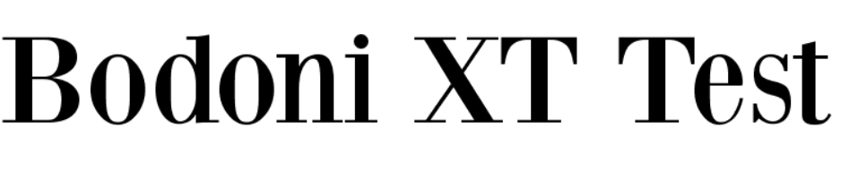
Bodoni XT is a newer, reworked version of the classical Bodoni font, that dates back to the late 18th century when it was created by the Italian type-designer, printer, and publisher Giambattista Bodoni.
The original Bodoni font is used by fashion mega-brands such as Calvin Klein and even the Vogue magazine. Bodoni XT was modified by designer Manfred Klein, and is slightly more condensed and has longer feet.
Sansita Swashes is a newer, less famous, but definitely more playful typeface than the previous ones on this list. It makes a great font to use in the beauty industry or food packaging. It has a hand lettering feel to it, but it’s precise and elegant.
Oranienbaum is another, more modern Antiqua style font (same as Bodoni), with a high-contrast and well-defined features. It is a typeface whose look is typical for type designs from the early 20th century and characterized by pronounced serifs and contrasting geometry. It is created by type designer Oleg Poslpelov, with the art direction and publishing of Jovanny Lemonad.
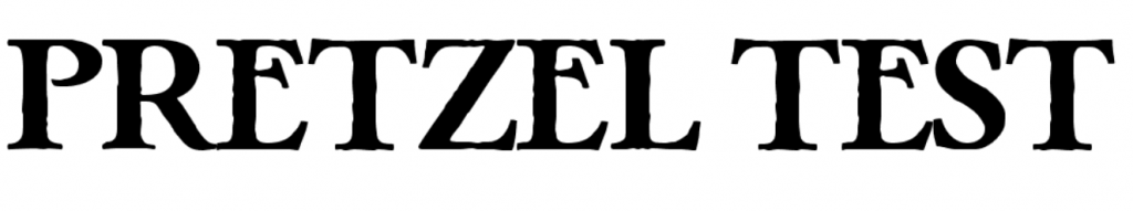
This eroded and fancy-looking font looks nothing like pretzels but has a slight nod to Gothic typeface design and Bavarian aesthetic.
The eroded effect makes it look old and mystical, but the generous spacing and width of the letters balance it out to result in a clean and elegant design. Keep in mind that it only has uppercase letters.
The last free serif font on this list is leaner and sleeker, but perfectly legible and stylish. It makes a great display font, and the gentle extra swooshes allow for it to be paired with any sans serif or script font. It is also an internationalized typeface with all sorts of glyphs and symbols, so it can be used in a selection of languages other than ones using the Latin Alphabet.
Sans serif fonts
Whereas serif fonts are elegant, traditional and playful, sans serif fonts are the face of the contemporary, minimal and clean design. The difference is in the name: the “sans” part means that they don’t have the extra swooshes and ornamental additions on the letters’ endings.
They give off a sense of approachability, youthfulness and corporate design.
This luscious Art Deco-inspired vintage font comes in all uppercase letters and a bigger height. Since there are no lowercase letters, if you use it for web design or headings, you’ll need to pair it up with another font for your body text. However, used on itself as a display font, in packaging, poster design, or even as a logo font, it looks very retro and impressive.
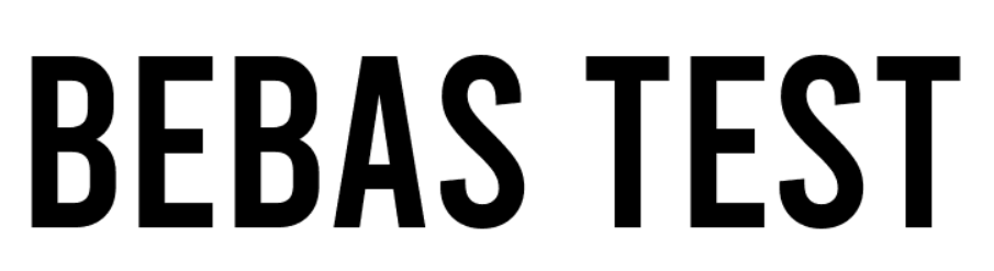
The Bebas font, created by designer Ryoichi Tsunekawa, is perfect for headlines, captions, and titling. It’s also a commonly used font since the whole Bebas font family is available on online design tools such as Canva. But, that shouldn’t discourage you from using it yourself: it’s subtle and sleek and makes a great font for all your web design and social media post needs.
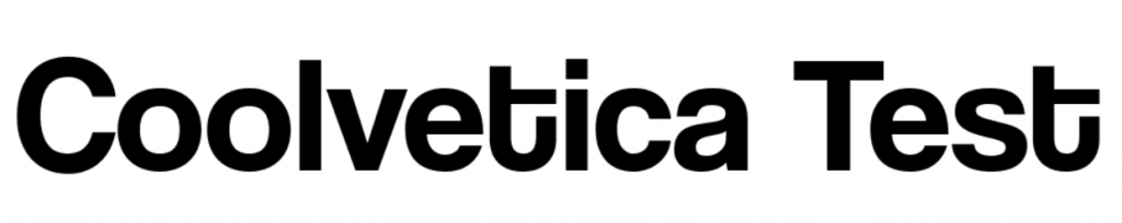
This cool (excuse the pun) font is built from scratch even though you might think it’s a variation of the more famous, classical Helvetica. It’s aesthetic is based on American chain store logos from the 1960s, an era when everyone was modifying Helvetica. Coolvetica successfully manages to mimic that style, but with a tighter kerning and funky curls, as the author Typodermic Fonts notes. It comes in four styles: regular, condensed, compressed, and crammed.
When the designers behind this font named it bold, they really meant it. This bulky typeface is noticeable, but clean, and will make a great headline or logo font. It has perfect circular shapes and a geometric base, similar to Art Deco fonts. Keep in mind that you might need to pair it up with a lighter and legible secondary font to balance out the noisiness of the design.
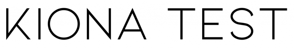
If the previous font was heavy and noticeable, Kiona is quite the opposite: contemporary, light, sleek and very elegant. It’s a very modern sans serif type, that will fit beautifully on luxurious packaging, logo design, or even collateral designs.
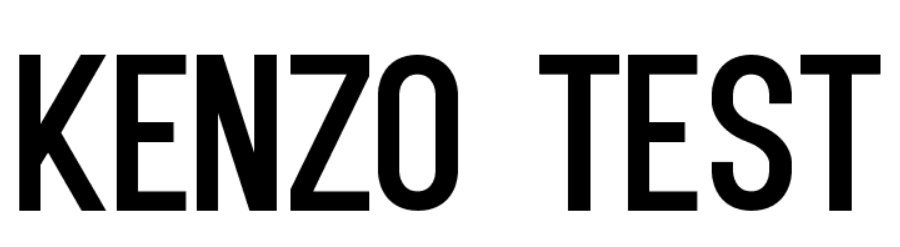
Possibly inspired by the Kenzo logo font, this fashionable font is characterized by rough cuts and geometric shapes. It’s slightly condensed but still lavishly designer, and will make a great font for both headlines, digital marketing ads, and even print design.
The Varicka font is yet another example on our list of typography that came to be from the industrial Art Deco movement of the 1920s. Flowy vertical lines and geometrically defined diagonals lend it a classy charm, but the sans serif nature of it makes it perfectly clean and legible.
Script fonts
A script font is a typeface that mimics handwriting, most often in cursive, and calligraphy lettering. Sometimes script fonts are based on personal handwriting, while other times they are made from scratch to just imitate a certain style. Nonetheless, both versions look elegant and flowy, and script fonts are known to be used in more creative, feminine and playful designs.
Thumbellia Test looks like the younger, more childish cousin of the Instagram logo font—it’s playful and very obviously mimicking cursive handwriting, but the legibility and distinguishable qualities are there. It makes a great font for a company in the beauty industry, fashion, or anything related to children’s products.
Instead of mimicking an ink or pen texture, Alita Brush looks exactly like it’s been written with a painter’s brush. It’s an urban, youthful and hip typeface, that will fit great on ads and posters.
Here is a font that is perfect to pair up with a stern-looking sans serif, and offer a feminine touch that will shake up the corporate look for sure. The Boardy is a bit harder to read, so it’s not recommended to use it as a primary font, but put it as a secondary and more ornamental font and you’ll do wonders to your design.
The Stella script font by Sudarman Mulkais the digitized format of the designer’s handwriting, and is a perfect choice to use if you feel like creating a logo or stationery that is supposed to mimic handwriting. It is dynamic and gentle, but probably not fitting as a header font or in web design body text.
Decorative fonts
Decorative fonts, as the name clearly tells you, are more ornamental and often include texture, three-dimensional design, or additional ligatures. They are a pretty addition to any design but keep in mind that the background and other design elements you’ll include with them have to be minimal, in order not to overwhelm the complete look of your design project.
Misto is a quirky font that looks both retro and futuristic at the same time; the oval-shaped circular letters and the bold vertical lines have a Bauhaus-style likeness, but the cleanliness of the design looks like it would fit a Dune poster.
This clean and simple sans serif font has an extra trick up its sleeve: it’s designed as a wooden 3D frame signage typeface. So, if you want a vintage Americana look or an industrial early 20th-century style typography, this one’s for you.
The last entry on our list of free and public domain fonts is Deadender, which has unique imitations of Art Deco metal parallel metal rods and curved angles. It’s a very noticeable and decorative font, so use it sparingly.