Print Cafe of LI, Inc

Print Cafe of LI, Inc
Logo
Showing posts with label #T-Shirt Printing. Show all posts

Friday, October 16, 2020

Tips On How To Ensure Versatility Of Your Logo Design


A company’s logo design is used on various marketing strategies. A logo appears in various sizes ranging from as big as billboards to tiny ones like on a business card, pens and stickers. Therefore, a logo must be scalable. It should also appear impressive in both color as well as black & white versions.
All types of businesses use logos as an effective marketing tool. People usually recall a business by seeing its logo on products and on advertisements. We can say that logos take business messages to the people and help the companies in converting the viewers into potential buyers.

However, success of a logo design largely depends on its quality of being versatile. This means that the logo must look equally great on all sizes of products. So, the logo must look impressive not only on big scales of large billboards to the size of a stamp. The logo must not lose its shape, size, colors, fonts, and other vital elements in all sizes. This is one of the basics of logo design.

A logo is printed on larger billboards or on fairly smaller advertising products such as pens, stickers, rubber stamps and business cards. In addition, the same logo must also look impressive on pixel based media such as websites and web banners. Business owners can use such versatile logos on a wide range of ads and products or services. Clearly, the businesses should be able to reproduce the logo in its varied sizes.

Versatility is one of the most essential quality of a good logo design. In the 21st century, brands are highly visible. They are exposed to a wide range of media. Most of the brands are actively projected on social media pages. This means that a logo should appear great on all the social media such as Facebook, Twitter, Instagram.

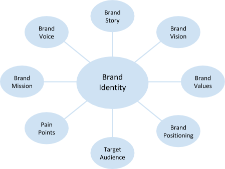
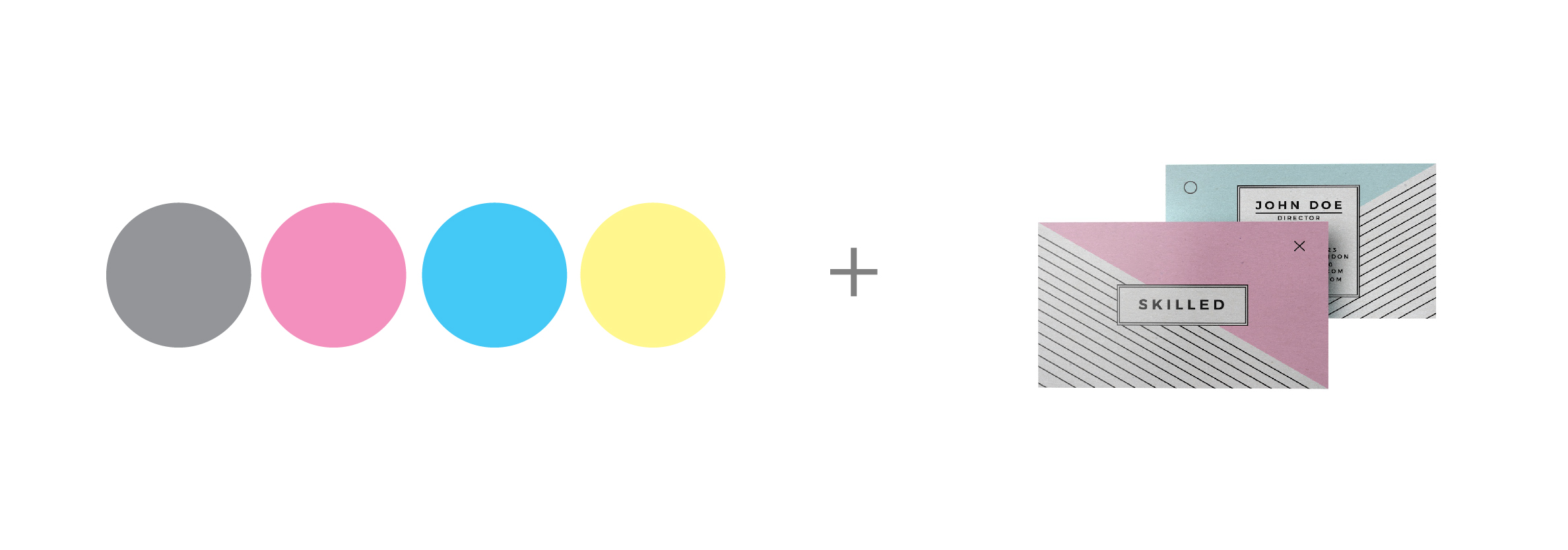
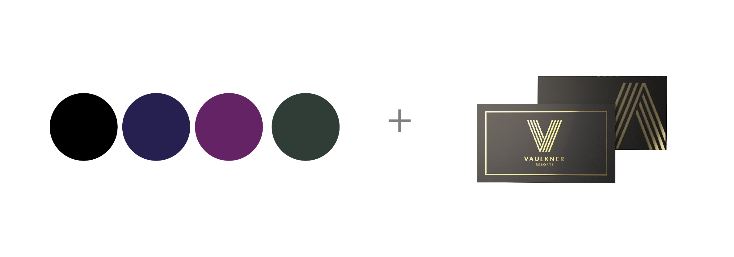
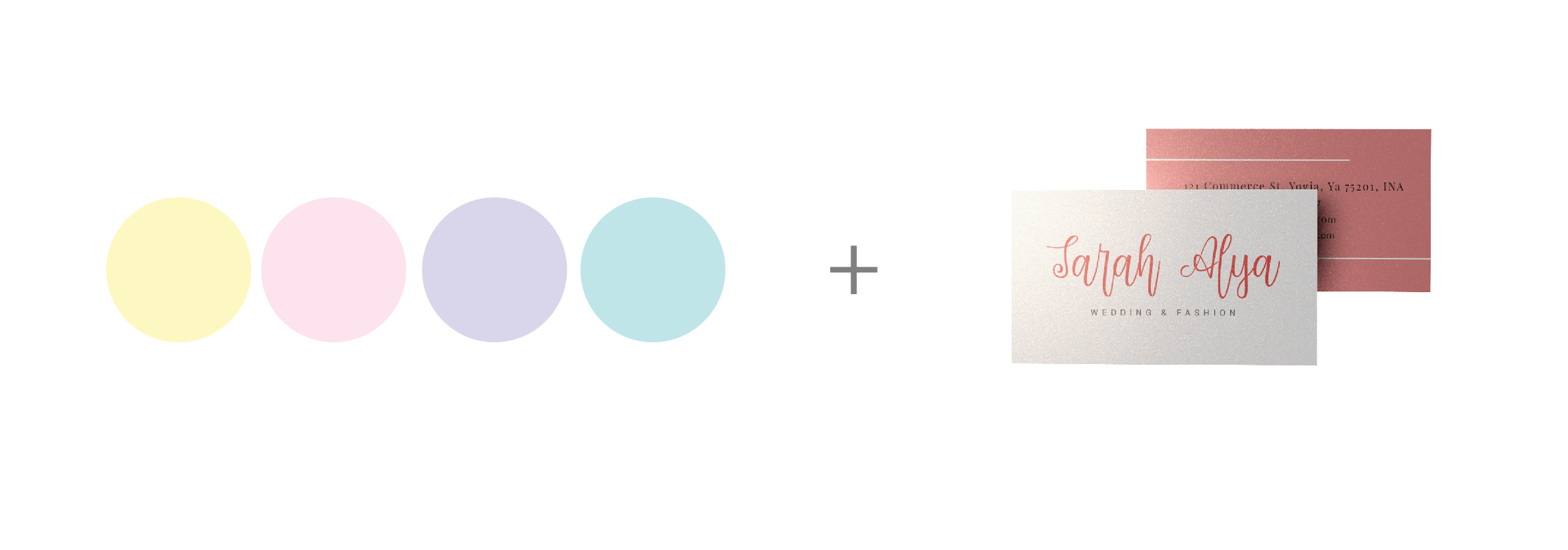
Another reason why your logo should be versatile is that it helps create your brand identity. So, a logo should look good when printed on the top of a letterhead, business card, mobile app icon, etc.

A versatile logo is cost-effective. It saves you money and time as you do not necessarily have to create separate logos for different media ads and products. Since, the same logo goes for all ads and promotion ranging from large billboards and smallest stamp size ads; you get to save a considerable amount. Additionally, your printing cost decreases manifold when you use fewer colors in the logo.

Here Are Some Tips To Create A Versatile Logo

01. Consider The Details

While designing your logo, consider how much detail should go in it. The details of lines, colors, fonts etc. are necessary to convey the business message. But too many details may create printing troubles for a logo.


If the details are minute such as delicate or skinny lines and too many colors, then these may disappear when printed. These details may appear as broken shapes when printed in small sizes. So, it is advisable to keep only fewer details that are extremely necessary for the logo.

A logo with fewer details will save your production cost of graphic design items. For example, your overall cost of a business card design will be lower to produce it if the logo that you print on the card is also a simple design.

02. Pay Attention To The Space

If a logo design has the white space, or negative space, it must be created carefully. The white space between the two elements should be consistent. This means that the space should not be too close as it may lead to elements overlapping each other when the logo is printed. And if the space distance is too big, the viewers may not find an association between the elements and the logo may fail to communicate well with the viewers.
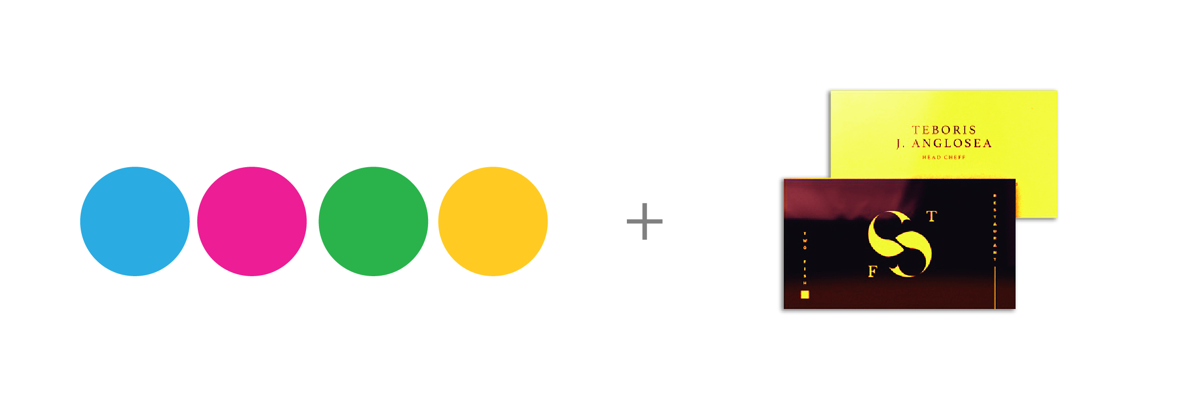
03. Use Gradients Selectively

Opt for gradients only when they can contribute to the overall quality and appeal of the design. Avoid choosing too light tints as such tints usually disappear when printed and the logo appears in white color scheme only.


Do not necessarily opt for too dark tints as they may appear too solid and patchy when printed. In fact, too dark tints create a muddy look for the logo when printed on a newspaper. Take note of the fact that some reproduction processes do not accommodate use of gradients very well.


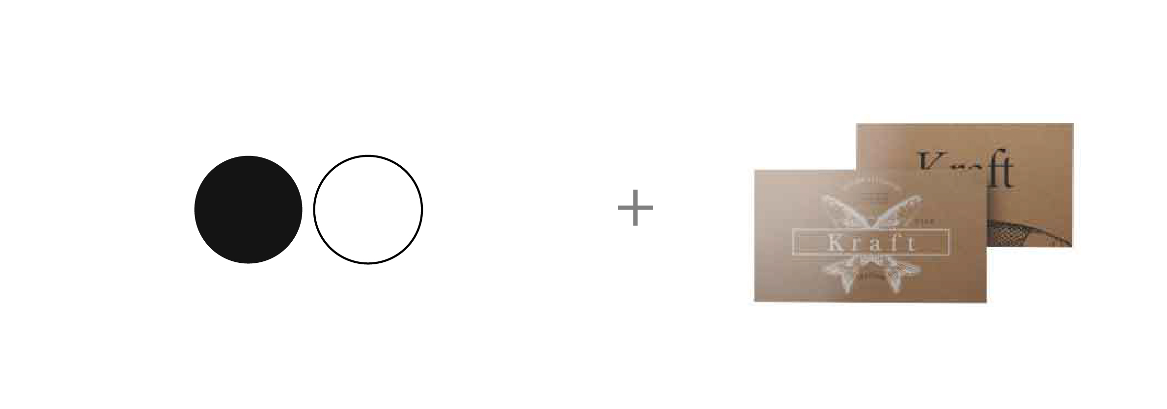
04. Create Logo Without Colors

Another sign of a versatile logo is that it appears impressive in both colors and without colors. This is because a logo is printed on newspapers, magazines, faxed copies, etc. in black and white. So, the logo must retain its uniqueness when printed without colors. This will ensure better logo and brand identity design of the business symbol.


A trick to create a versatile logo that looks impressive in black and white is to create it first without colors. When designing the logo, first create it in black and white only. It is only when you are satisfied with the design that you should fill colors in it. As a graphic designer, you should take a logo and get approval. Then, incorporate colors after getting the approval.
Read more of our informative blogs at:
http://store.printcafeli.com/blog/Print_Cafe_Blog.html

Wednesday, September 16, 2020


           Knowing The Different Processes For Apparel Printing


Digital Printing

Digital printing is also known as Direct to Garment (or DTG, for short). The best analogy for describing digital printing is an inkjet printer: The garment goes through the digital printer and the design is “printed” on the surface of the garment. The ink is applied directly to the garment, much like ink to a page in an inkjet printer. A computer controls the printing process, and your image must be transmitted in a digital format.

There are no setup costs for digital printing. It is ideal for short production runs but can get expensive with large production runs. The expense for large production runs lies in the fact that digital printing is not automated like screen printing and requires that someone be present at the machine for each garment that is printed.
With digital printing, the ink layer on the garment will be thinner and the resulting colors may not be quite as vibrant as you would see with screen printing. The definition of the final image on the garment may not be as sharp on darker background fabrics, either.

The result is not of the same level of quality you would find with screen printing; however, much more detail can be captured in a digitally printed garment, and it works far better than screen printing when transferring a photographic print onto fabric. Digital printing also supports all-over prints far better than screen printing, and, because such a thin layer of ink is used, the garment remains soft after printing.
One of the key characteristics of digital printing is speed: there is no delay involved with creating screens and setting up the automated system as is required of screen printing. At The Print Cafe of LI if you need a small quantity of shirts right away, then digital printing is the number one option.


Screen Printing
In traditional screen printing, the design is applied to the garment using a screen (think stencil) based on your artwork. Ink is applied to the garment through the screen, and each color used in the design requires its own screen. Every color used is then applied one at time through its respective screen.
Because multiple screens are needed, the setup costs for screen printing can be a bit on the expensive side. However, that cost ends up being distributed over the garments you have printed. So, the more garments you have printed, the lower the cost per garment. The screen printing process is automated, which reduces labor costs once the initial setup is completed. Note that most printing The Print Cafe of LI will have a minimum order for screen printing because of the setup costs involved.
With screen printing, you can expect a thicker layer of ink and more vibrant colors. Overall, the quality that results from screen printing is very good compared to that of digital printing. And screen printing supports novelty inks, such as metallics, UV-sensitive, and glow-in-the-dark, and is also capable of successfully achieving a far wider range of colors than digital printing.
However, screen printing may not be able to capture quite as much detail as digital printing.


Sublimation
 
So how does sublimation work? Well, sublimation printing uses heat to essentially bring ink and fabric together as one.
First, a design is printed onto special paper. The inks that are used turn into gas when brought under heat, then combine with the fabric and permanently print onto the fabric. The effects are permanent and less prone to fading, as the ink is embedded in the fabric or substrate rather than simply laying on top like a normal print.
The process is almost like a tattoo, but instead of for your skin, it’s for your chosen product. The heat opens up the pores of the fabric, then with the applied pressure the ink cools and returns to a solid form.
The result is a permanent, full colour image that won’t crack, peel or wash away from the substrate. The process allows the ink to go from a solid to a gas without turning to liquid, a bit like dry ice. The conversion is initiated by heat and controlled by pressure.
This quick and effective digital print method is growing in popularity for smaller batch orders and those designs that rely on the details. Sublimation printing is also known as ‘all over printing’ as it allows you to choose a design that can literally go from seam to seam.


Embroidery
 
Embroidery is the process is turning graphic design into needle and thread art for application to the fabric. These designs can be simple, single color or multi-color intricate pieces of art.
If the fabric can be laid flat then it can be embroidered. (Which leads to the question of how are hats embroidered? But, that is the subject of another post).
Of all of the methods of fabric embellishment embroidery is generally considered to add sophistication to any work or club apparel.
What is the process?
 
Digitise the image
Custom embroidery is primarily an automated process that converts a digital image into data which guides the operation of the embroidery machine. For this to happen, the first step is to digitise the image. This may include lettering, a logo or a visual image. Digitising converts the image into stitch data which the embroidery machine can understand.
Once digitised this is sent to the embroidery machine.
Teach the machine what it has to do
The embroidery machine is then instructed which design we are working on. The correct threads are loaded onto the machine and the machine taught where to find each colored thread. So for example, if the design includes some red and the red thread is on station 12 then the machine has to be taught that when stitching the red areas use station 12.
Stabilise and hoop the garment
During the embroidery process, the garment is held in a hoop. This is a 2 piece frame which is sandwiched over the garment to keep the fabric secure during the sewing process.
Test
A test sample is stitched out using the selected design, the required thread and on fabric which closely matches the finished article of clothing. There is a wide range of stabilising options and different design and fabrics require different stabilisers.
Stitch out
When we are happy that the digitised design is correct and loaded on the embroidery machine, the garment is correctly hooped and secured, the correct threads have been selected and the machine taught where to find them, then we start the embroidery onto the finished garments. This may be a run of 5, 10 or 100 items. This is when the industrial embroidery machine earns its keep. Providing the correct maintenance is kept up to date, these machines are designed the work all day every day without missing a beat.


For More Information On Any Of These Processes or Products Go To www.printcafeli.com or SMS Text 516-253-4040


Wednesday, August 26, 2020

The 8 Steps To Successful Brand Building


    The 8 Steps To Successful Brand Building

As a graphic designer, you know the importance of brand building. Some designers like to jump right into designing a fancy logo or business cards for their freelance business, but it’s important to build a solid brand foundation before working on those things. After all, your branding strategy needs remain effective in the long term.

To start creating your brand identity, there are important questions you need to ask yourself. The answers to these questions will become the basics of your brand building.

How to Build a Graphic Design Brand

To start building a graphic design brand, answer these 8 questions first.

1. Why do you design?

Start with yourself. Who are you? Sure you’re a graphic designer, but everybody’s journey is different. Why did you start designing in the first place, and why did you continue to design? Think about what motivates you. And beyond that, why do you want to design for others? The answers to these questions become your brand story, and brand stories can eventually become powerful marketing tools.

2. Where do you want to go with your designs?

To make a plan, you need a goal. What do you want your design business to become? Ask yourself where you realistically want to be in 1 year, 5 years, and 10 years. This is your brand vision.

3. What is important to you?

If your brand vision is where you want to go, then your brand values describe how you get there. What are your core beliefs about design and about doing business? This might relate to your brand story from Question 1.

4. What do you do differently from others?

You have unique motivations, experiences and skills that are reflected through both the act of designing and your designs themselves. Think about what you do better than your competitors, or what you do differently from them. What makes your design process unique? What makes your designs unique? This differentiation becomes your brand positioning.

5. What kind of clients will want this kind of design?

You are not aiming to please everybody with your design services. Hitting a niche, or at least a specific segment of the population, is a lot stronger than targeting the general population. Will you focus on designing for individuals or businesses? Based on your brand story and positioning, do some research to understand the demographic that is most likely to give you design work. This is your target audience. You may even want to build a buyer persona around your ideal customer.

6. What problem do my designs solve for these clients?

Your ideal customer from Question 5 needs your design services for a reason. What is that reason? Identify the problems they have and why they want them solved. These problems are called your client’s pain points. Why can’t they solve these problems themselves, and why are other designers not able to solve these problems for them? And finally, think about how this client would benefit if you solved these problems for them.

7. What do you want your designs to do?

After your design leaves your studio or hard drive, what do you want them to accomplish? Of course you want them to help your clients resolve their pain points, but what about beyond that? This would relate to your core beliefs about design and potentially your brand story as well. Why does your brand exist at all? Answering these questions help you formulate your brand mission.

8. How do you tend to communicate?

Now that you have a good foundation for brand building, how do you want to communicate your brand to potential clients? The way you communicate includes both the channels that you most frequently use (e.g. social media, phone, etc.) and your tone of voice (e.g. friendly, professional, etc.). Now is also a good time to ask yourself why you use those particular channels and that tone of voice. Does it relate to your brand values and target audience? Your tone becomes your brand voice, so consider it carefully.

The answers to these brand building questions become your brand identity.


Now that you’ve answered the foundational questions to brand building, you’re finally ready to create the visual identity of your brand. And because you’ve done the background work, you’ll be able to portray your brand consistently and effectively. In addition, you’ll have plenty of material to work off of when it comes time to promote your brand.

To learn more on how to use our marketing products for Brand Building go to our website Blog at:https://www.printcafeli.com/blog/Print_Cafe_Blog.html


Wednesday, August 12, 2020

Best Color & Stock/Coating Pairings For Print

Best Color & Stock/Coating Pairings For Print


In printing, stocks and coatings have different properties that affect print color results. Some colors will look better than others on certain stocks and coatings. This is not to say that printing other colors will necessarily look bad, but it does mean that there are certain pairings that work better.

So, here are some suggested combinations to help the design in your file look its best when printed.

Black + Spot UV

spot uv business card

We admit that black isn’t technically a color, but it is in print. The darkness and uniformity of the black (make it a rich black comprised of all 4 CMYK values), will emphasize the spot UV.

What about white? Some UV coatings have a slight color, which could make the white not as pure as your clients probably intended their white to be.

Low Coverage Colors + Uncoated Stock

uncoated stock business cards

Uncoated stock tends to soak in the ink, which can make the colors look muddier. Offsetting is also a common issue, especially where ink coverage is high. To minimize this, use lower values for each CMYK color that is in your artwork. If possible, use fewer color values. For example, instead of using all four CMYK colors to create your gray, opt to use just a K value.

Dark Colors + Metallic Foil

metallic foil card

Metallic foil is not exactly a stock or coating, but it does deserve its own color pairing. Two of the most popular metallic foils are gold and silver, and they make a design pop because they’re not regular CMYK colors. Contrast these reflective metallics against dark backgrounds such as black, dark blue, dark purple, or dark green.

Light Colors + Pearl Paper

pearl paper pastel colors

Pearl paper has a special shimmer when you view it at certain angles under the light. The shimmer of pearlescent stock has a color of its own, often a slight beige-and-silver or a pinkish hue. This stock will show a little through the ink, so we suggest colors that make the most of the stock itself. Pastel colors such as light blue, pink, and pale yellow do the trick.

Black & White + Kraft Paper

kraft paper printing

Kraft paper is brown and textured. Made from recycled paper, it will likely contains bits of materials in the stock that are not the same color as the rest of the paper. Since the stock color is not uniform, you’ll need high contrast colors without losing the intended homemade look of Kraft paper. For this reason, black and white work best.

If you’re going to print white ink, be sure to set your file up properly according to your workflow or the requirements of your print supplier.

Bright Colors + UV Coating

CMYK color cards

UV coating adds a smooth, shiny layer to the surface of your print. This layer reflects light to make your artwork look brighter. Take advantage of this light-reflecting property by using bright colors. Some of the brightest colors are solid CMY values: 100 cyan, 100 magenta or 100 yellow.

I want to print these products!

If you don’t currently offer these stocks or coatings, you can. You don’t even need to invest in any new equipment. The Print Cafe of LI, lets you test out how well products sell without risking thousands of dollars. You can order business cards in any of the stocks and coatings mentioned in this article online when you create an account. Go To:https://www.printcafeli.com/account/login.html

Trial & Error

We’ve suggested some pairings that produce the best print color results, but just as machinery differs as do human eyes, you may need to try different colors on various stocks and coatings to find what works best for you and your clients. Pulling physical samples is perhaps the best way to show yourself and your customers how inks interact with different substra.   

For Information On These Topics And Many Others Go To: www.printcafeli.com