Print Cafe of LI, Inc

Print Cafe of LI, Inc
Logo
Showing posts with label #catalogs #printing. Show all posts

Thursday, July 30, 2020

DTG(Digital) vs Screen Printing: What's The Difference?

DTG(Digital) vs Screen Printing: What's The     Difference?


 If you’re thinking about starting an apparel printing service for your business, it’s important to know the difference between DTG and screen printing. With the print industry constantly advancing with new technologies, this leaves printers with a variety of different print methods to choose from. When it comes to printing apparel, many are turning towards digital printing as it is both increasingly popular and affordable for printers. However, there are advantages and disadvantages for both print methods, which will be outlined in this quick guide. 

What’s the difference between DTG and screen printing? 

DTG (Direct-to-Garment)
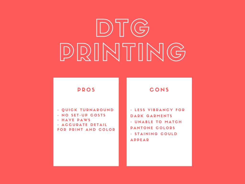
comparison-chart-showing-pros-and-cons-for-dtg-printing


DTG printing is the most standard and modern form of printing for apparel today. Thanks to the digital advancements we have in technology, DTG relies on a digital print head that works like an inkjet printer in your home or office. DTG offers extensive color options for print, which allows printers to print images in full-color and detail. This is beneficial especially for those looking for customization of printed apparel. 

Pros:

  • Quicker turnaround compared to screen printing
  • No set-up costs (ideal for low volume runs that are 100 or less)
  • A good option for designs that use a variety of different colors
  • Accurately prints full-color detailed photographs
  • Does not require artwork to be layer/colour separated or vector format

Cons:

  • Printing on dark-colored garments is less vibrant and maybe grainy
  • Unable to match exact Pantone colours
  • Obvious staining could appear due to how pre-treatment (under base layer for dark garments) reacts to the garment
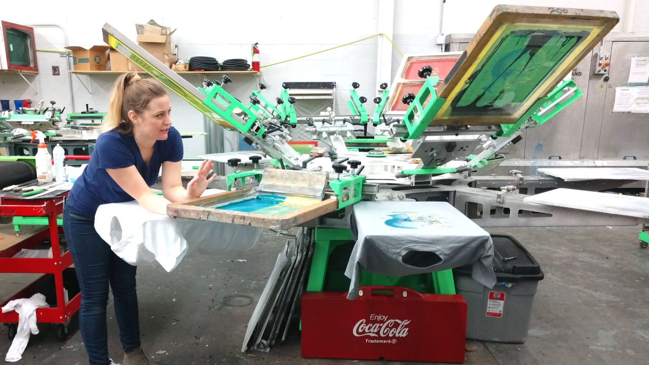
For printers who are only planning to print in small batches, DTG is more ideal. 

Screen

 comparison-chart-showing-pros-and-cons-for-screen-printing

Before digital technology existed, screen-printing was the traditional method for printing on apparel. The process for screen printing involves pressing the ink down through a woven mesh-like stencil onto the fabric. Despite the limited colors, printed graphics can come out in full saturation. 
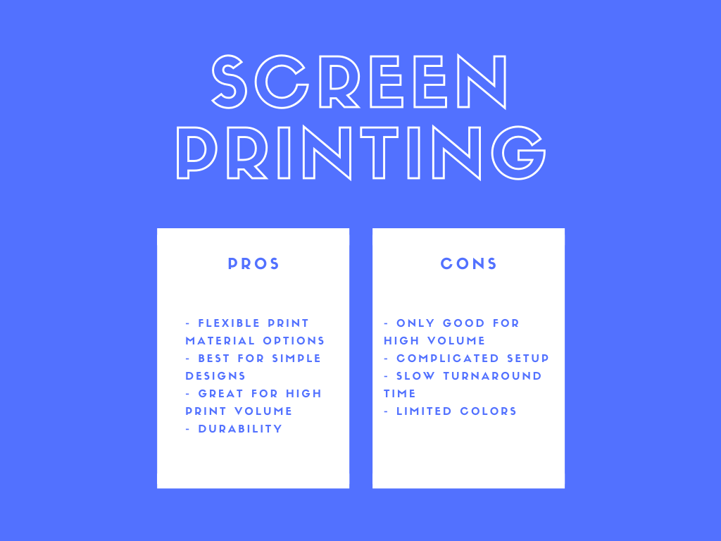
Pros: 

  • Flexible print material options
  • Works best with simple designs
  • Ideal for high print volume
  • Durability

Cons: 

  • Only good for high print volume
  • Setup more complicated 
  • Slower turnaround time
  • Limited colors
As opposed to DTG printing, screen printing is best for those who are looking to print a large quantity of apparel products. Many printers currently rely on screen printing because of the vibrant and durable results.

Which Method Should I Use?

For those who are new to printing apparel, you’re probably wondering which method is best for you. Before making a decision, do your research on both methods. The more knowledgeable you are about different print methods, the more reliable and insightful you appear to your clients. A few factors to take into consideration when choosing your print method:
  • The volume (Are you printing a low or high volume?)
  • The turnaround time
  • How complex are the designs you plan to print? 
  • What and how many colors will you be using?
  • Is a lot of time and effort needed for setup?
  • Which method is more cost-efficient for your business?
Overall, the easiest and most an effective way to grow your business today would likely be DTG printing. This method has been adopted by many printers in the modern print industry and its ease of access and setup save time and resources. Also, with the rising popularity and need for customization from clients, this is where DTG plays a big role in the apparel industry. 
At The Print Cafe of LI, our apparel printing service is brought to life through DTG printing. We strive to offer quick turnaround times and customization for your convenience. Check out the apparel printing service we offer at, The Print Cafe of LI, and start fulfilling your clients’ needs with printed apparel today!

Visit our Website at www.printcafeli.com

Tuesday, November 6, 2018

Color Combinations that Tax the Brain

                            Color Combinations that Tax the Brain
Easy on the Eye


Humans are creative beings, and one of our favorite ways to express ourselves is through words.


Words can bring sweetness to the soul, arouse dormant hunger, or give voice to beauty in the world.


That’s why names are such serious business. How much thought do we give to naming a pet? Or a child? Beautiful names can bring a charming nostalgia or an air of sophistication to the bearer.


But while some names are sweet on the ear, they don’t translate well for the eye, causing potentially years of frustration for your grade-schooler (or your veterinarian!).


Here are five names that are fun for the ear but a nightmare for the eye:


    1- Eulalia (Yu-LAY-Lia), like the mayor’s wife in The Music Man

    2-Azaiah (Az-EYE-ah), which has rocketed in popularity since 2000

    3-Grigoriy (Grig-OR-y), a Russian variant of Gregory, meaning “vigilant or watchful”

    4-Bludeuwedd (Bloo-da-e-wedd), referenced in Steinbeck’s Sweet Thursday, a Welsh name meaning “face of flowers”

    5-Aelwen (Eisel-wen), originating in England, with versions of the name in   J.R.R. Tolkien’s literature


Color Combinations that Tax the Brain


Some things are beautiful in concept but difficult in reality.


Similarly, certain images or color combinations are challenging for your eyes as well!


Have you ever seen a website that seems to chafe your eyeballs? A fabric pattern that makes you intrinsically recoil? This is actually not just a “tacky” color combination, it is a brain hijack: your brain gets misled into viewing these colors in 3D. Some colors appear to recede, while others float forward. 

For example, the combination of blue and red can be very difficult for the eye to process. One color may jump out while the other appears buried or muted. This effect, referred to as chromostereopsis, was first noted by Goethe in his Farbenlehre (Theory of Colours).


Goethe recognized blue as a receding color and yellow/red as a protruding or dominant force, arguing that, “like we see the high sky, the faraway mountains, as blue, in the same way, a blue field (also) seems to recede.” This phenomenon explains the visual science behind how we perceive colors and objects and is extremely important when you consider layouts and color combinations for print.


Some Important Color Takeaways


As you choose color combinations, here are some chromostereopsis design takeaways to consider:


Avoid putting blue and red (or green and red) near each other on a page or screen.

Avoid putting blue or green text on a red background (or red/green text on a blue background).

If the color combinations you’re using seem obnoxious, adjust the hue or filters to mute more jarring pure tones. 

Separate contrasting colors, either spatially or semantically (like using lines or charts to divide them). This will prevent viewers from having to pay attention to items of both colors at the same time. 

If you want to use chromostereopsis to your advantage, try using a jarring color combination in the background with a contrasting color on top (like white text on a black and red background, as we see here).

When the dynamics of good design are utilized, viewers will look at your images longer and perceive your ideas more clearly. So, stretch your designs but don’t strain their brains!
For more of our informative blogs go to: https://store.printcafeli.com/blog/Print_Cafe_Blog.html