The 8 Steps To Successful Brand Building
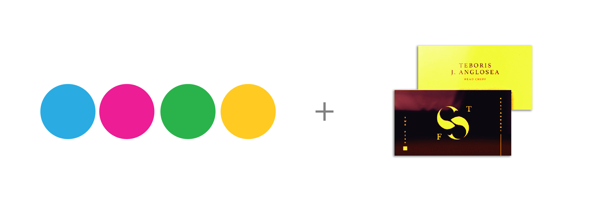
As a graphic designer, you know the importance of brand building. Some designers like to jump right into designing a fancy logo or business cards for their freelance business, but it’s important to build a solid brand foundation before working on those things. After all, your branding strategy needs remain effective in the long term.
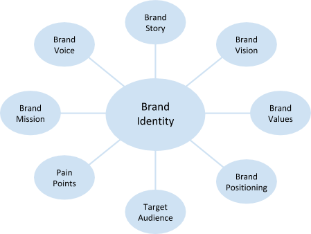
To start creating your brand identity, there are important questions you need to ask yourself. The answers to these questions will become the basics of your brand building.
How to Build a Graphic Design Brand
To start building a graphic design brand, answer these 8 questions first.
1. Why do you design?
Start with yourself. Who are you? Sure you’re a graphic designer, but everybody’s journey is different. Why did you start designing in the first place, and why did you continue to design? Think about what motivates you. And beyond that, why do you want to design for others? The answers to these questions become your brand story, and brand stories can eventually become powerful marketing tools.
2. Where do you want to go with your designs?
To make a plan, you need a goal. What do you want your design business to become? Ask yourself where you realistically want to be in 1 year, 5 years, and 10 years. This is your brand vision.
3. What is important to you?
If your brand vision is where you want to go, then your brand values describe how you get there. What are your core beliefs about design and about doing business? This might relate to your brand story from Question 1.
4. What do you do differently from others?
You have unique motivations, experiences and skills that are reflected through both the act of designing and your designs themselves. Think about what you do better than your competitors, or what you do differently from them. What makes your design process unique? What makes your designs unique? This differentiation becomes your brand positioning.
5. What kind of clients will want this kind of design?
You are not aiming to please everybody with your design services. Hitting a niche, or at least a specific segment of the population, is a lot stronger than targeting the general population. Will you focus on designing for individuals or businesses? Based on your brand story and positioning, do some research to understand the demographic that is most likely to give you design work. This is your target audience. You may even want to build a buyer persona around your ideal customer.
6. What problem do my designs solve for these clients?
Your ideal customer from Question 5 needs your design services for a reason. What is that reason? Identify the problems they have and why they want them solved. These problems are called your client’s pain points. Why can’t they solve these problems themselves, and why are other designers not able to solve these problems for them? And finally, think about how this client would benefit if you solved these problems for them.
7. What do you want your designs to do?
After your design leaves your studio or hard drive, what do you want them to accomplish? Of course you want them to help your clients resolve their pain points, but what about beyond that? This would relate to your core beliefs about design and potentially your brand story as well. Why does your brand exist at all? Answering these questions help you formulate your brand mission.
8. How do you tend to communicate?
Now that you have a good foundation for brand building, how do you want to communicate your brand to potential clients? The way you communicate includes both the channels that you most frequently use (e.g. social media, phone, etc.) and your tone of voice (e.g. friendly, professional, etc.). Now is also a good time to ask yourself why you use those particular channels and that tone of voice. Does it relate to your brand values and target audience? Your tone becomes your brand voice, so consider it carefully.
The answers to these brand building questions become your brand identity.
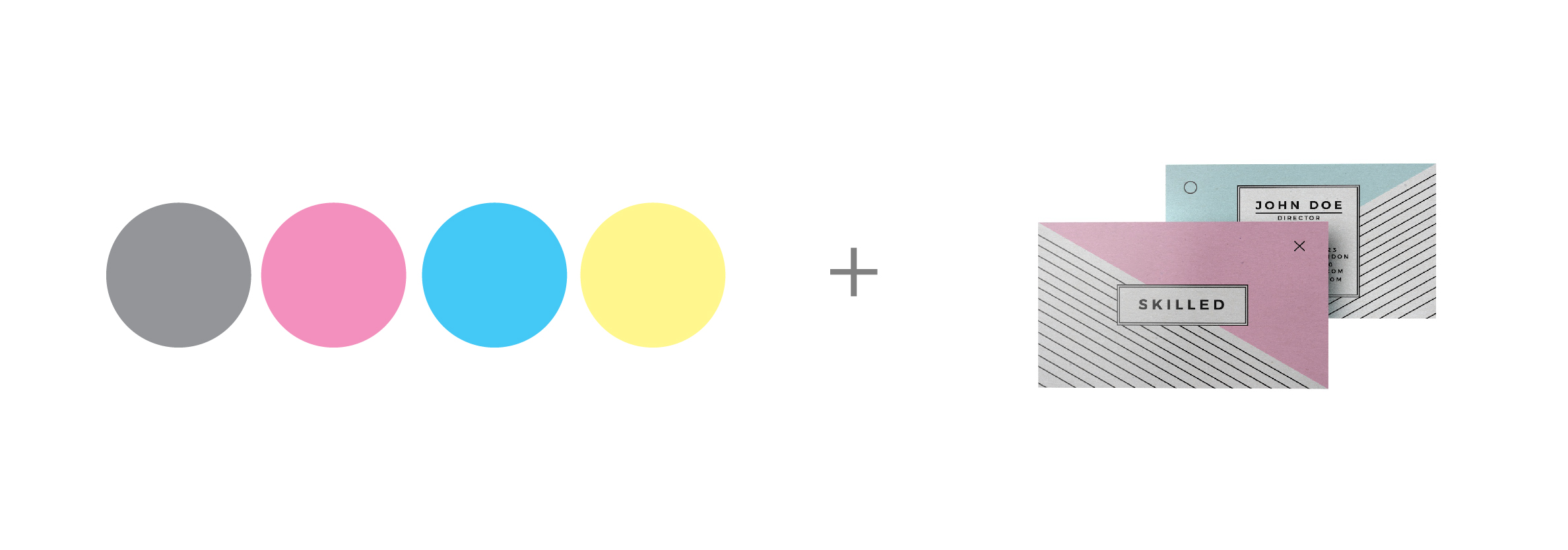
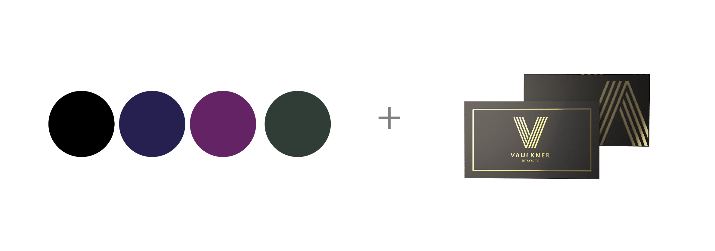
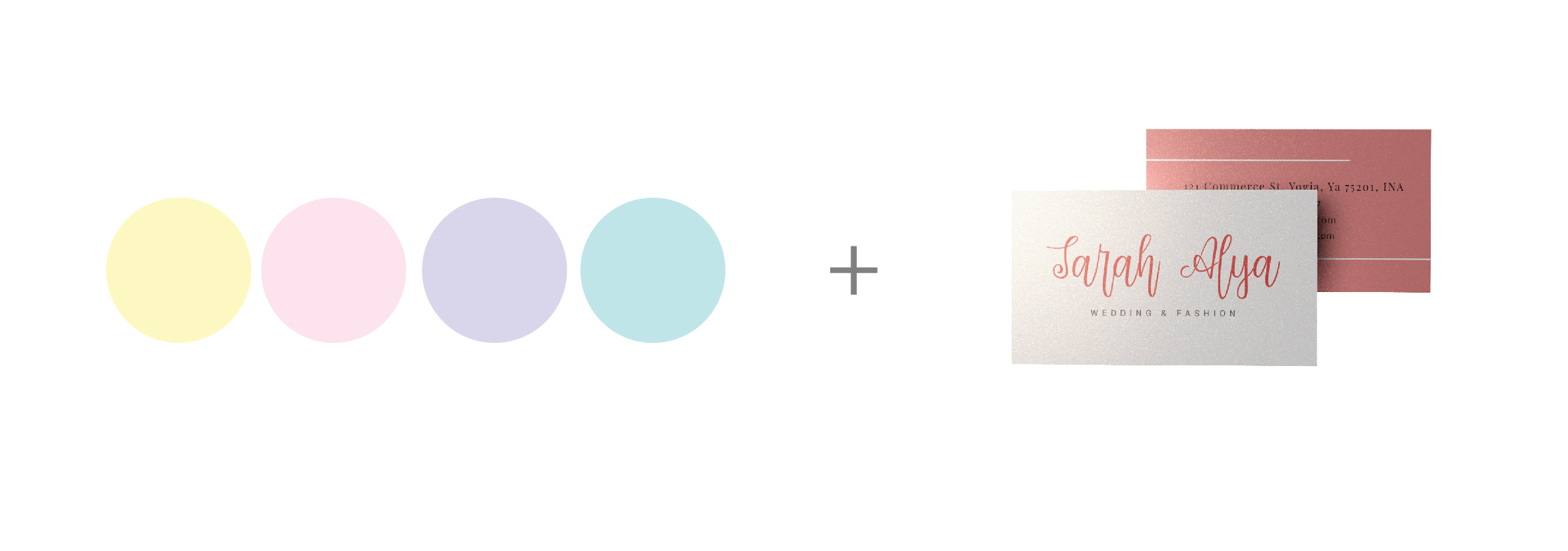
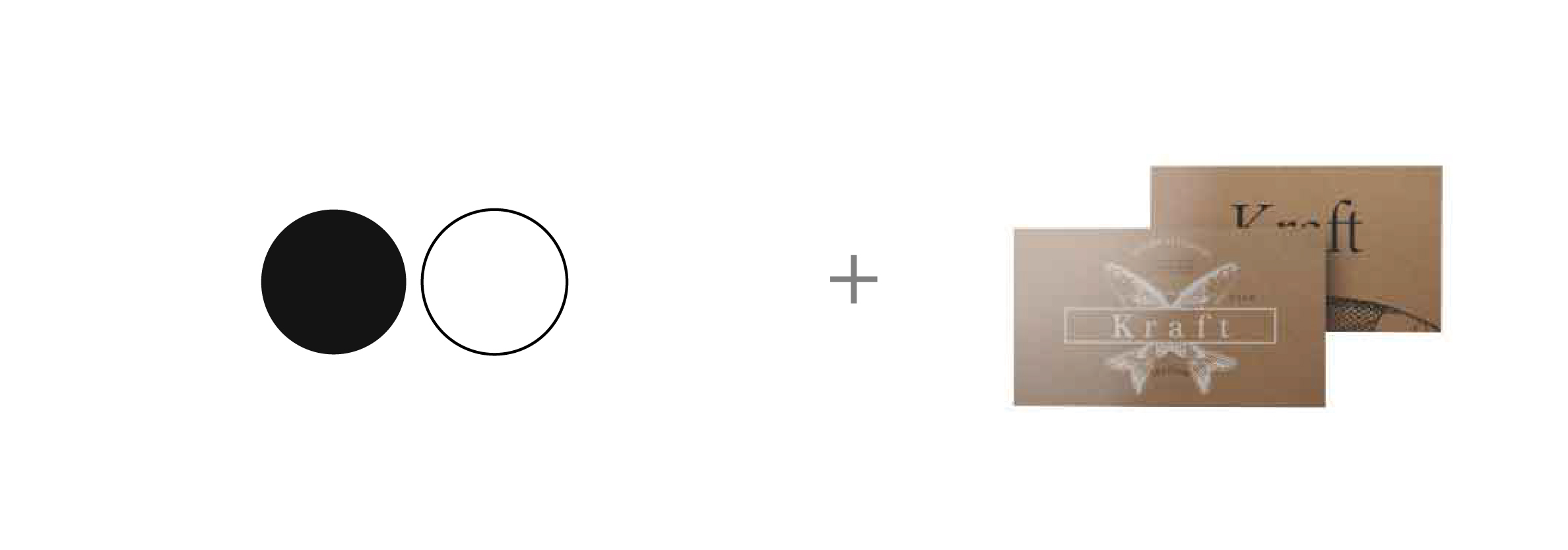
Now that you’ve answered the foundational questions to brand building, you’re finally ready to create the visual identity of your brand. And because you’ve done the background work, you’ll be able to portray your brand consistently and effectively. In addition, you’ll have plenty of material to work off of when it comes time to promote your brand.
To learn more on how to use our marketing products for Brand Building go to our website Blog at:https://www.printcafeli.com/blog/Print_Cafe_Blog.html