Print Cafe of LI, Inc

Print Cafe of LI, Inc
Logo
Showing posts with label #booklet #catalog printing #printing long island #printingnewyorkcity #advertising #design #logo's #marketing. Show all posts

Friday, January 8, 2021


Tell a Beautiful Story with Five Design Principles


Did you know that 90% of the information processed by your brain is visual?

Design is powerful.

It takes only 13 milliseconds for the human brain to process an image, and 80% of people will remember the visuals they see. In today’s generation, audiences demand short, highly-visual content, and coordinating your design elements is the best way to tell a rich, compelling story.

Knowing this is one thing, but making it happen is another. As a design novice, watching a graphic artist work can be a mystifying experience. How do they know which colors to use? Why do those fonts look so good together? How are these images evoking such an emotional response?

While there are no right or wrong answers in design, basic principles can transform one person’s coloring page into another person’s masterpiece.

Check out principles like these to elevate your designs from good to GREAT.

1. Emphasis


The principle of emphasis demands you ask one question: what is the first piece of information I need people to know?

Like building without a blueprint, starting your publication without a clear idea of your message structure will bring a muddy result.

2. Proportion


Proportion helps you group your design in sections, like consolidating elements by size, amount, or numbers.

Whether it’s columns in a magazine, sidebars on a poster, or pull quotes in a newsletter, proportion communicates importance and helps the brain decode information.
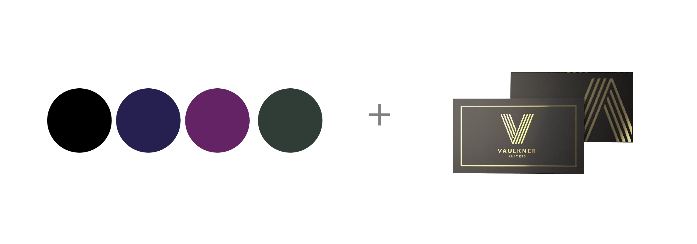
3. Contrast


What do people mean when they say a design really “pops?”

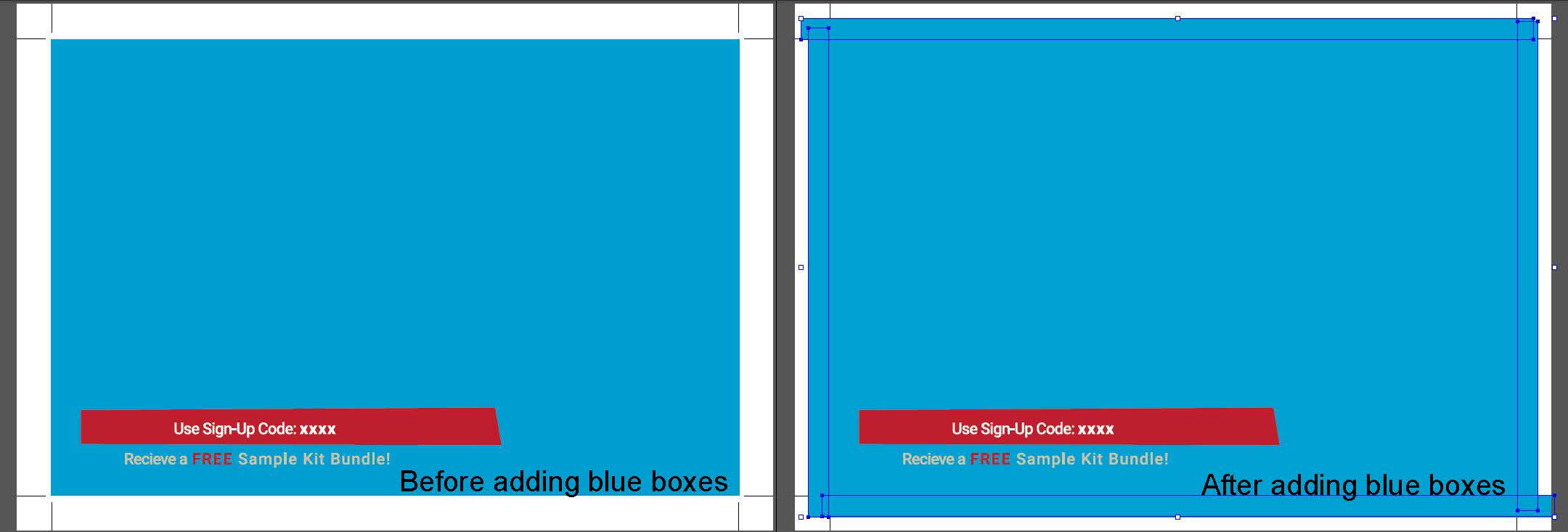
Contrast refers to obvious differences on a page. Contrast attracts the eye, organizes information, and guides the reader. Contrast can be created with varying font pairings or line weights, extreme color differences, and graphics that display opposites. You can contrast a smooth texture with a rough texture, curves with sharp edges, a horizontal image with a vertical one, or widely spread lines with closely packed ones.

For contrast to be effective, it must be strong. Go big! (Think red sneakers with a black tuxedo.) If you are putting two elements on the page that are not the same, they should not be similar. If the items are not exactly the same, make them very different.
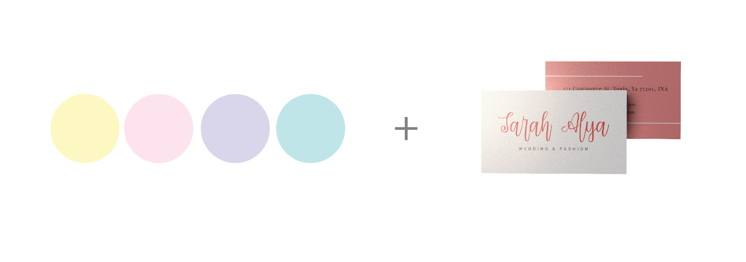
4. White Space


White space (or negative, empty space) is the only element that specifically deals with what you don’t add to a design.

Like one diamond set on a stone, white spaces give designs room to breathe and make mediocre images seem more luxurious.
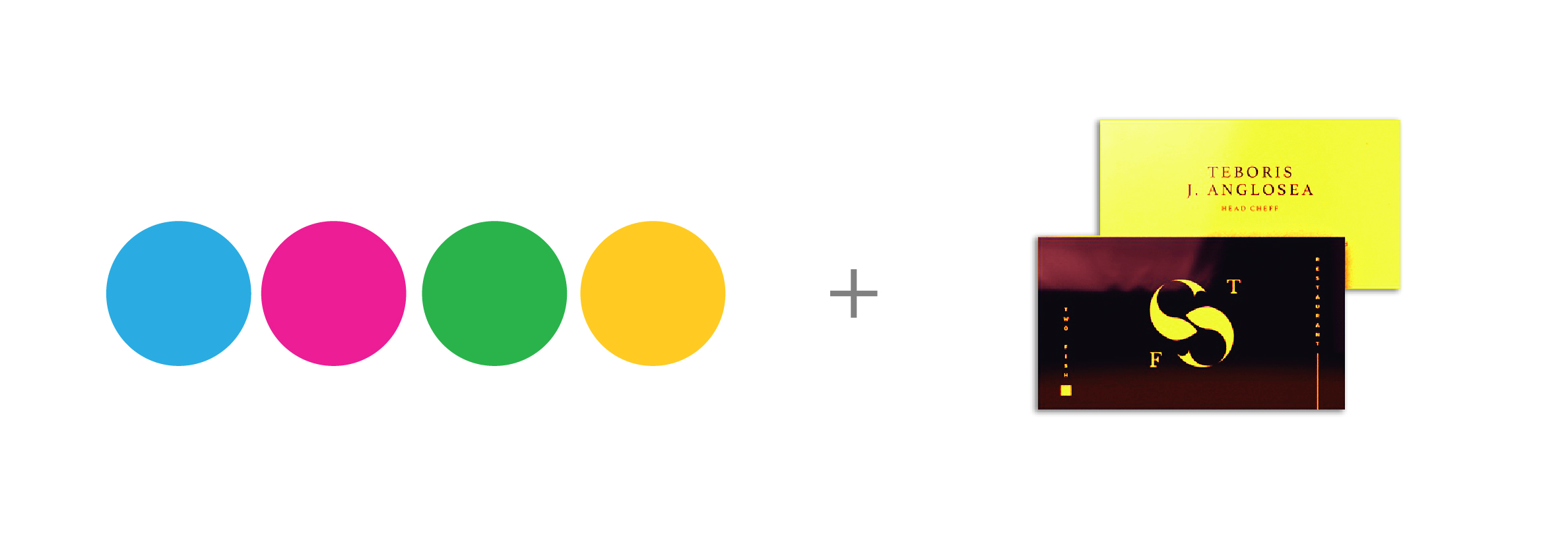
5. Movement


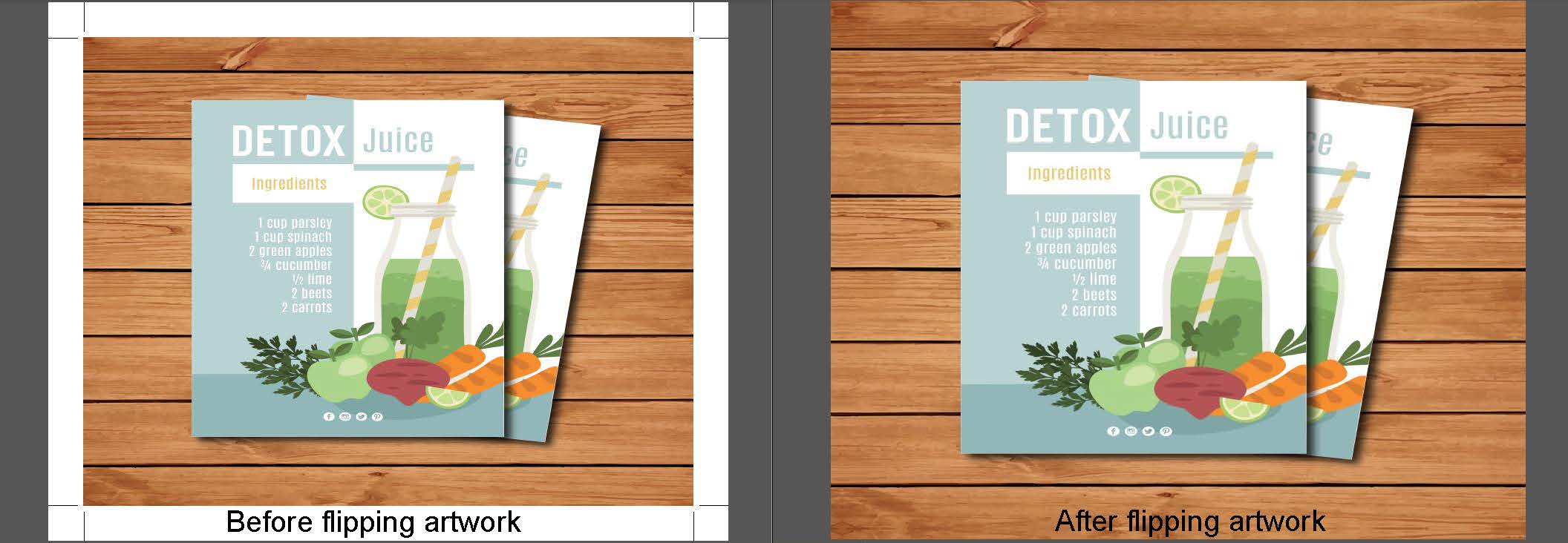
Movement refers to the way an eye travels over a design.

Just like a musician reads notes on a staff, a reader should follow a visual journey through your design. For viewers to engage, they must have a path to follow, so try to tell a “visual story” with a beginning, middle, and end.

To move people through your piece, start with a focal point and then move eyes through the page with subheadings, text boxes, line patterns, etc. Use bright colors to grab attention, jagged lines to build excitement, curves to slow people down, or patterns to guide your viewers. 

First Impressions are Lasting Impressions

While there is no right or wrong design method, principles like these keep visuals stable and cohesive while allowing for movement, unity, and excitement.

Want your first impression to be your best impression? Through the planning, design, and review process, we’re here for you. Whether you’re creating a template or need start-to-finish graphic design, we’re ready to consult, create, and help you bring your best ideas to life in print!

For more Information on all our Marketing Products Go to:www.printcafeli.com

Monday, December 14, 2020

      Use Themed Booklets as a Strategic Marketing Asset

 
When is the last time you enjoyed a good book? What about a good booklet?

Booklets are everywhere – from the magazine rack at the grocery store to the playbill at your local theater. They are typically smaller than a book (between four and 48 pages), and they are an extremely versatile print product thanks to their size, format, and ease of use.

From mini brochures to media kits, booklets might be a great option for you. Here are some creative ideas to share your message through booklets.

Look Books and Product Catalogs

Today’s consumers crave an experience, so catalogs and look books are a surefire way to reach customers directly and get them excited about your brand.

Gone are the days of dull directories! Today’s designers use the catalog format to feature artistic typography, zingy color, and striking photography. Whether your niche is food, fashion, or custom car parts, fun and fresh catalogs help viewers feel they are experiencing your product in person.

Square Brochures

Is it a brochure . . . a booklet . . . or both?

Booklets can come in all different shapes and sizes, and one trendy option is a square booklet. The compact shape offers a style as savvy as your business, from photography or art showcases to new product launches and tradeshow handouts.

Calendars or Planners

Calendars or handheld planners are practical for everyone, offering branded staying power while conveying your business goals in a way that’s customized to the interests of your audience.

And you can double your impact by combining deliberate calendar planning with irresistible product promotions. Every business has crazy seasons and slow seasons, and planning ahead can provide a strategic opportunity to offset these challenges. Do you traditionally see a slump or spike in your business during key months? Call these out in your calendar by placing special promotions in the calendar, or prepping team members with personalized perks or reminders within your calendar design.

Whether it’s the biggest sales day for local bakeries or the period when your shipping company frequently misses delivery guarantees, highlighting seasonal trends can set you up for success.

Portfolios

Businesses that are into creative work (like architecture, custom designs, or photography) often create portfolio books to showcase their best work.

Whether you provide personal care services or interior design consulting, a well-designed portfolio helps your prospects to get a fair idea of the type (and price range) of services you can offer.

Instruction Manuals

These booklets are also called owner’s manuals.

They contain important information regarding a particular product. Instruction manuals provide step-by-step instructions on how to assemble or install the product. They also contain warranty and guarantee details.

Reference Guides or Reports

Reference guides are like instruction manuals. However, they are usually brief and contain essential details about a product such as do’s and don’ts, features, benefits, and more.

Reports professionally document your company’s progress, financial growth, and mission in an accessible booklet for your shareholders. Data can be boring, so when you display your finances and various charts and graphics, make it pretty or clever (like these infographics, for example). Booklets are an excellent tool for presenting easy-to-read data visualizations!

Find the Best Product for Your Bottom Line

In times of fierce competition, booklets can go a long way toward elevating your message.

But, beyond design, they must be user friendly and durable. Want to turn heads and get the best product for your budget? When you’re ready to visit about paper stocks, binding, or other booklet questions, we’re here to help!

For More Information Go To:https://www.printcafeli.com/store/product-view.html/97-Booklets

Or Call 516-561-1468

Wednesday, December 9, 2020


  4 Must-Know Strategies for Hosting Virtual Events


4 Must-Know Strategies for Hosting Virtual Events

How you choose to promote an event can have a direct impact on how successful that event is.

For brands that have established a rhythm for online events, promotion efforts don’t need to be particularly intense. But if you’re new to hosting online events, it can be difficult to build engagement.

The Milken Institute, a financial think tank that thrives on bringing people and ideas together through large events, had to postpone their live flagship annual event, the Global Conference, which convenes more than 4,000 executives and thought leaders from around the world. In its place, the Institute has started hosting regular virtual summits, including smaller local webinar gatherings called “The COVID-19 Conference Call Series.”

Here’s what Milken’s new business development director Ira Rosen said about this change:

“People have gotten creative with what they can now do online, but people are discovering that hosting events online isn’t necessarily easier than in-person events. If you’ve never held a digital event before, there are a few things you have to consider.”

Here are a few starter steps:

 
1. Create an Attention-Grabbing Event Page


This is the place where everyone goes to learn about your event.

Use a simple tool like Cvent Flex to make it stand out, and entice people to sign up by including eye-catching graphics, professional pictures, and engaging clips of keynote speakers, workshop leaders, and performers. Keep people from wandering away from your page by embedding all relevant videos, pictures, and other media, so they don’t have to find it elsewhere.

Finally, include all of the essential details so your event page is a one-stop-shop for information and attendee actions. This includes: 

  • Time and date(s) of the event
  • An agenda 
  • Speaker bios 
  • Sponsor information
  • Registration links
  • Secure payment options  

2. Ask Partners or Sponsors to Spread the Word


When your sponsors and partners promote your virtual event, it markets your program exponentially—this benefits all stakeholders.

Put yourself out there by directly asking others to promote your virtual event. Provide the affiliate link, printed publicity, and any hashtags or online videos that might make it easier to build momentum.

3. Keep Participants Engaged


Being confined behind a screen can make it harder for speakers to engage with the audience during the event, but there are ways to encourage interaction.

Research shows that 47% of people are more likely to ask a question at a virtual event, and 37% are more likely to speak to a person in a virtual booth than a real one. View virtual events as an opportunity to engage with your audience rather than an obstacle. Take time to conduct a poll, ask questions, or play a video in the middle of your presentation.”

Other ways to engage viewers include trivia segments, participant voting options for upcoming segments, or even “virtual booths” (like breakout rooms) participants can visit after the event’s conclusion.

4. Build Content that Promotes Your Event


No matter what kind of event you promote, planning it in a vacuum is never a good idea.

If regular content production is part of your marketing mix, these efforts should overlap with the event you’re promoting. From a weekly podcast or newsletter to printed inserts or your website, any platform you control can be used to build interest. 

Need an extra publicity boost? Contact us today to spread the word through print!

www.printcafeli.com or Call 516-561-1468


Friday, December 4, 2020

Leadership is unlocking people's potential to become better.


How Fantastic Managers Bring Out the Best in Each Person

Have you ever had a “bad” boss?

If you’ve ever led a team, you’ve probably encountered a life-sucking person, problem, or habit that’s restricting your potential. But a challenging situation doesn’t guarantee a poor outcome, especially if there’s a good manager in the mix!

Managers have the power to make or break their organization. Strong managers can lead teams, help them grow, and bring out the best in each person. These leaders don’t just produce great work; they inspire it. Why is that?

While effective managers are goal-oriented, they also have an innate ability to bring out the best in people.  And while these people come in many flavors, there is one quality that sets truly great managers apart from the rest: They discover what is unique about each person and then capitalize on it.

Marcus Buckingham, head of people and performance research at the ADP Research Institute, characterized it this way:

“Great managers know and value the unique abilities and even the eccentricities of their employees, and they learn how best to integrate them into a coordinated plan of attack. This is the exact opposite of what great leaders do. Great leaders discover what is universal and capitalize on it. Their job is to rally people toward a better future. Leaders can succeed in this only when they can cut through differences of race, sex, age, nationality, and personality and, using stories and celebrating heroes, tap into those very few needs we all share. The job of a manager, meanwhile, is to turn one person’s particular talent into performance. Managers will succeed only when they can identify and deploy the differences among people, challenging each employee to excel in his or her own way.”

Positioning People for Success

When you want to bring out the best in your team, here are some specific steps to consider:

1. Ask the Right Questions


To assess your team’s strengths and skills, try using questions like these:


  • What do you like best about your work?
  • What skills do you have that are being underused?
  • What was the best day you had at work in the last three months? Why?
  • What was the worst day you had at work in the last three months? What drains you?

2. Find Optimal Triggers


Everyone works for a purpose.

Some work for money. Some for the personal challenge. And still others for relational equity they build through personal and professional friendships.

Managers can bring out the best in people by finding unique ways to motivate people. One company that does this exceptionally well is HBSC, a London-based bank. Each year it presents its top individual consumer-lending performers with “Dream Awards.” Each winner receives a unique prize, precisely tailored to something especially motivational to each employee (though capped at $10,000 and redeemable in prize form only). At the end of the year, HBSC hosts a Dream Awards gala and shows a video about the winning employee and why this person selected a particular prize. From college tuition funds to dream vacation airline tickets, the celebration of individual dreams is a win for the entire company.

Beyond individual awards, other performance triggers may include financial incentives, ownership shares, public recognition, increased autonomy over key projects, workday perks, or even quality time with key leaders.

When you tailor perks to your team’s unique strengths, they will feel more motivated to give their best effort.

3. Invest in Training Opportunities


People are more likely to excel when they feel valued.

One simple way to invest in people is through training. Did you know an astonishing 87% of Millennials say that career development opportunities are very important to them? When you want to motivate and shape your people, look beyond daily tasks, and encourage people to grow their skills. And as you’re evaluating training opportunities, look for those that fit each person’s unique learning style, like analyzing, watching, or doing.

Great managers look to build and mobilize people. By investing in individual people, you will work with them, not above them. And that’s a win for everybody!

www.printcafeli.com

Tuesday, December 1, 2020


6 Ways to Add Bleed (and How to Choose the Best One)

Missing bleed is one of the most common problems on print files. Bleed is the extension of the artwork on each side to allow for cutter variance, so it’s an essential part of a good print file. Bleed requirements differ among printers but a commonly minimum is 0.125” on each side.

Many of your clients may not know how to add bleed, leaving the task in your hands. There are several different ways to add bleed. Naturally, each has its own advantages and disadvantages.

We’ll cover them in this article so that you can easily choose the best way to add bleed to your clients’ files.

Adding Bleeding to Your Print Files

1. Release or Remove Masks

Sometimes the bleed is just hidden by a mask that’s set around the edge of the trim area. When you release or remove the mask, it appears, so you’re therefore not truly adding bleed; you’re just unmasking it.

before and after removing mask

Pros

  • It won’t distort the artwork or change image resolution.
  • The client may have provided the bleed that they wanted underneath.
  • It can be quick and easy if the file is built simply.

Cons

  • There may not be any bleed hidden after all.
  • You risk unmasking other elements that were intentionally hidden.
  • Time consuming if the file is complex with multiple masks.

2. Increase Artwork Size

Another way to add bleed is to increase the size of the entire artwork, or part of it (e.g. the background). This method is most suitable when there are no important elements close to the trim edge.

before and after enlarging artwork

Pros

  • When enlarging the entire artwork, the ratio won’t get distorted.
  • It’s a fast and easy fix.
  • Most clients won’t be able to tell if their artwork was increased by 1-2%.

Cons

  • Elements close to the edge may get cut off (e.g. thin borders).
  • Enlarging raster images will slightly affect their resolution.
  • The client may be able to tell that their artwork was enlarged.

3. Decrease Artwork Size

Similarly, you can shrink the artwork. This leaves a white border. You’re not actually adding bleed, just eliminating the need for one. Alternatively, you may choose to add a color to this border and add bleed to that.

before and after shrinking artwork

Pros

  • It’s a fast and easy fix.
  • It actually slightly improves the resolution.
  • None of the artwork will get cut off.

Cons

  • There is a very obvious change in the artwork, which may not be wanted.
  • You risk having uneven borders due to both resizing and cutter movement.
  • Small type may become harder to read.

4. Stretch Elements

This technique is most suitable when objects that are missing bleed are rectangular vector elements with no curves, as you can easily stretch them out without distortion or pulling parts too close to the edge.

before and after stretching artwork

Pros

  • It will only impact the element that is getting stretched.
  • It can be quick and easy on certain types of artwork.
  • Most clients won’t be able to tell if you stretch an unimportant part of the artwork.

Cons

  • Distortion will occur on non-rectangular vector elements and raster images.
  • Parts of the stretched element may get cut off if they’re close to the trim edge.
  • You may also have to delete masks.

5. Add Objects

Adding shapes to the bleed area works best when the artwork at the trim edge is a solid color. It’s still possible if it isn’t, but takes much more time. Ideally, you are purely adding bleed and not touching anything else.

before and after adding elements

Pros

  • You are not changing any artwork within the trim area.
  • It can be done using even simple image editing software.
  • If done well on the right type of artwork, clients won’t be able to tell the difference.

Cons

  • The added bleed may not perfectly match the edge of the original artwork.
  • It can be time consuming.
  • The difficulty level can be high depending on the artwork.

6. Flip the Artwork

Flipping the artwork at the trim edge to create a reflected mirror image for the bleed is a function available in some programs and plugins. This produces a symmetrical image with the line of symmetry at the trim. There is no hard rule for what works best here, so you may have to test it out to see whether the result visually “makes sense.”

before and after flipping artwork

Pros

  • With the right plugin/program tool it can be fast and easy.
  • It won’t distort or change the artwork within the trim area.
  • It matches the same colors and shapes in the artwork.

Cons

  • It requires a higher level image editing software/plugin.
  • The results may appear nonsensical and not what the client intended.
  • It won’t work if there’s a thin border or if the artwork doesn’t fully touch the trim edge.

Conclusion: Using Good Judgement

A good bleed makes a big difference, but not all bleed is good bleed. The methods that we shared here produce different results depending on the nature of the artwork, so always exercise your own good judgement in addition to the tips we’ve provided. Sometimes you may even choose not to add bleed.

For More Information on this Topic or any other Technical Questions Go to:https://www.printcafeli.com/help/index.html


Tuesday, October 27, 2020

Be a better designer in 2018

        Be A Better Designer In 2021

Make 2021 the year you take your design skills to the next level with these tutorials and tips.

For designers, the start of a new year sees us setting fresh goals and pledging to experiment with a new piece of software, master a tool or technique, brush up on creative theories and knowledge, and look to land new clients. 

So to help you to up your design game, we're lending you a helping hand with this round-up of the best design skills, theories, and practical tips to ensure that you become a better designer in 2021.
All of our guides and tutorials have been broken down into easy to navigate sections, so whether you want to improve your software skills, master a new design theory, or even start that side project you've been sitting on for ages, you'll find something here to help you on your way.


Software skills
Since its release, Illustrator CC has become the go-to tool for plenty of designers. Learn how to make the most of this premier graphics design tool with these tutorials – covering the basics, tools and features, text effects, illustration techniques, logo and icon design, advanced techniques and more.

Photoshop continues to be the design software of choice for millions of designers. We've rounded up the best Photoshop tutorials for everyone from beginners to expert users – covering tools, techniques and effects – so you're bound to learn something new!

Cinema 4D is one of the most popular 3D animation, modelling and rendering platforms. Master the basics of modelling and animating simple characters with the software and work your way up to advanced animation techniques with these Cinema 4D tutorials.

Adobe's Creative Cloud 3D motion graphics and animation software, After Effects, is a popular way to bring your work to life. These tutorials will show you how to get started with After Effects and work your way up to creating special effects.

It's easier than ever to implement responsive web design thanks to a wealth of useful tools. We've rounded up 10 of the best, to help you make your website look amazing on any device.

Have you always wanted to make an app but not known where to start? It's an increasingly vital skill, so make sure you crack app-making for iPhone, iPad, Android and desktop with the help of this tutorial.


http://store.printcafeli.com/blog/Print_Cafe_Blog.html

Friday, October 16, 2020

Tips On How To Ensure Versatility Of Your Logo Design


A company’s logo design is used on various marketing strategies. A logo appears in various sizes ranging from as big as billboards to tiny ones like on a business card, pens and stickers. Therefore, a logo must be scalable. It should also appear impressive in both color as well as black & white versions.
All types of businesses use logos as an effective marketing tool. People usually recall a business by seeing its logo on products and on advertisements. We can say that logos take business messages to the people and help the companies in converting the viewers into potential buyers.

However, success of a logo design largely depends on its quality of being versatile. This means that the logo must look equally great on all sizes of products. So, the logo must look impressive not only on big scales of large billboards to the size of a stamp. The logo must not lose its shape, size, colors, fonts, and other vital elements in all sizes. This is one of the basics of logo design.

A logo is printed on larger billboards or on fairly smaller advertising products such as pens, stickers, rubber stamps and business cards. In addition, the same logo must also look impressive on pixel based media such as websites and web banners. Business owners can use such versatile logos on a wide range of ads and products or services. Clearly, the businesses should be able to reproduce the logo in its varied sizes.

Versatility is one of the most essential quality of a good logo design. In the 21st century, brands are highly visible. They are exposed to a wide range of media. Most of the brands are actively projected on social media pages. This means that a logo should appear great on all the social media such as Facebook, Twitter, Instagram.

Another reason why your logo should be versatile is that it helps create your brand identity. So, a logo should look good when printed on the top of a letterhead, business card, mobile app icon, etc.

A versatile logo is cost-effective. It saves you money and time as you do not necessarily have to create separate logos for different media ads and products. Since, the same logo goes for all ads and promotion ranging from large billboards and smallest stamp size ads; you get to save a considerable amount. Additionally, your printing cost decreases manifold when you use fewer colors in the logo.

Here Are Some Tips To Create A Versatile Logo

01. Consider The Details

While designing your logo, consider how much detail should go in it. The details of lines, colors, fonts etc. are necessary to convey the business message. But too many details may create printing troubles for a logo.


If the details are minute such as delicate or skinny lines and too many colors, then these may disappear when printed. These details may appear as broken shapes when printed in small sizes. So, it is advisable to keep only fewer details that are extremely necessary for the logo.

A logo with fewer details will save your production cost of graphic design items. For example, your overall cost of a business card design will be lower to produce it if the logo that you print on the card is also a simple design.

02. Pay Attention To The Space

If a logo design has the white space, or negative space, it must be created carefully. The white space between the two elements should be consistent. This means that the space should not be too close as it may lead to elements overlapping each other when the logo is printed. And if the space distance is too big, the viewers may not find an association between the elements and the logo may fail to communicate well with the viewers.

03. Use Gradients Selectively

Opt for gradients only when they can contribute to the overall quality and appeal of the design. Avoid choosing too light tints as such tints usually disappear when printed and the logo appears in white color scheme only.


Do not necessarily opt for too dark tints as they may appear too solid and patchy when printed. In fact, too dark tints create a muddy look for the logo when printed on a newspaper. Take note of the fact that some reproduction processes do not accommodate use of gradients very well.


04. Create Logo Without Colors

Another sign of a versatile logo is that it appears impressive in both colors and without colors. This is because a logo is printed on newspapers, magazines, faxed copies, etc. in black and white. So, the logo must retain its uniqueness when printed without colors. This will ensure better logo and brand identity design of the business symbol.


A trick to create a versatile logo that looks impressive in black and white is to create it first without colors. When designing the logo, first create it in black and white only. It is only when you are satisfied with the design that you should fill colors in it. As a graphic designer, you should take a logo and get approval. Then, incorporate colors after getting the approval.
Read more of our informative blogs at:
http://store.printcafeli.com/blog/Print_Cafe_Blog.html

Wednesday, August 26, 2020

The 8 Steps To Successful Brand Building


    The 8 Steps To Successful Brand Building

As a graphic designer, you know the importance of brand building. Some designers like to jump right into designing a fancy logo or business cards for their freelance business, but it’s important to build a solid brand foundation before working on those things. After all, your branding strategy needs remain effective in the long term.

To start creating your brand identity, there are important questions you need to ask yourself. The answers to these questions will become the basics of your brand building.

How to Build a Graphic Design Brand

To start building a graphic design brand, answer these 8 questions first.

1. Why do you design?

Start with yourself. Who are you? Sure you’re a graphic designer, but everybody’s journey is different. Why did you start designing in the first place, and why did you continue to design? Think about what motivates you. And beyond that, why do you want to design for others? The answers to these questions become your brand story, and brand stories can eventually become powerful marketing tools.

2. Where do you want to go with your designs?

To make a plan, you need a goal. What do you want your design business to become? Ask yourself where you realistically want to be in 1 year, 5 years, and 10 years. This is your brand vision.

3. What is important to you?

If your brand vision is where you want to go, then your brand values describe how you get there. What are your core beliefs about design and about doing business? This might relate to your brand story from Question 1.

4. What do you do differently from others?

You have unique motivations, experiences and skills that are reflected through both the act of designing and your designs themselves. Think about what you do better than your competitors, or what you do differently from them. What makes your design process unique? What makes your designs unique? This differentiation becomes your brand positioning.

5. What kind of clients will want this kind of design?

You are not aiming to please everybody with your design services. Hitting a niche, or at least a specific segment of the population, is a lot stronger than targeting the general population. Will you focus on designing for individuals or businesses? Based on your brand story and positioning, do some research to understand the demographic that is most likely to give you design work. This is your target audience. You may even want to build a buyer persona around your ideal customer.

6. What problem do my designs solve for these clients?

Your ideal customer from Question 5 needs your design services for a reason. What is that reason? Identify the problems they have and why they want them solved. These problems are called your client’s pain points. Why can’t they solve these problems themselves, and why are other designers not able to solve these problems for them? And finally, think about how this client would benefit if you solved these problems for them.

7. What do you want your designs to do?

After your design leaves your studio or hard drive, what do you want them to accomplish? Of course you want them to help your clients resolve their pain points, but what about beyond that? This would relate to your core beliefs about design and potentially your brand story as well. Why does your brand exist at all? Answering these questions help you formulate your brand mission.

8. How do you tend to communicate?

Now that you have a good foundation for brand building, how do you want to communicate your brand to potential clients? The way you communicate includes both the channels that you most frequently use (e.g. social media, phone, etc.) and your tone of voice (e.g. friendly, professional, etc.). Now is also a good time to ask yourself why you use those particular channels and that tone of voice. Does it relate to your brand values and target audience? Your tone becomes your brand voice, so consider it carefully.

The answers to these brand building questions become your brand identity.


Now that you’ve answered the foundational questions to brand building, you’re finally ready to create the visual identity of your brand. And because you’ve done the background work, you’ll be able to portray your brand consistently and effectively. In addition, you’ll have plenty of material to work off of when it comes time to promote your brand.

To learn more on how to use our marketing products for Brand Building go to our website Blog at:https://www.printcafeli.com/blog/Print_Cafe_Blog.html


Wednesday, August 12, 2020

Best Color & Stock/Coating Pairings For Print

Best Color & Stock/Coating Pairings For Print


In printing, stocks and coatings have different properties that affect print color results. Some colors will look better than others on certain stocks and coatings. This is not to say that printing other colors will necessarily look bad, but it does mean that there are certain pairings that work better.

So, here are some suggested combinations to help the design in your file look its best when printed.

Black + Spot UV

spot uv business card

We admit that black isn’t technically a color, but it is in print. The darkness and uniformity of the black (make it a rich black comprised of all 4 CMYK values), will emphasize the spot UV.

What about white? Some UV coatings have a slight color, which could make the white not as pure as your clients probably intended their white to be.

Low Coverage Colors + Uncoated Stock

uncoated stock business cards

Uncoated stock tends to soak in the ink, which can make the colors look muddier. Offsetting is also a common issue, especially where ink coverage is high. To minimize this, use lower values for each CMYK color that is in your artwork. If possible, use fewer color values. For example, instead of using all four CMYK colors to create your gray, opt to use just a K value.

Dark Colors + Metallic Foil

metallic foil card

Metallic foil is not exactly a stock or coating, but it does deserve its own color pairing. Two of the most popular metallic foils are gold and silver, and they make a design pop because they’re not regular CMYK colors. Contrast these reflective metallics against dark backgrounds such as black, dark blue, dark purple, or dark green.

Light Colors + Pearl Paper

pearl paper pastel colors

Pearl paper has a special shimmer when you view it at certain angles under the light. The shimmer of pearlescent stock has a color of its own, often a slight beige-and-silver or a pinkish hue. This stock will show a little through the ink, so we suggest colors that make the most of the stock itself. Pastel colors such as light blue, pink, and pale yellow do the trick.

Black & White + Kraft Paper

kraft paper printing

Kraft paper is brown and textured. Made from recycled paper, it will likely contains bits of materials in the stock that are not the same color as the rest of the paper. Since the stock color is not uniform, you’ll need high contrast colors without losing the intended homemade look of Kraft paper. For this reason, black and white work best.

If you’re going to print white ink, be sure to set your file up properly according to your workflow or the requirements of your print supplier.

Bright Colors + UV Coating

CMYK color cards

UV coating adds a smooth, shiny layer to the surface of your print. This layer reflects light to make your artwork look brighter. Take advantage of this light-reflecting property by using bright colors. Some of the brightest colors are solid CMY values: 100 cyan, 100 magenta or 100 yellow.

I want to print these products!

If you don’t currently offer these stocks or coatings, you can. You don’t even need to invest in any new equipment. The Print Cafe of LI, lets you test out how well products sell without risking thousands of dollars. You can order business cards in any of the stocks and coatings mentioned in this article online when you create an account. Go To:https://www.printcafeli.com/account/login.html

Trial & Error

We’ve suggested some pairings that produce the best print color results, but just as machinery differs as do human eyes, you may need to try different colors on various stocks and coatings to find what works best for you and your clients. Pulling physical samples is perhaps the best way to show yourself and your customers how inks interact with different substra.   

For Information On These Topics And Many Others Go To: www.printcafeli.com