Print Cafe of LI, Inc

Print Cafe of LI, Inc
Logo

Thursday, January 14, 2021

 Public Domain and Free Fonts For Personal and Commercial Use

Working on your branding, social media posts, or any sort of marketing effort? You probably need a good font that fits your budget. Here’s a selection of 100% free and public domain fonts you can use for both personal and commercial needs.

Public domain fonts, or open typographies, are all the fonts that are not only free to use but also open to edit, customize and modify, as well as redistribute. 

On the other hand, 100% free fonts are made available by the authors to use for both personal and commercial use, but should not be modified or redistributed.

If you need a free font for your marketing purposes, whether it be a display font for a sleek landing page, a new logo, or even social media posts, this selection’s got you covered.

We separated the fonts into four different categories, so you can choose by style.

Serif fonts

Serif fonts are a classic choice: they are one of the oldest types of typography and are characterized by the extra swooshes and details at the ends and “feet” of letters. 

Serif fonts date back to the 18th century when stonemasons still carved letters in rock. They that your brand is established and trustworthy, but also traditional and refined.

Plenty of world-known brands use serif fonts, such as Vogue, T Mobile, Sony, Volvo, and many others.

Check out these free and public domain serif fonts you can use with no extra weight on your budget.

1. Linux Libertine (public domain)

This is a very noticeable font you’ve seen a thousand times, but you probably don’t realize that. It’s an Open Type proportional serif typeface, that was mainly created as a more contemporary and sleek alternative to the Times font family.

What’s great about this font is that it has more than 2,000 glyphs and encompasses the Greek and Hebrew alphabet, as well as the Cyrillic script. If your branding efforts need to be translated and used internationally, consider using this font.

And if you still can’t remember where you’ve seen it: it’s the Wikipedia logo.

2. Bodoni XT (free font)

Bodoni XT is a newer, reworked version of the classical Bodoni font, that dates back to the late 18th century when it was created by the Italian type-designer, printer, and publisher Giambattista Bodoni.

The original Bodoni font is used by fashion mega-brands such as Calvin Klein and even the Vogue magazine. Bodoni XT was modified by designer Manfred Klein, and is slightly more condensed and has longer feet.

3. Sansita Swashed (Public Domain)

Sansita Swashes is a newer, less famous, but definitely more playful typeface than the previous ones on this list. It makes a great font to use in the beauty industry or food packaging. It has a hand lettering feel to it, but it’s precise and elegant.

4. Oranienbaum (public domain)

Oranienbaum is another, more modern Antiqua style font (same as Bodoni), with a high-contrast and well-defined features. It is a typeface whose look is typical for type designs from the early 20th century and characterized by pronounced serifs and contrasting geometry. It is created by type designer Oleg Poslpelov, with the art direction and publishing of Jovanny Lemonad.

5. Pretzel Regular (public domain)

This eroded and fancy-looking font looks nothing like pretzels but has a slight nod to Gothic typeface design and Bavarian aesthetic.

The eroded effect makes it look old and mystical, but the generous spacing and width of the letters balance it out to result in a clean and elegant design. Keep in mind that it only has uppercase letters.

6. MPH 2B Damase (Public Domain)

The last free serif font on this list is leaner and sleeker, but perfectly legible and stylish. It makes a great display font, and the gentle extra swooshes allow for it to be paired with any sans serif or script font. It is also an internationalized typeface with all sorts of glyphs and symbols, so it can be used in a selection of languages other than ones using the Latin Alphabet.

Sans serif fonts

Whereas serif fonts are elegant, traditional and playful, sans serif fonts are the face of the contemporary, minimal and clean design. The difference is in the name: the “sans” part means that they don’t have the extra swooshes and ornamental additions on the letters’ endings.

They give off a sense of approachability, youthfulness and corporate design. 

7. Shakeout (free font)

This luscious Art Deco-inspired vintage font comes in all uppercase letters and a bigger height. Since there are no lowercase letters, if you use it for web design or headings, you’ll need to pair it up with another font for your body text. However, used on itself as a display font, in packaging, poster design, or even as a logo font, it looks very retro and impressive.

8. Bebas (free font)

The Bebas font, created by designer Ryoichi Tsunekawa, is perfect for headlines, captions, and titling. It’s also a commonly used font since the whole Bebas font family is available on online design tools such as Canva. But, that shouldn’t discourage you from using it yourself: it’s subtle and sleek and makes a great font for all your web design and social media post needs.

9. Coolvetica (free font)

This cool (excuse the pun) font is built from scratch even though you might think it’s a variation of the more famous, classical Helvetica. It’s aesthetic is based on American chain store logos from the 1960s, an era when everyone was modifying Helvetica. Coolvetica successfully manages to mimic that style, but with a tighter kerning and funky curls, as the author Typodermic Fonts notes. It comes in four styles: regular, condensed, compressed, and crammed.

10. The Bold Font (free font)

When the designers behind this font named it bold, they really meant it. This bulky typeface is noticeable, but clean, and will make a great headline or logo font. It has perfect circular shapes and a geometric base, similar to Art Deco fonts. Keep in mind that you might need to pair it up with a lighter and legible secondary font to balance out the noisiness of the design.

11. Kiona (free font)

If the previous font was heavy and noticeable, Kiona is quite the opposite: contemporary, light, sleek and very elegant. It’s a very modern sans serif type, that will fit beautifully on luxurious packaging, logo design, or even collateral designs.

12. Kenzo (free font)

Possibly inspired by the Kenzo logo font, this fashionable font is characterized by rough cuts and geometric shapes. It’s slightly condensed but still lavishly designer, and will make a great font for both headlines, digital marketing ads, and even print design.

13. Varicka (public domain)

The Varicka font is yet another example on our list of typography that came to be from the industrial Art Deco movement of the 1920s. Flowy vertical lines and geometrically defined diagonals lend it a classy charm, but the sans serif nature of it makes it perfectly clean and legible.

Script fonts

A script font is a typeface that mimics handwriting, most often in cursive, and calligraphy lettering. Sometimes script fonts are based on personal handwriting, while other times they are made from scratch to just imitate a certain style. Nonetheless, both versions look elegant and flowy, and script fonts are known to be used in more creative, feminine and playful designs.

14. Thumbellia (free font)

Thumbellia Test looks like the younger, more childish cousin of the Instagram logo font—it’s playful and very obviously mimicking cursive handwriting, but the legibility and distinguishable qualities are there. It makes a great font for a company in the beauty industry, fashion, or anything related to children’s products.

15. Alita Brush (free font)

Instead of mimicking an ink or pen texture, Alita Brush looks exactly like it’s been written with a painter’s brush. It’s an urban, youthful and hip typeface, that will fit great on ads and posters.

16. The Boardy (free font)

Here is a font that is perfect to pair up with a stern-looking sans serif, and offer a feminine touch that will shake up the corporate look for sure. The Boardy is a bit harder to read, so it’s not recommended to use it as a primary font, but put it as a secondary and more ornamental font and you’ll do wonders to your design.

17. Stella (free font)

The Stella script font by Sudarman Mulkais the digitized format of the designer’s handwriting, and is a perfect choice to use if you feel like creating a logo or stationery that is supposed to mimic handwriting. It is dynamic and gentle, but probably not fitting as a header font or in web design body text.

Decorative fonts

Decorative fonts, as the name clearly tells you, are more ornamental and often include texture, three-dimensional design, or additional ligatures. They are a pretty addition to any design but keep in mind that the background and other design elements you’ll include with them have to be minimal, in order not to overwhelm the complete look of your design project.

18. Misto (free font)

Misto is a quirky font that looks both retro and futuristic at the same time; the oval-shaped circular letters and the bold vertical lines have a Bauhaus-style likeness, but the cleanliness of the design looks like it would fit a Dune poster.

19. Baise (free font)

This clean and simple sans serif font has an extra trick up its sleeve: it’s designed as a wooden 3D frame signage typeface. So, if you want a vintage Americana look or an industrial early 20th-century style typography, this one’s for you.

20. Deadender (public domain)

The last entry on our list of free and public domain fonts is Deadender, which has unique imitations of Art Deco metal parallel metal rods and curved angles. It’s a very noticeable and decorative font, so use it sparingly.


For More Information on any of our Marketing Products Go towww.printcafeli.com Follow us on:https://www.facebook.com/printcafeli

Monday, January 11, 2021

 Expand Your Market: 15 Ways You Can Use Direct Mail to Sell in 2021


Life is noisy.

In today’s world, everywhere you look, you’re constantly swamped by ads: buy this, watch this, subscribe now!

How pervasive is this? These stats give us a glimpse:


  • Thanks to the internet and new technologies, the average viewer is exposed to between 6,000 and 10,000 ads daily.
  • Google has managed to grow its advertising revenue every year for the past 19 years. It made over $134 billion in 2019 alone, just from advertising.
  • Sixty-five percent of people say they skip online video advertising – doing so as soon as they get the chance – and 76 percent say this is an ingrained behavior.
  • In 2020, the average open rate for marketing emails was around 21%, and more than 20% of marketing emails never made it to a subscriber’s inbox.

In contrast, more than 40 percent of recipients scan or read the direct mail pieces they get, and consumers are 22 percent more likely to purchase products promoted through direct mail than they are products advertised through email.

Maybe this noise overload is one reason younger people are placing greater value on print products. Millennials say they value direct mail in general: 69% of Millennials said they “somewhat” or “very much” like print coupons for restaurants, and 65% said they like coupons for retail businesses. In one survey of Millennials, 75% of respondents said receiving personal mail makes them feel special.

Open the Door with Direct Mail

All of these are wonderful reasons to add direct mail as an arrow in your marketing quiver.

In the digital age, an ink-on-paper sales letter or direct-mail package that your customers can hold in their hands will really distinguish you from competitors. More exposure means higher response rates. Higher response rates lead to more leads. And more leads generate greater sales!

When you’re ready to expand your market, here are several ways to package your message through direct mail.

-- Make an announcement (perhaps using a flashy invitation or an oversized postcard)

-- Send a sales letter or script font note combined with a catalog or brochure

-- Introduce a new product or service

-- Distribute a maintenance or service checklist with a detachable coupon

-- Generate long-lasting impact with a sleek postcard magnet

-- Invite people to attend a product demonstration, educational seminar, or nonprofit fundraiser

-- Send renewal reminders for subscriptions, contracts, insurance policies, or service agreements

-- Send holiday greetings with a special New Year’s offer

-- Welcome inactive customers back with an incentive

-- Get your company in front of fresh prospects using new mover marketing lists

-- Promote a “live” social media event you are hosting

-- Distribute valuable content through educational newsletters

-- Conduct a sweepstakes event or contest

-- Sell seasonal merchandise or products linked with hometown favorites

-- Offer a free analysis or a complimentary cost estimate, review, or consultation

New Prospects = New Possibilities

Some marketers shy away from print, which is truly a loss.

Mastering direct mail can help you strengthen your reputation, drum up leads, entice new prospects, and make you a hero to your clients or boss.

Need some quick-to-print templates or tips on no-hassle mailing lists? Have you considered targeting certain neighborhoods with EDDM (Every Door Direct Mail) Contact us today! We’re here to help.Go to www.printcafeli.com or Call: 516-561-1468 or SMS Text 516-253-4040

Friday, January 8, 2021


Tell a Beautiful Story with Five Design Principles


Did you know that 90% of the information processed by your brain is visual?

Design is powerful.

It takes only 13 milliseconds for the human brain to process an image, and 80% of people will remember the visuals they see. In today’s generation, audiences demand short, highly-visual content, and coordinating your design elements is the best way to tell a rich, compelling story.

Knowing this is one thing, but making it happen is another. As a design novice, watching a graphic artist work can be a mystifying experience. How do they know which colors to use? Why do those fonts look so good together? How are these images evoking such an emotional response?

While there are no right or wrong answers in design, basic principles can transform one person’s coloring page into another person’s masterpiece.

Check out principles like these to elevate your designs from good to GREAT.

1. Emphasis


The principle of emphasis demands you ask one question: what is the first piece of information I need people to know?

Like building without a blueprint, starting your publication without a clear idea of your message structure will bring a muddy result.

2. Proportion


Proportion helps you group your design in sections, like consolidating elements by size, amount, or numbers.

Whether it’s columns in a magazine, sidebars on a poster, or pull quotes in a newsletter, proportion communicates importance and helps the brain decode information.

3. Contrast


What do people mean when they say a design really “pops?”

Contrast refers to obvious differences on a page. Contrast attracts the eye, organizes information, and guides the reader. Contrast can be created with varying font pairings or line weights, extreme color differences, and graphics that display opposites. You can contrast a smooth texture with a rough texture, curves with sharp edges, a horizontal image with a vertical one, or widely spread lines with closely packed ones.

For contrast to be effective, it must be strong. Go big! (Think red sneakers with a black tuxedo.) If you are putting two elements on the page that are not the same, they should not be similar. If the items are not exactly the same, make them very different.

4. White Space


White space (or negative, empty space) is the only element that specifically deals with what you don’t add to a design.

Like one diamond set on a stone, white spaces give designs room to breathe and make mediocre images seem more luxurious.

5. Movement


Movement refers to the way an eye travels over a design.

Just like a musician reads notes on a staff, a reader should follow a visual journey through your design. For viewers to engage, they must have a path to follow, so try to tell a “visual story” with a beginning, middle, and end.

To move people through your piece, start with a focal point and then move eyes through the page with subheadings, text boxes, line patterns, etc. Use bright colors to grab attention, jagged lines to build excitement, curves to slow people down, or patterns to guide your viewers. 

First Impressions are Lasting Impressions

While there is no right or wrong design method, principles like these keep visuals stable and cohesive while allowing for movement, unity, and excitement.

Want your first impression to be your best impression? Through the planning, design, and review process, we’re here for you. Whether you’re creating a template or need start-to-finish graphic design, we’re ready to consult, create, and help you bring your best ideas to life in print!

For more Information on all our Marketing Products Go to:www.printcafeli.com

Tuesday, January 5, 2021

10 Ways to Perfect Your Graphic Design Skills With Domestika’s Online Courses


Graphic design is a complex industry, you can either specialize in a specific area and be an expert in the field, or delve into various areas to widen your scope of opportunities. However, one thing is certain: to stand out from the crowd and become the best at what you do, keeping up to date with the latest trends and techniques is essential to your success.


Whether you want to perfect your technique or learn something new, Domestika is the ideal place to start. Meet a passionate community of creatives and learn alongside renowned experts who are committed to helping you reach your full potential.

5 courses to perfect your graphic design skills

Introduction to Adobe XD

Generating creative solutions to engage the attention of users is what great designers do. However, a UX designer goes a step further in that direction: it’s how the user interacts with the creative solution that is most important. UX designers solve a problem for the user, while also aligning with a brand’s business goals. It is a complex role and one that is becoming increasingly important within design teams today.

Ethan Parry has become a thought leader in UX design, partaking in the Interaction Design Association’s Interaction Awards committee, as well as teaching in Barcelona’s most reputed design universities. With this course, Ethan teaches you everything you need to know to take on a personal or professional UX design project with confidence and skill.

Art Direction for Creative Visual Branding

If there’s a budding Art Director in you, filled with ideas, and searching for the right tools and techniques to build remarkable brand identities, then you’ve come to the right place. Linus Lohoff, is a freelance Art Director for clients like Adobe, Nike, and Comme des Garçons, who wants to show you the ropes and widen your creative scope, so that you too can enchant the world with your visual communication strategy.

In this course, Linus breaks down the art direction profession into a tried and tested step-by-step method, encourages you to find your own conclusions, and leads the way for you to create your own professional brand book, ready to present to a client.


Logo Design: From Concept to Presentation

Balancing simplicity and distinctiveness is one of the most difficult tasks in graphic design, and it can be difficult to achieve these goals while designing a new brand identity or logo.

Sagi Haviv is a New York-based graphic designer and a partner in the design firm Chermayeff & Geismar & Haviv. Among the over 60 identity programs he has designed are the logos for the US Open Tennis Championships, Leonard Bernstein at 100, Harvard University Press, Conservation International, and LA Reid’s Hitco Entertainment. In this course he will help you break some misconceptions about design and will help you elevate your work and your portfolio. By the end of this course, you will not only have become a better designer but also a more focused one, with all the tools to design an iconic logo and sell it to a client.


Adobe Illustrator for Graphic Design

Having a graphic communication strategy is the pillar that starts any project, and your best ally to develop the entire visual and graphic world of it is Adobe Illustrator, the most popular and indispensable program for designers worldwide. In this 6-course Domestika Basics, graphic designer and art director Valeria Dubin will teach you from scratch how to use software to create graphic projects from start to finish.

With her extensive experience working for brands such as Barceló Hotels, La Xunta de Galicia, the CCCB and projects such as 25 years of Pixar at the Caixa Forum in Barcelona (Spain), you will learn to use the program to create a logo, a corporate stationery, the design of patterns and textures, and the design of a promotional poster.


1. Master the basic graphic design software

Never feel left behind again in a work meeting or presentation when you are required to prepare a certain project in a very specific way. Keep yourself on the loop for the most popular software and learn to use its interface and basic tools like a pro, such as Adobe Photoshop and Adobe InDesign.

2. Incorporate typography to your designs with Illustrator

Maybe you already know how to vectorize images and create digital illustrations on Adobe Illustrator. But you can also keep advantage of this software to create, vector and optimize your letters in a professional way.

3. Modify an existing type for your logo design projects

You can create a unique logo by modifying an existing typeface. You can start by creating the initial sketch and later convert it into vectors, to adding the final touches for a complete typography customization.


4. Become a typography expert for branding and logo design

From user reading habits to devices, browsers and operating systems … choosing a typography for digital content includes many factors that determine that the texts are legible and look good on screens, so it’s a good idea to learn how to choose the perfect typography for all your digital projects. Also, you can create beautiful logos using only letters, which can be challenging but nevertheless rewarding. You just need to learn how to custom letters for every brand and be an expert typographic logo designer.


5. Go a step further and create your own type!

You could incorporate type design into your professional life as a useful and differentiating tool by learning how to create your own typographic system. The software Glyphs is another preferred tool that will allow you to design and create your own fonts from scratch.


Head to Domestika’s website and check out their catalog of creative arts courses, and get ready to level up your career.

Also Visit Our Website For All Your Marketing Products:  www.printcafeli.com


Tuesday, December 29, 2020


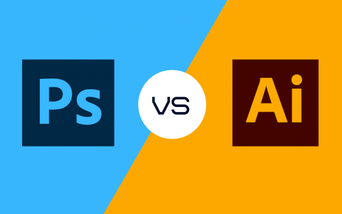
Photoshop vs Illustrator

Photoshop vs Illustrator

If you are just starting out as a designer, deciding between Photoshop vs Illustrator might not be an easy task.

So, we’ll lay out some facts for you to decide which one of these Adobe products is a better fit for you. 

Let’s start off with the basics.

Adobe Illustrator

Adobe Illustrator is a vector graphics editor and design software that is developed by, well, Adobe. The first version of Illustrator came to life in 1987. It has been regarded as the best vector graphics editing software by PC Magazine in 2018. 

Vectors are points that are used to create perfectly smooth lines. They are scalable images that no matter how large or small you make the size, they look the same when it comes to resolution and clarity. You can zoom up to 900%, and you’ll have sharp & clear designs. 

If you want to create a design from scratch, Adobe Illustrator is a great fit. It gives you the flexibility to create a design that you can also freehand to get the best results.

As above mentioned, if you are on a vector-based project such as logos, designs, or any other type of project, Adobe Illustrator is the way to go.

Adobe Photoshop

Adobe Photoshop is a raster graphics editor developed and published by Adobe, Inc in 1988. It’s been a standard in the digital art industry ever since. 

As the name itself suggests, if you are looking to work on images, whether it is editing or enhancing the image, Adobe Photoshop is the way to go. Photoshop is also great for raster-based art since the program itself is raster-based and uses pixels to create images.

Photoshop was originally developed for photographers, but over time it has grown to help all kinds of artists with their work. It is now widely used for interface designs, web pages, video graphics, banners, and the creating and editing of images.

Photoshop vs Illustrator

Adobe Photoshop and Adobe Illustrator are both great graphic design apps, but they have features that make them best for certain tasks and projects.

If you are looking to work with vectors, Adobe Illustrator is the way to go. If your work is pixel-based, you should go with Adobe Photoshop since it uses the pixel-based format to show images. 

Illustrator enables you to create precise, crisp, and editable vector graphics. As aforementioned, these graphics stay sharp in any size. You can use flexible shape and drawing tools to create great-looking logos, icons, other types of illustrations that’ll look good on a business card or a flyer.  

Illustrator works great for artwork that is going to be used in various mediums, and for various types of artworks such as typography, infographics, and one-page design.

However, If you are looking to create multi-page documents, using Illustrator is not a good idea. It doesn’t have the features that are used to set up master pages. 

Adobe Photoshop is great for working with pixel-based images that’ll be designed for print, web, and mobile applications. You can use Photoshop to create flyers that have heavy images, posters, web and app designing, videos, animations, and editing 3d images.

Both these programs have their strong points, and graphic designers usually use both. To have the best workflow, it’s always best to have all the options available in your arsenal.

That being said, if you have a tight budget and can afford to purchase just one, make sure to go with the one that fits your specific graphic design needs.

If that’s the case, there are many factors you should consider. You don’t need to limit yourself to these two apps, either. If you want to be able to design wherever you are with your iPad, Procreate is a great app. If you are not on iOS, there are Procreate android alternatives that you can try. Quite a few of them also work on PC, so you can create new cg artwork wherever you are!

If you were to choose only one of them, which would be your design software of choice? Let us know !

Visit Our Website at: www.printcafeli.com


Wednesday, December 23, 2020

               The Power Of Belief


Belief is powerful. What you believe in can guide you, give you purpose, and fill you with hope and optimism no matter what may come your way.

2020 has been a year that has required much belief. So much belief that the events of 2020 may make phrases like “Merry Christmas” and “Happy Holidays” feel like they lack the meaning and depth they usually carry.

But, hold on.

Allow me to share one of the greatest stories in history with you – a story where clinging to the belief of a brighter future yet to come marked a moment so significant that we recalibrated our calendar to that moment. 

You may choose to receive this story of a snapshot in time as nothing more than history. Or, if you’re like me and you look at history through a spiritual lens, perhaps you’ll see a deeper meaning as Christmas Day 2020 arrives. 

FINDING BELIEF AMIDST SILENCE

If you were a citizen of the ancient nation of Israel 2,400 years ago, you would be used to hearing words of instruction and caution from those that God chose to speak His words through. In fact, you would have been accustomed to the mighty moves of your nation’s God shown both in blessings and punishment, yet always in Love. 

And then, suddenly, you would have noticed a change – a BIG change.

Silence. All the signs, words, and wonders that you had once become familiar with would have gone suddenly silent as the God of the nation of Israel made a statement. Not an ordinary statement, however. A statement made with silence… lasting for four hundred years!

Can you imagine the uncertainty of such a time? Of such silence? And to top it all off, as a citizen of Israel, you’d be asked to believe that this pause of silence wasn’t the end but rather a time to reflect and anticipate a new beginning. 

What an incredible belief!

This clung-to belief passed on from generation to generation for 400 years. And then, finally, in a most unusual moment, a bright and brilliant star appeared in the sky to announce an end to the silence of the God of the nation of Israel. 

THE TIME IS NOW

Belief carries us forward to each next moment. As we end 2020, it’s time to reflect on a year like no other and to eagerly anticipate a new and shining star!

From myself and the entire team here at The Print Cafe of LI, Merry Christmas!