Print Cafe of LI, Inc

Print Cafe of LI, Inc
Logo

Tuesday, April 4, 2023

A Graphic Designer’s Guide 

to Better File Naming

Haidan Dong By Haidan Dong 

Ever had trouble looking for the right file? You tried to run a search but couldn’t because the file name was irrelevant to the project. Or you opened your file logofinalfinalupdated.ai when the correct file was actually logofinalfinaledited2.ai. Needless to say, having an organized file naming structure is important for graphic designers.

Why should I have a file naming structure?

Having a file naming structure helps you in a number of different ways.

  • It helps you stay organized, so that you can save time
  • It reduces the chances of mistakes
  • It makes communicating with clients easier
  • It makes working with team members easier
  • It makes files and folders easier to search for
  • It improves SEO
  • It improves the readability of the file names
  • It elevates your professionalism as a graphic designer

How should I name my design files?

There are many different file naming conventions and there isn’t a “right” way, but you need to include the elements that are important to your own workflow. The following list contains some elements that many graphic designers find helpful in file names. Pick the ones that you think would help you identify the file more easily:

  • Client name, initials or last name (e.g. JohnDoe)
  • Client’s brand (e.g. JDBrand)
  • Name of client’s campaign (e.g. SummerCampaign)
  • Channel within that campaign (e.g. blog)
  • Component needed for channel (e.g. image)
  • Date (e.g. 2019_05_30)
  • Version number (e.g. v01)

You will very likely not need all the elements. For example, maybe you only work on one project per client, and you specialize in business cards. In this case, you probably won’t need the name of your client’s campaign. Or maybe you tend to finish a project in one day, so you need the version number more than the date. Choose the elements that meet your unique work needs.

Now string these elements together to create your file name. If it looks too long, check out the next section below.

How long should my file name be?

If your file name is too long, it tends to get truncated when displayed. This truncation varies between operating systems and devices, so there isn’t a set number of characters. Your goal then is be as concise as possible.

With shorter names, you will be able to see the full file name easily. They are easier to type when you’re communicating with clients or team members, and faster to scan when you’re in a hurry. With shorter names, however, you will likely need more project folders and folder levels to provide the additional information not included in the file name.
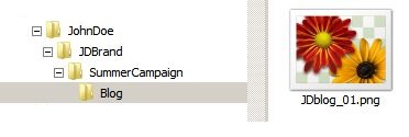
Example: JohnDoe > JDBrand > SummerCampaign > Blog > JDblog_01.png
Example: JohnDoe > SummerCampaign > Blog > JDblog_01.pdf

Longer names, on the other hand, already have plenty of identifying information in them, so they don’t require a very complex folder structure. They also make it easier for you to run a search because they likely include details about your project. Unfortunately they tend to get truncated so that you can’t see the full information. Long names also slightly increase the file size.
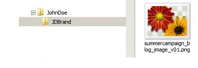
Example: JohnDoe > JDBrand > summercampaign_blog_image_v01.png
Example: Blog > JohnDoe > summercampaign_blog_image_v01.pdf

Examples of File Naming

Here are some examples of file names so that you can see different file naming structures. You will notice that some contain more information than others. Again, it should be need-based.

  • Doe_Blog_image_2019-05-30_V01
  • blog_banner_2019-05-30-v01
  • doe_blog_banner01
  • jdoe_blog_20190530_v01
  • JD_blogbanner_v01
  • jd_blog001_v1
  • jd_banner_01

Tip: If you have a large volume of projects to archive, use a project number instead of a project name. Just make sure you have a record of which numbers correspond with which projects.

File Naming Do’s and Don’ts

Do’s

  • Do name files with SEO in mind if it’s going on the web (use keywords)
  • Do use 0’s in front of single digits to preserve chronological order (e.g. 01 instead of 1)
  • Do save changes as new files
  • Do stay consistent with your naming structure
  • Do use international standard date notation (e.g. 2019-05-30)

Don’ts

  • Don’t use spaces or special characters except underscores and dashes
  • Don’t name files that only differ between upper and lower case
  • Don’t use words such as final, new, updated, fix, or edited

Conclusion

Naming your files in a structured manner can look like more work in the short run but in the long run it saves time, reduces mistakes, and elevates you professionally as a graphic designer. It makes working with a team easier and increases your productivity, so that you can focus on growing your design business instead of opening and closing the wrong files. For More Information on this Blog or any of our Marketing Products Call: 516-561-1468


Tuesday, March 28, 2023

Throw Caution to the Wind 

With Mesh Banners

It's no secret that banners are great marketing tools. They create brand awareness, help increase foot traffic, boost conversion rates, and ultimately grow businesses! They're ideal for grand openings, big events, special sales, trade shows, sports events, etc., and with their indoor/outdoor usage, they're incredibly versatile. One thing to consider when moving banners outside—the wind!  Well, never fear, mesh banners from the Print Cafe are here!

Throw caution to the wind with Print Cafe mesh banners! Your customers no longer have to forgo their beautiful banners because it’s a little gusty outside. Our full-color mesh banners have enough opacity to display images, text, and logos clearly but they also have tiny, breathable openings that allow wind to pass through. Most standard banners have a sail effect when hit with heavy winds, causing grommets to pull out, event canopies to fall over and even windows to break. Don't let your customers face this headache and agony without showing them the peace of mind mesh banners from the Print Cafe can provide.

Mesh banners are made from the same strong vinyl material as our 13oz banners so there’s no compromise in strength, but the mesh pattern brings the weight down to 8oz. This makes the handling and installation of larger-size banners much easier. Our mesh banners are ideal for most general outdoor uses and come in sizes as large as 10 feet x 30 feet. Show your customers how to make their next event a breeze with mesh banners from 4over!

To get started, just give us a call or register today for a free account on our website. We’re ready and waiting to deliver! Call Today 516-561-1468 or Visit Our Website at: www.printcafeli.com


Thursday, March 23, 2023

 Best Practices in Sign Design

Signs grab attention. They are information-light and impact-rich to promote, engage, inform, and sell. According to the Sign Research Foundation, 60% of businesses that added or upgraded their signage enjoyed a 10% increase in sales. Getting the best results, however, requires a knowledgeable salesperson to help clients navigate the many choices in signage types, material choices, design options, and format sizes. Signs viewed indoors from a few feet away require different choices than outdoor signage viewed by drivers from hundreds of feet away. Poor choices in any category will result in a sign that does not function as intended or fit in the intended space. And it may not unlock those additional sales.

 Indoor and Outdoor Signage

Approach choosing the best sign for the job using a decision tree. The first decision point is location — will the sign be used indoors or outdoors? Indoor signage is often used for a shorter period and does not need to be as durable as those used outdoors. Signs placed outdoors must withstand the local weather, including sun exposure, varying temperatures, precipitation, and wind.


Make the Best Design Choices

Where the sign will be located, or its placement, is another closely related design choice. Placement will dictate the type of lighting that will influence how the color is perceived, the viewing distance, and the context of the surrounding environment. An adhesive window graphic installed on the glass partition of a city bus stop is quite different from a window graphic placed inside the window of a restaurant. The bus stop sign will require more durable materials and likely need a design that can be understood at a greater distance.

The physical space and the viewing distance for the sign will influence the finished size and mounting options. State-of-the-art, large format printing equipment allows 4over to print sizes measured in inches to feet in width and length. To help choose the best size, the Print Cafe website and team provide design specs, templates, and guidelines that work best for each type of sign. Remember to consider the constraints of the target location, including wall and ceiling heights, floor space for sign stands, and how close people will pass by the signs.    

The same is true for material choices, where Print Cafe generally offers a limited number of materials that are known to perform well for each type of sign. Outdoor banners, like those used for advertising at ball fields, can be printed on scrim vinyl or mesh. The difference is that scrim vinyl is a solid, reinforced material that may also need wind slits added to allow the breeze to flow through the sign. Woven mesh materials inherently allow wind to flow through.

How the sign will be attached, affixed, mounted, or otherwise installed requires careful consideration. Banners can be hung with grommets, a sleeve, and a pole, or placed in a retractable stand. Road and yard signs made from fluted coroplast commonly use an aluminum frame that can be staked in the ground. Window and floor graphics are affixed using adhesives. The environment will impact the placement and the best method for installation.

Design for Effectiveness

With these decisions made, the final design considerations relate to the artwork and color choices. These are important decisions because the research tells us that small unclear signs do not help a business. The Sign Research Foundation says that 61% of US consumers missed a business location because a needed sign was unclear or too small. 

Bold colors and simplified designs usually work best for most signage because the message needs to capture the viewer’s attention within seconds. Photographs, graphics, and fonts must be sized appropriately. We have all seen signs where the font is too small to read from the highway, street, or sidewalk as we pass by. Do not let your clients make those mistakes. 

Colors not only relate to those used in the artwork design but also to what inks will be used to print the sign. Some signs, due to the materials used, are only printed using four standard inks (cyan, magenta, yellow, and black) on one side, which is often expressed as 4/0 printing. Other types of signs, like coroplast yard signs, are often printed on both sides or printed 4/4. Also, remember that printing on metals or other colored materials must use white ink as a base layer for the colors to “pop” on the sign.

Place with Deliberation

Signs allow smaller companies to compete for attention, even in mall and shopping center locations. A well-placed sign hanging at eye level or on a sidewalk sign by the store entrance gets people to stop and take notice. And once you get them in the store, don’t forget way finding signs to guide customers to the specials. 

For non-retail customers, like event organizers, sports teams, and schools, the same rules apply. Keep the sign designs sharp, vibrant, and easy to find. Ask about feather flagsretractable banners, and other types of portable signage that can be stored between events.

Work through this set of design considerations with your clients to avoid most mistakes before placing an order. Reach out to the experienced team at Print Cafe that is available to answer any more nuanced or specific questions related to your signage requirements. Call 516-561-1468 or Visit Our Website at:www.printcafeli.com


Tuesday, March 21, 2023

5 Main Differences Between Print 

and Online Graphic Design

Graphic design is critical in making marketing effective.

But, unfortunately, you can't just take one well-designed piece and transfer it to another form of advertising. It just doesn't work that way.

Graphic designers are trained to know how to design for the two forms. Here's a glimpse of what they know…just in case you want to try it yourself. 

5 Main Differences Between Print and Online Graphic Design

1. Print is tactile

When you think of print, you think of a more tactile experience, such as texture, smell, and shape.

This lends itself to a different experience than online. When printing materials, you might try letterpress, embossing, or debossing, which reaches out to one's senses in another way than online. 

2. Web is flexible

For print, all information must be presented within the constraints of the printing surface, whereas designers have almost unlimited flexibility to organize, arrange, and filter information for the web.

However, using different browsers can change the web designer's original layout, requiring testing with various browsers and operating systems.

3. Color differences

Color is another way that print and web design differ.

There are different color spaces for attaining the correct color in print versus on the web. You either use CMYK for print or RGB for the web and knowing the difference will make your images and design shine.

You'll need to know how to use Pantone colors to create the colors from print that you want online. 

4. Font variances

Desktop fonts and web fonts are different.

Besides the basic rules, anything goes in print. For example, you want to avoid clashing styles and give plenty of space between letters and lines. Also, cut down on dangling text fragments and focus on creating a clean alignment.

But in web design, you must make sure it is legible online by using sans-serif or an unembellished serif. Designers have less control over how fonts display across various devices, so enhancing readability (as much as possible) is vital

5. File modifications

Deciding on a file type is essential in design.

However, before deciding on a file type, you should first consider the destination of your piece. For example, the TIFF file extension is a good choice if you're designing for print because it can be compressed without sacrificing quality.

If you are designing for the web, two file formats will only work: GIF and SVG. GIF offers the ability to use transparency and animation. But it's worth noting that this format isn't ideal for high-resolution photographs due to its limited color capabilities. In that case, the SVG format works best to preserve quality regardless of how it's scaled.

This is the tip of the iceberg in web and print design differences.

If you need insight on graphic design for your next print project, reach out to us! We would love to help you create the right image for your business.Call Now! 516-561-1468 or Visit Our Website at: www.printcafeli.com Follow us on:


https://www.facebook.com/printcafeli/


https://www.instagram.com/theprintcafe/


Thursday, March 16, 2023

6 Top Ways to Promote Your 

Brand Via Word of Mouth

You want the word out…the good word! But how does that happen organically?

Sometimes it takes some help to brand your business and get word-of-mouth advertising. There are so many things you can do to help it along. Let’s take a look.

6 Top Ways to Promote Your Brand Via Word of Mouth

1. Hire an influencer


Sometimes using an influencer helps spur word-of-mouth advertising.

This method creates an image in people’s minds and gets people talking about what you offer. A recent study by Sideqik found that 7 out of 10 consumers trust influencers’ recommendations just as much as the opinion of real-world friends.

If you can’t get a significant influencer, try contacting a micro-influencer. Reach out to bloggers, video bloggers, or DIYers with a smaller following whose goal is to share subject matter expertise by producing tutorials, shout-outs, how-to guides, day-in-the-life videos, and so on

2. Create a unique experience

Get people to talk about your business because you treated them so well that they can’t stop talking about it.

No company wants bad publicity, but people are quick to speak. So make sure you do all you can to offer what you promise and surpass it.

Try adding a thank you note or a gift to the order. According to SDL, more than half of all consumers (58%) share their positive experiences with a company on social media.

3. Keep branding elements consistent

No matter how you promote your business and brand, you must ensure your language is appropriate for your specific audience. 

Think about the kind of language you use in your marketing materials, signage, and slogan, as well as on your social media profiles. Does it convey the image that you want to associate with your brand?

Additionally, pick engaging colors and fonts but keep them consistent across all print and packaging materials to create a branding impression that remains in your audience’s mind.

4. Solve a real problem

No matter who is talking about you, they will spread the word if you can help them solve an issue.

Make it obvious how you can help. Then, when they try out your product, they can see the truth and tell their friends.

5. Use a visual trigger

Create a space people want to snap pictures with or near and share on social media.

First, play it up if you have a unique decorating style, an unusual prop, a photo, art, or other items. Then, encourage people to take and post pictures next to it.

6. Use a hashtag

Hashtags are a way to categorize content on social media by topic or theme, e.g., #printmarketing. If you create a hashtag that includes your business name and encourage visitors to use it when posting about your business, potential customers can use it to find you online. So it will boost your name recognition.

While tracking whether the sales came from the hashtag or some other channel can be tricky, this simple tactic helps build more vital brand awareness. 

The possibilities are as endless as your creativity. If you need more ideas, especially in the printed realm, check us out today! Call 516-561-1468 or Visit Our Website at: www.printcafeli.com


Tuesday, March 14, 2023

6 Ways to Combine Print 

and Email Marketing

What does your marketing plan look like?

Does it include print marketing? What about email marketing?

An approach that combines print and digital marketing, like email, is best to get optimal results for any marketing campaign. Don't forget to include these critical elements in your marketing lineup!

Here are six ways to utilize this multi-channel approach to make your marketing dollars go further. 

6 Ways to Combine Print and Email Marketing

1. Reiterate Your Message

Use email to reiterate what you say in your printed pieces.

That way, you will catch their attention no matter their preferred medium.

2. Try Teasers

Send teasers through email, promoting your direct mail that is coming.

Use this technique to announce a big sale or event. Then when your direct mail is delivered, they can get more information about what you are offering them.

Provide a digital coupon on your direct mailer or give direct mail recipients a unique promo code to redeem an online offer.

3. Get More Subscribers

If someone is on your direct mail list but not on your email list, inform them about your email newsletter by print and ask them to join it. 

Encourage this action by offering a special deal, e.g., free shipping, or a freebie, e.g., a digital download, if they subscribe.

4. Consider QR Codes

You can use QR codes in print marketing to send the customer to a landing page.

For example, one where they can subscribe to your email newsletter. Link QR codes in your print marketing to make sign-up easy. QR codes can also direct customers to make a phone call, watch a video, or download an app. 

5. Make Communications Personal Across Channels

Technology allows you to personalize both print and email marketing efforts, and doing it across marketing channels shows your consumers that you know them.

You can use Variable Data Printing to create variations in text, colors, graphics, and images of printed materials based on the recipient.

Many email newsletter platforms also allow you to personalize communications using first names and other information stored in your database. 

You can further tie the two together using personalized URLs (PURLs). When added to print pieces and emails, PURLs direct customers to landing pages that are highly targeted and customized to them. 

6. Create a Print Newsletter

Use email communication to promote short tidbits of what you will discuss in your printed piece. Get their juices flowing and pique their curiosity.

When you combine technology with proven direct mail, your efforts are doubled, and you are more likely to reach your target audience and capture their attention.

You will reach them where they are—either online or through the mail. Tangible mail is overlooked today, but it's important because people like to hold things in their hands. Direct mail provides a physical object more likely to be read than a mass email ad.

No matter what, we will help your printed piece get noticed. Check us out today! Call 516-561-1468 or Visit Our Website at: www.printcafeli.com