Print Cafe of LI, Inc

Print Cafe of LI, Inc
Logo
Showing posts with label #signs. Show all posts

Tuesday, November 2, 2021

                 3 Powerful Tricks to Learn New Skills Faster


3 Powerful Tricks to Learn New Skills Faster

“Change is the law of life. And those who look only to the past or present are certain to miss the future.” 

– John F. Kennedy

Though few people like it, change never stops.

Success in life requires the ability to adapt. As one Chinese proverb quips, “the wise adapt themselves to circumstances, as water molds itself to the pitcher.”

Whether you enjoy change or not, the pace of change marches ahead at an ever-increasing pace. Here is a statistical snapshot of what that looks like:


  • 94% of the internet workload will be processed on the cloud by the end of 2021
  • It is estimated that 70% of all automobiles will be connected to the internet through the Internet of Things by 2023
  • By 2030, the fully and semi-automatic car market will be worth $26 billion
  • Artificial Intelligence is slated to replace around 85 million US jobs by 2025
  • The world has produced 90% of its Big Data (or extensive data sets) in the past two years

Does that feel overwhelming?

It can be. But humans are change experts. We are master adapters! People adapt when they enter a new life stage, take a new job, when abrupt social change occurs, or when faced with a health crisis.

Simple Skills that Increase Retention

As you are prompted to innovate, create new jobs, or develop new ways of working, you can learn faster and retain more information. Want to be more efficient in learning new skills? Here are a few tips:

1. Rehearse Aloud

When trying to learn someone’s name, people often speak the name aloud two or three times in the initial conversation.

Research shows that, compared with reading or thinking silently, the act of speech is one of the most important mechanisms for retaining information. Want to retain and solidify something in less time? Rehearse it aloud.

As psychologist Colin MacLeod says, "learning and memory benefit from active involvement. When we add an active measure or a production element to a word, that word becomes more distinct in long-term memory, and hence more memorable."

2. Link New Ideas with Familiar Concepts

Mentally connecting concepts is a fantastic memory hack.

Associative learning takes place when two elements are connected in our brain in a way that links seemingly unrelated things. For example, a science teacher might set out an ice cube, a bowl of water, and a steaming pot to link something kids are already familiar with (common forms of water) to explain a new concept (the phases of matter).

In simple terms, whenever you say, “Oh, I see . . . this is basically like that,” you’re associating something you currently understand with something you’re trying to learn. By mentally linking things, you learn and categorize quickly and remember them more easily.

3. Practice Varying Skills in Succession

Interleaving is a learning technique that involves mixing different topics or forms of practice to facilitate learning. For example, if a student uses interleaving while preparing for an exam, they can mix up different types of questions rather than study only one type of question at a time.

This varied practice (as contrasted with the specific practice of one skill) focuses on multiple tasks at once. Interleaving blocks you from slipping into mindless muscle memory and forces continual adaptation and adjustment. When you quickly switch between practicing piano, typing, and marimba – or speaking Spanish, German, and Italian – it helps you really learn what you’re trying to learn because you must concentrate at a deeper level.

Need to learn something new? Try these tricks to become more lean and efficient in the process!Need some fresh ideas? Contact us today to get started! 516-561-1468 or FOR MORE INFORMATION ON ANY OF OUR MARKETING PRODUCTS GO TO:www.printcafeli.com

Friday, October 29, 2021

                       Using Content to Win New Customers

Marketing content is a useful tool for any business trying to generate more traffic to their doorstep, either digitally or in person.

Whether your content is provided through a direct mailer or digitally, the right information catches people's attention and attracts them to want to find out more.

And that generates valuable activity that causes sales to happen.

Yes, content is powerful and profitable, but what kind of content works? Here are valuable content tips that can make a difference for your business.

Don’t Reinvent the Wheel

A lot of energy, time, and resources are consumed creating new methods from scratch, whether in business or anything else.

So why go down that road when you can learn by working examples instead?

The key is to focus on companies and organizations that put out both digital and print content that is wildly successful. It doesn’t even have to be the same industry as yours.

Instead, look for methodology and strategy. What is it about these businesses that makes their content work? Find the system, learn the approach, and then apply it to your business.

Pinpoint What Attracts Customers to You

In traditional marketing, identifying viable customers is known as “defining a target market.”

Typically, a marketer would find the right type of demographics mix that makes up a target market and then aim marketing efforts towards that person, hoping for a response.

Today, however, things are easier.

Ask your current customers what they appreciate and like about your business and find more people with similar interests. Then shape your content accordingly.

Screen Your Existing Material for Easy Gems

Most likely, your company has already produced a library of information that can be used to create content for customers.

Review your existing resources, modify the material, and post or print it for them to find. Customers connect to the most amazing things; the trick is to tell a story that brings them back for more.

Don’t Brain Dump, Choose Material Wisely

Content is never an accident.

Your customer-oriented material should be part of an overall story you tell each month to audiences. Every piece should connect and integrate with the next during each content push window.

One of the best ways to do this is to shape your content for each month. Whether weekly or daily, the month’s material should be planned, summarized, and segued from one piece of the story to the next. Consider each content piece a chapter in a bigger book.

Make Sure Your Writer is Passionate

If your content is just a chore for whoever gets assigned the task, it will show in the writing.

Make sure your writer actually has a passion for your topic, and the difference will come out naturally. It will also be far more attractive to your customers, who will find the content genuine and natural.

Avoid Hard Calls to Action

Remember, your content’s goal is to generate an audience for your business.

Hard messaging stands out awkwardly in genuine content. Instead, the material should be informative, helpful, and useful. The body of the content will do its work and attract customers, who will then seek your business on their own and connect it with your business. Their interest will do the rest on the natural. This is why content generation is so powerful.

Lastly, make your content human and personal. Put a face to it if possible. Customers connect far more to a person than generic information.

Need some fresh ideas? Contact us today to get started! 516-561-1468 or FOR MORE INFORMATION ON ANY OF OUR MARKETING PRODUCTS GO TO:www.printcafeli.com


Tuesday, October 26, 2021

   5 Print Marketing Pieces that will Woo Your Corporate Clients


Some of the most effective ways of communicating value don’t require looking up a website or downloading a mobile device teaser program.

In fact, non-digital marketing activities win over corporate clients regularly without ever needing to be plugged in. Here are five of them.

1. Business Cards

Yes, those traditional business cards are still winners.

Business cards provide critical contact information and enough detail on how to connect with an organization quickly. Whether by email, text, phone, or mail, the info on a business card is powerful.

People love business cards because they are easy to transfer, pack, save, and reference. In the corporate world, business cards still resonate.

2. Letterheads and Stationary

In a day and age when so much communication happens by email and texting, the traditional letter stands out, even in a mail pile full of folders and generic material.

Best used when conveying a personal connection, professional letterhead is loved by corporate leaders everywhere and often seen as a sign of respect to the reader.

3. Add to Your Digital Slidedeck

Digital presentations can be so commonplace that people are often bored to death by the lack of engaging multiple senses.

A quick fix? Add printed materials people can hold in their hands that support your digital presentation. A beautifully printed presentation contained in a clean and stylish folder is easy to carry and review hands-on later. Combine a print version of a presentation with a digital slidedeck, and you’re hitting a home run with both formats simultaneously.

4. Company Information Brochures

A tri-fold company brochure is a convenient marketing tool that easily fits in a jacket pocket or folder. And, like business cards and presentation folders, brochures engage multiple senses of sight, touch, and even smell. 

Unlike digital PDFs, professionally printed brochures can be visualized and held easily. They don’t get lost in files like emails and tweets. A well-done brochure with high-impact visuals gets shared with those who matter as well. They are often shown as an example of what’s possible with the right skills hired.

5. Everyone Loves Catalogs

Today, digital menus and scrolling lists have tried to replace catalogs online.

However, the traditional catalog publication stands firm because of its tremendous impact.

Sometimes, folks like to leaf through a well-designed paper catalog to relax and pass the time, which often triggers more sales.

Additionally, companies that provide catalogs are becoming more unique and a stand-out factor from the crowd. Folks do not always remember a general product, but they definitely remember who has a catalog.Need some fresh ideas? Contact us today to get started! 516-561-1468 or FOR MORE INFORMATION ON ANY OF OUR MARKETING PRODUCTS GO TO:www.printcafeli.com


Friday, October 22, 2021

           Grow Your Business Through Instagram Marketing


If you're looking for a way to boost the results of your print marketing, integrate your next campaign expand your reach with Instagram!

Instagram is a cost-effective marketing tool that houses many resources to help your business grow.

As the second most accessed network behind Facebook, with 1 billion monthly active users, Instagram boasts highly engaged users, browsing an average of 53 minutes per day.

Instagram can be a handy tool if you’re trying to reach ages 18-44, as 45% of Instagram users are within this age group. 

4 Tips to Get Your Business Started on Instagram

Before initiating an Instagram business profile, it’s important to develop a marketing strategy.

1. Know Your Why.

Why do you want your business on Instagram?

For example, are you there to sell products, share portfolio content, build brand awareness, share user-generated content, and/or use Instagram’s analytic tools? When you discover your why, you’ll have a beneficial framework for moving forward.

2. Determine Your Target Market.

Think about age, location, gender, income, interests, motivations, & pain points.

If this is challenging, try looking up competitors on Instagram to see who their audience is. 

3. Conduct a Competitive Analysis.

A competitive analysis is when you research your competitors to see how they are doing.

Then, using this data, you develop a plan to improve your own business. When doing this through Instagram, see what and how often your competitors are posting, what posts are getting the highest engagement, what they are using for captions, how quickly they are growing, etc.

Acquire data that can then be used as a benchmark for your business. You can also brainstorm ways you can stand out from your competitors.

4. Create an Editorial Calendar.

An editorial calendar is a visual representation of your workflow.

You can develop a plan for when, what, and how often to post on both your main Instagram feed and Instagram stories.

5 Tips for Gaining Instagram Followers

Now that your marketing strategy is in place, you can get on Instagram to grow your follower base and engagement. Here are some tips to get you started.

1. Create a Business Account.

Perhaps obvious, but make sure your business is under a business account.

Go to your profile page, click the three horizontal lines at the top, click settings, account, then scroll down.

If it says, “Switch back to Personal Account,” then you have a business account. If it says, “Switch to Professional Account,” your business is under a personal account.

No worries! Just click “Switch to Professional Account,” follow the prompts, and now you have a business account. This is important because it will give you access to useful features, including analytic tools, promoted posts, and a contact button.

Instagram’s analytic tools allow you to see who (age and gender), when, and where you generate the most engagement. You can also see data for follower growth. 

2. Make Sure Your Instagram Bio is Strong.

Your bio is your potential client’s first impression.

Add all the necessary information and use keywords that will draw in your target audience. 

Your bio is also the area where you'll put your call-to-action URLs. Because Instagram is image-based, URLs don't work well on each post. Instead, update your bio URL to correspond with anything unique you're posting.

3. Create a High-Quality Instagram Feed.

Ensure that your Instagram feed flows nicely by choosing consistent editing styles and adding filler photos.

Filler photos are posts that serve to improve your Instagram feed’s aesthetic. They are important because Instagram is such a visual app. Space out busy photos with minimalistic ones. You can even try posting six to nine photos in a row to create one large picture on your feed.

4. Don’t Forget to Use Your Stories.

Because Instagram stories disappear after 24 hours, they’re a great way to post various content and drive engagement.

Plus, thanks to Instagram’s stickers, you can create quick polls to drive follower engagement while simultaneously receiving follower feedback.

5. Add Instagram to Your Networking Cards.

Networking cards are business cards that highlight your social media presence. They are a great way to increase your follower base and sales. 

Instagram is a wonderful tool to grow your business. Apply the above advice, so you can stand out and increase sales.

Need some fresh ideas? Contact us today to get started! 516-561-1468 or FOR MORE INFORMATION ON ANY OF OUR MARKETING PRODUCTS GO TO:www.printcafeli.com

Friday, September 3, 2021

   Add Depth and Drama to Your Page with 4 Riveting Techniques


Tension. There’s just nothing like it to prompt emotion in relationships, film, and art.

Steven Spielberg demonstrated this masterfully in the classic 1993 film Jurassic Park. While young siblings Tim and Lex hide in an industrial kitchen, two raptors creep inside and begin prowling and sniffing the perimeter. As the children silently crawl on their knees and cower under stainless steel countertops, the toenails of the raptors click . . . click . . . click . . . along the floor behind them.

Though some would classify Jurassic Park as a children’s film, you can be sure the tension of this scene had every adult breathless as the raptors prepared to pounce.

Create Rhythm and Release in Your Page

As plot twists are to a story, visual tension is to design.

Visual tension is an aspect of composition that uses unexpected color, shape, or scale to create energy. While visual tension can be used to evoke anxiety, typically it is used to add depth and create a more dynamic viewer experience. This pattern of building and releasing tension is one of the most ingrained patterns of human experience.

Here are four ways to weave visual tension into your next design:

1. Go Off the Grid

Most shapes or pages have a sort of “structural skeleton” running through them.

In a square, the axis points would form a letter X through the center of the page. Elements placed along any major axis (or in the center) will appear more stable. Objects placed outside these major grid points will carry a greater sense of tension. If you place a logo underneath the invisible X of a square page, your design will feel a bit more exciting.

2. Use Jarring Color Combinations

While monochromatic or complementary colors are soothing, dissimilar or bold combinations create a unique energy in your designs.

The possibilities here are endless! Try gray suede and cheetah print mixed with white and gold. Or electric orange interspersed with neon pink. A rule of thumb is to favor one color over another (like using a dominant color for the background and the secondary color for accents). To tone it down a bit, use both colors for accents against a neutral shade.

3. Try Something Unexpected

Is the sky always blue?

It doesn’t have to be! Designs spur emotion when you do something unexpected, like adding a hot pink filter to a nature landscape. Try something surprising, like placing a giant head on a tiny body, coloring a chicken blue, or creating a visual puzzle (using concepts from the Gestalt principle) within your logo design.

4. Employ the Spatial Properties of Color

Colors create movement and affect the way we perceive an image.

Did you know that warm tones appear to advance in three-dimensional space? If you want to highlight a focal point in your image, you can increase the size of this object or also use a warm color such as red, orange, or yellow to bring it forward. If you want to reverse this effect, use a cool color (like blue or purple) on the closer, larger object and a warm color like red on a distant, smaller object. Viola! Tension created.

Engaging, Irresistible Images

Balance and tension are at the heart of every creative endeavor. Build hierarchy, focal points, and flow as you create a visual tension that makes your image irresistible!

Need some fresh ideas? Contact us today to get started! 516-561-1468 or FOR MORE INFORMATION ON ANY OF OUR MARKETING PRODUCTS GO TO:www.printcafeli.com

Friday, August 27, 2021

How to Keep Brand Value


Your brand is everything.

It’s what makes potential buyers and customers recognize you and helps set you apart from competitors.

It’s important to maintain the value of your brand in order to make the most of your business marketing. Keeping brand focus and consistency is key. If customers know what your brand stands for, they’ll end up appreciating it more, and you’ll gain more organic traffic.


A strong brand value helps tell your company’s story, creating awareness, loyalty, and excitement for the consumer.

Sales and marketing trends will continually change over time. However, building the power of your company’s brand is an investment that pays for years to come.

3 Ways to Keep Your Brand Value

1. Business Visuals

Your logo is at the forefront of your company.

Anyone who knows your business knows what your logo looks like, including the color palette, typography, imagery, and graphic elements. These brand visuals are most important to maintain throughout your business advertising.

When marketing for your business, continue to use these same characteristics of your logo throughout. Over time, after creating enough brand awareness, you should simplify your logo, and people will still know exactly who you are. For example, the Chevrolet logo doesn’t need the word “Chevrolet” next to it for people to know who they are. They’ve been around long enough and created a strong brand value to be able to pull that off.

2. Business Values and/or Mission

Brand values and/or the mission of your business are just as important to show and maintain as the logo characteristics.

Use your values to strengthen your advertising, show what you stand for, and create awareness. When people see an advertisement, they should be able to tell what company it’s for before even showing a logo or a name.

3. Business Style

Your company’s style fits in with your brand value and is important to maintain across all marketing consistently.

Does your building’s interior design use a modern appeal or more of a rustic look? Does your website use a white and clean look or a dark and textured theme? Use this style as a part of your print marketing and other advertising. 

The Ultimate Marketing Combination

All of these things; your logo, values, and style all play an important role in maintaining brand value.

Used often and strategically, these brand elements will help strengthen your brand so that your business is better known, and you’ll gain more traffic online and in person.

Need some fresh ideas? Contact us today to get started! 516-561-1468 or FOR MORE INFORMATION ON ANY OF OUR MARKETING PRODUCTS GO TO:www.printcafeli.com


Tuesday, August 24, 2021

The 8 Dos and Don'ts of Branding


Your brand is often the key to growing and keeping your customer base. 

A recognizable, identifiable brand with a cohesive look and feel helps you get the attention of a potential customer and keeps the would-be one-time customer coming back for more. You want your brand to be instantly memorable, especially when it comes to print-based marketing. This is why it is essential to make sure your brand is in tip-top shape!

How do you know if your brand is on point or missing the mark? You follow these dos and don'ts of branding.

The Dos of Branding

1. Take the Time to Update Your Brand Logo

Even iconic brands like Coca-Cola revamp their logo on occasion.

The longer you have been in business, the more likely you need to update your brand logo. You want your brand to appear fresh and relevant. You don’t have to redesign your brand logo completely; just give it a revamp. 

2. Pay Particular Attention to Detail

Designing for print leaves little to no room for error.

You want to get it right the first time and avoid costly fixes down the road. Therefore, it is usually best to start with a digital design before printing the final product.  

3. Take Advantage of Print Textures

Because print-based marketing gives the consumer something they can hold, don’t forget about using print texture to enhance your brand.

Techniques like folding, embossing, or even well-placed foiling can create a unique print experience. 

4. Respect White Space

With print, sometimes less if more.

Try to leave space between the icon and the text. Try your design in black and white before adding color. You’ll see just how impactful it is or realize you need to go back to the drawing board for tweaks and adjustments.  

The Don’ts of Branding

1. Forget to Edit

Editing is often the best friend of printing and branding.

Come up with several options before settling on something final. Brands will inevitably evolve, but spending the initial investment of time on the front end will allow you to come up with a solid brand.

2. Add Too Many Fine Details for Printing

There is a time and place for intricacy when it comes to branding.

Intricate designs with multiple colors and gradients may be amazing for digital marketing platforms but will most likely get lost in translation in print. So instead, think simple but unique for print purposes by scaling back fine details.

3. Use a Wide Variety of Colors

One of the goals of print marketing is to get the customer’s attention.

While you can do this with color, too many colors may have the opposite effect. Think about the size of your print materials and use that to guide your choices of colors. 

4. Use the Wrong Font

Think about your brand. Is it bold? Demure? Classic?

Choose a font that represents the overall feel of your brand. For example, a construction company would likely never utilize a swirly font with loopy letters. Put your font choice to the test before making a final decision. Look at it in various sizes. If it doesn’t translate well to several settings, choose another font.

Creating a brand for your business doesn’t have to be an impossible task. When you keep these dos and don’ts of branding in mind, your business can be well on its way to iconic status in no time. 

Partner With a Marketing Expert

When it comes to building a successful printing brand, partnering with an experienced team of marketing experts is crucial. With years of valuable experience, we're here to help your business shine. Contact us today to get started!Need some fresh ideas? Contact us today to get started! 516-561-1468 or FOR MORE INFORMATION ON ANY OF OUR MARKETING PRODUCTS GO TO:www.printcafeli.com


Tuesday, December 1, 2020


6 Ways to Add Bleed (and How to Choose the Best One)

Missing bleed is one of the most common problems on print files. Bleed is the extension of the artwork on each side to allow for cutter variance, so it’s an essential part of a good print file. Bleed requirements differ among printers but a commonly minimum is 0.125” on each side.

Many of your clients may not know how to add bleed, leaving the task in your hands. There are several different ways to add bleed. Naturally, each has its own advantages and disadvantages.

We’ll cover them in this article so that you can easily choose the best way to add bleed to your clients’ files.

Adding Bleeding to Your Print Files

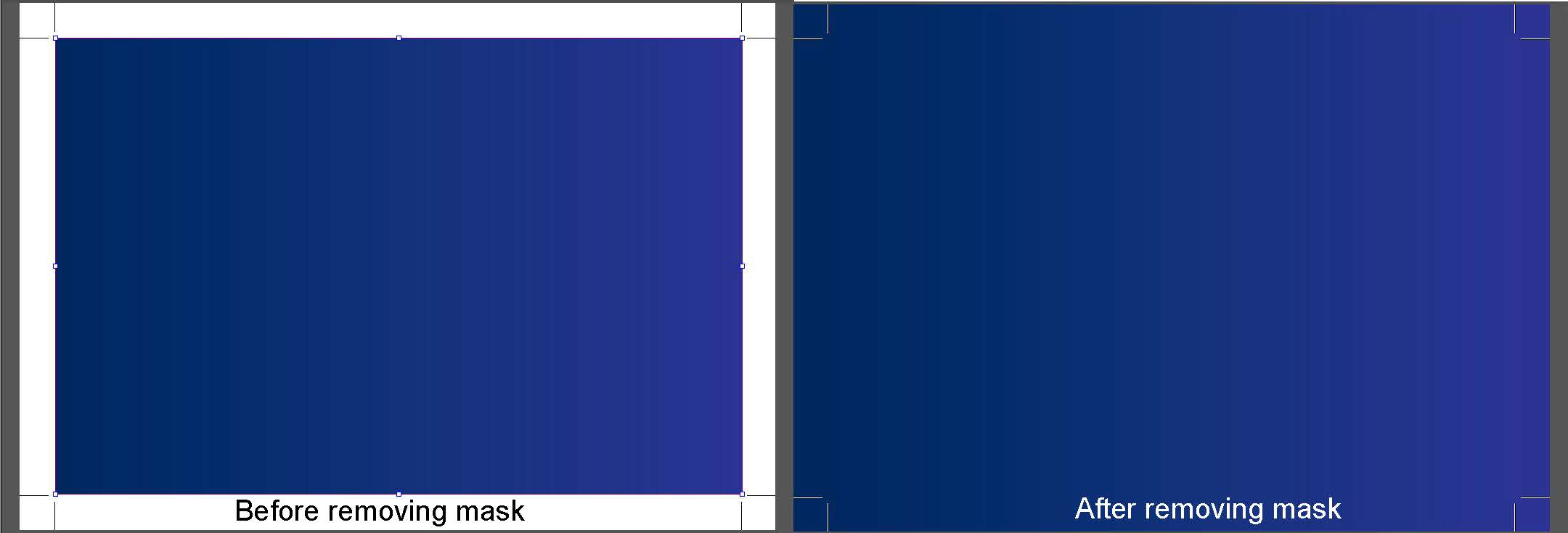
1. Release or Remove Masks

Sometimes the bleed is just hidden by a mask that’s set around the edge of the trim area. When you release or remove the mask, it appears, so you’re therefore not truly adding bleed; you’re just unmasking it.

before and after removing mask

Pros

  • It won’t distort the artwork or change image resolution.
  • The client may have provided the bleed that they wanted underneath.
  • It can be quick and easy if the file is built simply.

Cons

  • There may not be any bleed hidden after all.
  • You risk unmasking other elements that were intentionally hidden.
  • Time consuming if the file is complex with multiple masks.

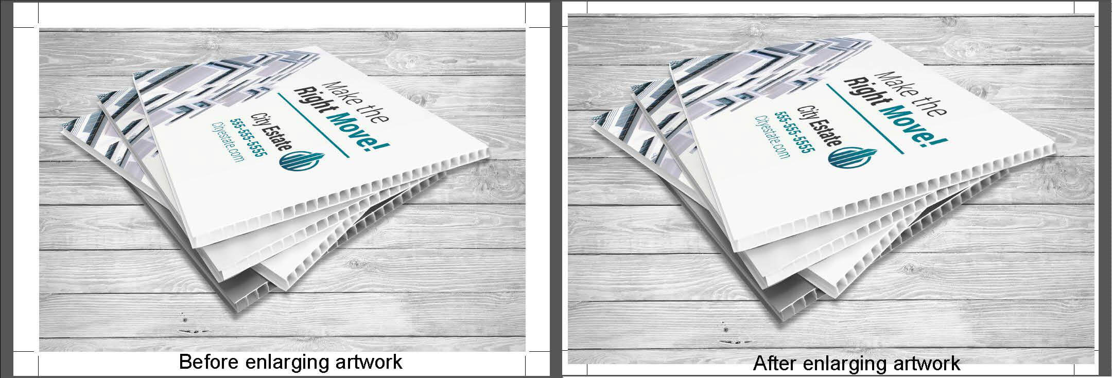
2. Increase Artwork Size

Another way to add bleed is to increase the size of the entire artwork, or part of it (e.g. the background). This method is most suitable when there are no important elements close to the trim edge.

before and after enlarging artwork

Pros

  • When enlarging the entire artwork, the ratio won’t get distorted.
  • It’s a fast and easy fix.
  • Most clients won’t be able to tell if their artwork was increased by 1-2%.

Cons

  • Elements close to the edge may get cut off (e.g. thin borders).
  • Enlarging raster images will slightly affect their resolution.
  • The client may be able to tell that their artwork was enlarged.

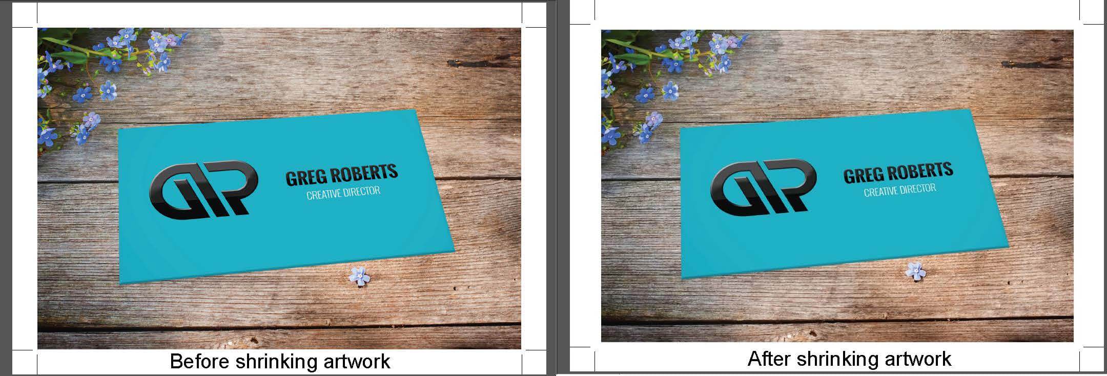
3. Decrease Artwork Size

Similarly, you can shrink the artwork. This leaves a white border. You’re not actually adding bleed, just eliminating the need for one. Alternatively, you may choose to add a color to this border and add bleed to that.

before and after shrinking artwork

Pros

  • It’s a fast and easy fix.
  • It actually slightly improves the resolution.
  • None of the artwork will get cut off.

Cons

  • There is a very obvious change in the artwork, which may not be wanted.
  • You risk having uneven borders due to both resizing and cutter movement.
  • Small type may become harder to read.

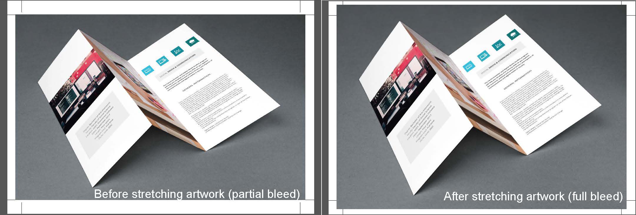
4. Stretch Elements

This technique is most suitable when objects that are missing bleed are rectangular vector elements with no curves, as you can easily stretch them out without distortion or pulling parts too close to the edge.

before and after stretching artwork

Pros

  • It will only impact the element that is getting stretched.
  • It can be quick and easy on certain types of artwork.
  • Most clients won’t be able to tell if you stretch an unimportant part of the artwork.

Cons

  • Distortion will occur on non-rectangular vector elements and raster images.
  • Parts of the stretched element may get cut off if they’re close to the trim edge.
  • You may also have to delete masks.

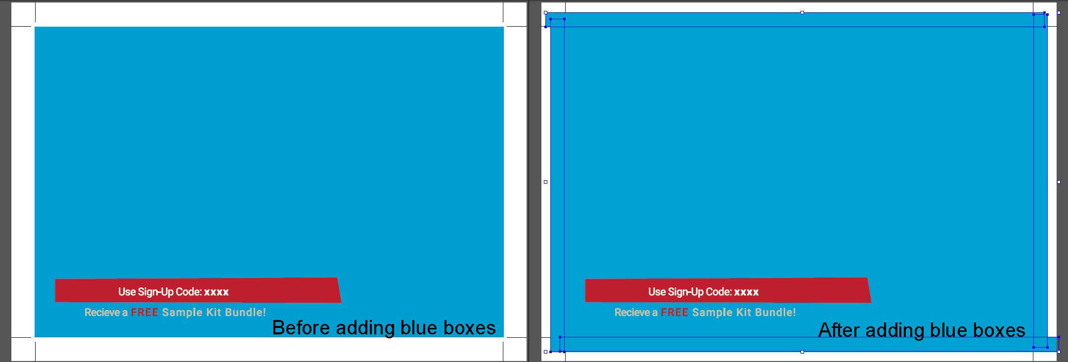
5. Add Objects

Adding shapes to the bleed area works best when the artwork at the trim edge is a solid color. It’s still possible if it isn’t, but takes much more time. Ideally, you are purely adding bleed and not touching anything else.

before and after adding elements

Pros

  • You are not changing any artwork within the trim area.
  • It can be done using even simple image editing software.
  • If done well on the right type of artwork, clients won’t be able to tell the difference.

Cons

  • The added bleed may not perfectly match the edge of the original artwork.
  • It can be time consuming.
  • The difficulty level can be high depending on the artwork.

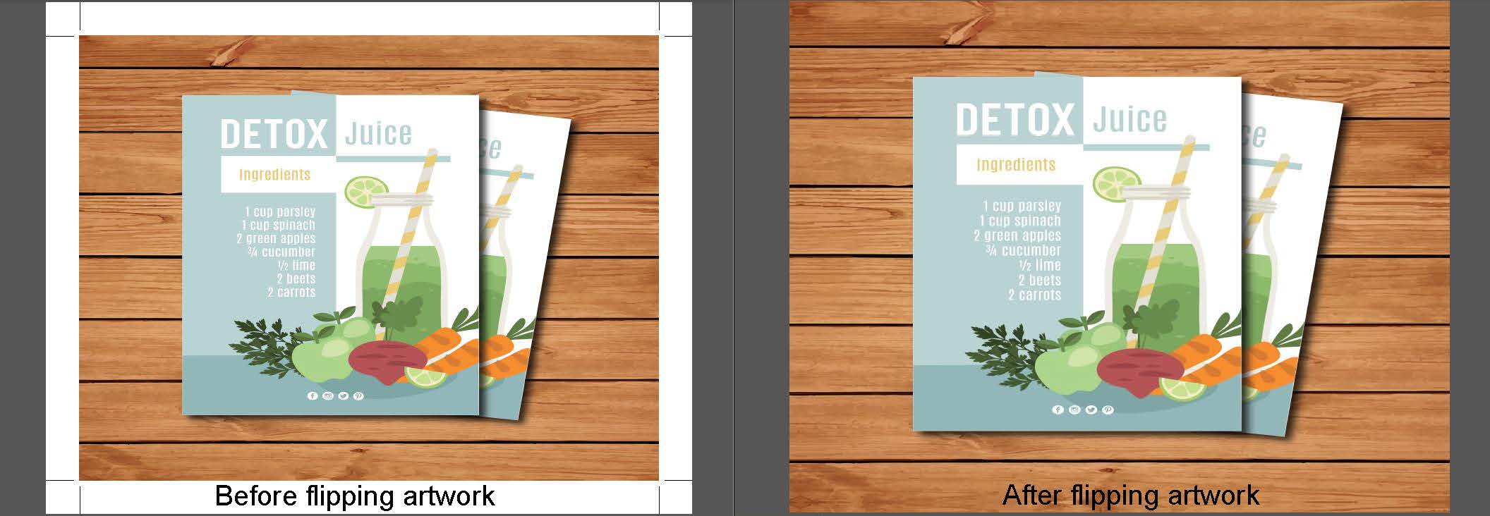
6. Flip the Artwork

Flipping the artwork at the trim edge to create a reflected mirror image for the bleed is a function available in some programs and plugins. This produces a symmetrical image with the line of symmetry at the trim. There is no hard rule for what works best here, so you may have to test it out to see whether the result visually “makes sense.”

before and after flipping artwork

Pros

  • With the right plugin/program tool it can be fast and easy.
  • It won’t distort or change the artwork within the trim area.
  • It matches the same colors and shapes in the artwork.

Cons

  • It requires a higher level image editing software/plugin.
  • The results may appear nonsensical and not what the client intended.
  • It won’t work if there’s a thin border or if the artwork doesn’t fully touch the trim edge.

Conclusion: Using Good Judgement

A good bleed makes a big difference, but not all bleed is good bleed. The methods that we shared here produce different results depending on the nature of the artwork, so always exercise your own good judgement in addition to the tips we’ve provided. Sometimes you may even choose not to add bleed.

For More Information on this Topic or any other Technical Questions Go to:https://www.printcafeli.com/help/index.html


Tuesday, October 6, 2020

 Brilliant Yard Sign Ideas


Yard signs are affordable, lightweight and incredibly portable, so it’s not surprising that both small and large businesses use them to target passersby and local customers.

However, as with any other marketing tool, there are several factors that should be taken into consideration to make your lawn signs as effective as possible. Before you order your signs, make sure the text is large and legible and the color scheme is bold and visually appealing. The overall design should be simple yet memorable.

Thanks to their versatility, yard signs can be used for countless promotional and practical applications. We thought we’d share some examples of unexpectedly brilliant yard sign designs that have passed through our doors.

Real Estate 


With so many real estate agents using yard signs to market properties for sale or for lease, it can be difficult to stand out from the competition. Here are some of our favorite tips for real estate yard signs that get noticed:

*Choose a distinctive shape and/or size. For example, a 24” x 36” sign is not one you see every day, and the extra room allows you to increase font size for more visible text. Remember, a larger size should not be taken as an invitation to include as much information as possible. Your sign should focus on one or two key messages, whether it’s advertising your company or attracting potential buyers

 *Put some thought into your color scheme. If you specialize in luxury properties, pick an understated color like navy blue or burgundy. If  you live in a sports town, incorporate the local team’s color into your signs. 

 *If you focus on starter homes, include a persuasive tagline like “Buying Your First Home? We Can Help” to let clients know you’ll be with them every step of the way.

Garage Sale 


Advertise your yard sale with a sturdy yard sign! Each weekend, plenty of garage sale enthusiasts drive around looking to spend money, and you don’t want them to miss yours. Stick to a bold color scheme that is noticeable from afar (like red and white) and for added impact, use an unexpected shape like an octagon or star.

Political Campaign


Name recognition can make all the difference on election day, which is why candidate lawn signs are such a staple of campaigning. Make sure you keep plenty in stock at your campaign headquarters to sell or hand out to volunteer and supporters. Your signs should include your name, of course, the office you are seeking and, if you have additional space, a memorable slogan, endorsement or campaign website URL.

Security


Help keep your home secure by displaying lawn security signs that serve as powerful deterrents to unwanted visitors. A durable, professionally-made sign is an inexpensive investment that should be a part of any home security system. You can also order custom yard signs to discourage specific behavior, such as door-to-door soliciting, walking across your lawn or parking in front of your driveway.

Parties and Celebrations 


Add a little extra flair to your next gathering by ordering a personalized yard sign! Whether you are hosting a birthday party at your house or a summer BBQ at the local park, a brightly colored yard sign makes it easier for guests to find the right location. Depending on the size of the event, you may want multiple signs directing people toward the food stations, trash, and restrooms.

Graduation 


Let the neighbors know that your proud of your son or daughters graduation. Whether it's Grammer School, Middle School, or High School.Your children will feel good for what they accomplished.

Non Profit Organizations


Make it easy to make a difference. Set up a secure donation box outside your office or negotiate with a local shopping center to install one in a highly trafficked area. Place sturdy yard signs in the area that point toward the donation box and include a few bullet points and/or image that clearly explains how the donations will be used.

QR Code 


Bring this timeless marketing tool into the smartphone age with a QR code! You can use a free online QR generator to create a code to print on your signs. Link the QR code to a specific page created just for this purpose so you’re able to track the sign’s effectiveness.

For More Information on Lawn Signs and Other Signage: Call 516-561-1468 or SMS Text 516-253-4040 or Visit Our Website at:https://www.printcafeli.com/store/product-view.html/84-Signs