Print Cafe of LI, Inc

Print Cafe of LI, Inc
Logo
Showing posts with label #labels. Show all posts

Monday, May 3, 2021

    Top 4 Places To Find Graphic Design                        Templates 

by JELLY SHAH

Graphics play an important role in today’s marketing campaigns. A graphic design is a very subjective thing — while a design can be excellent for you, your colleague sitting next to you may not like it. This makes the job of graphic designers much more challenging. They need to translate the design brief shared by the clients into reality. They have to create designs that match precisely the likes and thoughts of the clients.

Creating such demanding designs quickly and economically, graphic design templates come to the rescue. Most small business owners, marketers, and enterprises running on a shoestring budget that cannot afford to hire a professional graphic designer or agency for their design projects prefer this option. No matter whether they have a design background or not, anyone can easily create graphic designs on their own.

In fact, these graphic design templates are easy to personalize, and even novices can customize them with colors, fonts, icons, the layout of their choice. Irrespective of the design category, template designs are available for every requirement like poster templates, flyer templates, etc.

Small businesses that do not have a regular or bulk need can use graphic design templates to fulfill their requirements without hiring a graphic designer or spending too much on a graphic design agency.

Now the question is—where can you find such graphic design templates from?

Here Are The Top 4 Online Platforms Or Websites To Get Graphic Design Templates

01. Designhill Studio

Designhill Studio is a leading online graphic design tool that provides a wide range of graphic design templates. These easy-to-customize templates cover all categories and industry types. Whatever the need may be, you can find an abundance of options for every single category. Pick one that’s closest to your needs and start customizing with the choices of your colors, fonts, images, and layout.

Its interface is user-friendly, and even non-designer can effectively use it to create their own graphics in minutes and without breaking their banks. You will have the option to download graphics with transparent background.

02. Canva

Canva is another great online graphic design tool that provides a vast range of graphic design templates for varied categories. All of these templates come with the easy-to-customize feature. You can either download the finished designs or share them online with friends, colleagues, or family members. This popular online graphic design platform has a huge customer base.

03. Template.net

Template.net is an online graphic design platform where you can find template design galleries for different categories. Unlike the first two online platforms, this platform is for template designs gallery only.

Many template designs are free, but there is also a paid template design option. In order to get more template design options, you need to sign up for creating an account.

04. PNGTree

Unlike all tree tools mentioned above, PNGTree is a design gallery and not a tool. PNGTree is the website that is usually considered for getting images and graphics in png file formats. But this online platform is more than just png files. It also provides a template design gallery.

It has a good range of graphic design templates that can be used to customize according to the business requirements. After customizing these template designs, these can be downloaded in PSD format

Conclusion

The graphic design industry needs booth skills and creativity to design high-quality graphics that stand out. Creativity is not an entity that can be learned from someone but art that comes from within. Most graphic designers possess it. But it does not mean that a non-graphic designer cannot create incredible designs. A non-graphic designer can design images using graphic design templates. It does not require any programming or designing skill or expertise in tools such as Photoshop. Graphic design templates are the best option for small businesses that can’t afford to hire a graphic designer for their design projects. They are both economical and quick.

Need some fresh ideas? Contact us today to get started! 516-561-1468 or FOR MORE INFORMATION ON ANY OF OUR MARKETING PRODUCTS GO TO: www.printcafeli.com


Tuesday, April 27, 2021

   The 4-Minute Guide to Designing with White Ink

                                                                                 By Haidan Dong


Designing with white ink is like vectorizing—it takes a little extra work but the end result is worth it. You may have seen white ink used in designs for food labels, business cards printed on a special stock, or clear vinyl decals. This article is dedicated to helping you see why and how you can use white ink to enhance your designs and produce beautiful results.

Why Design with White Ink

There are many reasons why graphic designers create print artwork with white ink. The two main reasons are:

1. To produce white areas on non-white stocks

Sometimes printing with white ink is essential because white is part of a company’s logo or campaign colors. Therefore, to produce white areas on stocks such as a silver or transparent label, the design requires white ink.

2. To help other colors pop on non-white stocks (as a support color)

When CMYK colors print on non-white stocks such as brown kraft paper, the end result is that you may be able to see the stock show a little bit underneath the colors. If this is not what you’re looking for and you want your CMYK colors to appear more opaque, you can add white ink underneath the CMYK to stop the stock from showing through.

Why the White Ink Printing Process is Special

Printing white ink requires a different process than printing CMYK colors. This is because white does not get printed in a standard CMYK-only workflow. When you design a CMYK file to print on regular white cardstock, the areas without any color values (C0% M0% Y0% K0%) don’t get any ink, so the cardstock shows through as simply white. 

This means that the white needs to be its own ink (in addition to any CMYK colors you use in the artwork).

As this is a printing process that is more out-of-the-norm, you would need to first find a print provider that can print white ink. We recommend The Print Cafe of LI, that offers special prices to graphic designers.

How to Create a File with White In

Ready to start designing a file for white ink printing? Different printers have different requirements such as:

  1. Using spot color for white ink areas
  2. Using a different layer that contains all your white ink areas
  3. Using a separate file containing only the white ink areas

Note: Some print workflows require specific naming of your file in order to work, so you may need to name your white spot color, layer or file a certain way. Always check their requirements before submitting your file.

SinaLite, for example, requires the white ink areas to be a spot color with a particular name. Download their free white ink setup guide here:

Tips for Designing with White Ink

  • We recommend using Adobe Illustrator to design files for printing. You can, however, use any program that exports files as PDFs for printing.
  • While designing, you may wish to set your spot color for the white ink as a more visible color to help you visualize.
  • Even if your printer doesn’t require a separate white layer, it’s still a good idea to create a separate layer for them, as it makes working on them easier.
  • Here are a few things you should check for before submitting a file that contains white ink areas:
  1. Overprint settings (check with your printer for their requirements)
  2. Knockout settings
  3. All strokes and fills accounted for
  4. Your order specs indicate white ink printing
  5. File contains CMYK only plus your spot color if your printer requires it
  • We recommend using Adobe Acrobat Pro (not Reader) to check your file prior to submitting it for printing.Need some fresh ideas? Contact us today to get started! 516-561-1468 or FOR MORE INFORMATION ON ANY OF OUR MARKETING PRODUCTS GO TO: www.printcafeli.com


Tuesday, April 20, 2021

                 Stand Tall with 6 Sharp Embossing Techniques


Have you ever run your hand over an antique, textured wallpaper?

With its authentic sense of depth and detail, you almost can’t help but touch it. The raised relief is as appealing to your imagination as it is to your fingertips.

Embossing has a similar effect. Embossing and debossing are two print techniques used to add texture to a design. An embossed pattern is raised against the background, while a debossed pattern is sunken into the material's surface (but might protrude somewhat on the reverse side). These popular finishing techniques – used for business cards, menus, invitations, foil stickers, notepads, and more – are ideal for bringing a fresh, contemporary look.

Take Center Stage

Embossing elevates your design from the background and can be used to create geometric patterns, add borders, or produce a custom seal for product packaging.

The texture and sculptural quality that embossing creates makes for a memorable user experience. Add elegance and stateliness to your next project with one of these beautiful techniques:

1. Blind Embossing

Blind embossing uses custom-made dies to create a raised surface according to the design.

Blind embossing refers to a stamped design without metallic leaf or ink (like plain textured letters with a page), giving a base-relief effect. One way to make blind embossing stand out even more is to use textured paper. Since the area around the embossing will be pressed smooth, this creates more of a contrast.

2. Combination Embossing

As its name suggests, this type of die combines multiple effects (like embossing and foil stamping) into one process.

The combination die has a cutting edge around the perimeter to cleanly break the excess foil away from the embossed area. Given the unbeatable finish and fine detail of this element, it is a natural choice when printing elegant crests, fancy logos, or intricate type for business cards, letterheads,

3. Single-Level Embossing

This process uses a die that changes the surface of the paper at only one level.

Since the die needed for this kind of embossing is simple, it is the most affordable embossing option.

4. Multi-Level Embossing

This process uses a die with several distinct levels to create a sculptured impression or a more detailed texture.

Multi-level embossing kicks things up a notch by changing the surface of the paper at several planes. This makes the technique popular for multi-dimensional shapes, landscapes, or images with unique details (such as leaves or feathers).

5. Sculptured Die

This kind of die requires custom hand tooling to create levels and details for an emboss that resembles a bas-relief sculpture, a figure that is raised a few inches from a flat background to give a three-dimensional effect.

Like a piece of metal leaping off the paper, the effect is striking and lifelike. While sculptured embossing is more expensive, it is absolutely gorgeous for creating custom pictures, shapes, 3D logos, faces, animals, or landscapes.  

Because this die requires someone to create it by hand – usually based on an image provided – this method is more expensive.

6. Bevel-Edge Dies

Want to add sophistication to your project?

Beveled dies bring a softened, refined look to your shapes and letters, adding a curve or edge to each character (typically at 30 to 60 degrees). The broader the angle, the greater the illusion of depth.

Create a Timeless Treasure

New trends take shape every day, and you can make a bold statement with existing techniques that give your print materials a sleek twist.

While embossing was originally found mostly in personalized stationery, today, raised elements can be used in envelope flaps, business cards, packaging, hang tags, and more. Great designs mix the old and the new to create timeless print pieces your clients will love!

Need some fresh ideas? Contact us today to get started! 516-561-1468 or FOR MORE INFORMATION ON ANY OF OUR MARKETING PRODUCTS GO TO:www.printcafeli.com

Friday, April 16, 2021

                         4 Key Design Elements of Corporate Branding

                                                       By Christa TuttleMarch 12, 2021


Your company’s design and branding are key components of marketing and play a large part in what customers and prospects think and feel before they consume any of your marketing materials. This is important as we oftentimes draw conclusions about a company solely based on the design of their marketing materials, their website and the overall look and feel of their brand. In fact, it takes less than a second for someone to form an opinion of your brand when looking at just your website. So, why does making a good first impression matter? Your time is limited. Having the essential elements of corporate branding can allow you to have a positive impression on your buyers and prospects.

To give you an idea of what consistent, impressionable corporate branding looks like, take a look at any of the branding projects in our portfolio. You will see that a core component for each of them was establishing a consistent look and feel. To achieve this, there are four essential elements that must be considered when establishing a corporate brand.

#1. Logo

Your logo is perhaps the most important element of your brand identity. As the icon and hallmark, it is usually the most recognizable element. Your logo is typically used in all materials, whether they are digital, print or in another form. There are many criteria to designing a logo, but one that stands out is that the logo should be legible in any size. From a small web icon to a large banner at an event, the logo should be clear to all. Another consideration is that it should also be legible when faced with color restrictions. If there is ever an instance where you are unable to use your brand colors, does it still work when you are only able to use one color or black and white? Keep these this in mind in the logo design process.

#2. Colors

The colors used by a company can communicate many different messages and can sometimes be a key factor in the recognition process. When choosing your colors, there can be many things to consider. Here are two:

  • Color meanings: In some cases, certain colors have a story behind them and can often elicit certain feelings. For example, yellow is seen as a bright, friendly and optimistic color that can generate positive feelings.
  • Contrasting colors: Colors can often be labeled as “warm” or “cool” based on where they are on the color wheel. Whether you want to have “warm” colors, “cool” colors, or both, it’s important to understand if they contrast well together.

For your brand’s colors to become associated with your company, it is important that the same colors are used throughout all materials. By selecting Pantones, and their corresponding RGB/CMYK colors, and enforcing their usage, you ensure that the colors used in all of your company’s print and digital pieces remain consistent.

#3. Fonts

Similar to colors, it is important to select a specific font, or fonts, to use throughout your company’s materials. It is a good idea to limit this selection to as few fonts as possible. One best practice is to choose a serif font for body content and a sans-serif font for headings. Additionally, it is noteworthy to select a corresponding web-safe font to use if your corporate fonts are not already web-safe. There are many different fonts to choose from that vary in styles from traditional to modern. It’s essential to choose fonts that reflect your company’s image and can fit in well with your logo and overall style.

#4. Imagery

Imagery is always a core component of any marketing material, but its usage has become more important than ever due to the transition to the all-digital environment. You should expect to utilize many images in your marketing materials. To tie these images together, it is necessary to establish a common theme or treatment that is leveraged across all the images you use. For example, if you are a technology company that is defining your imagery, think about what your brand embodies and decide if graphic icons, stock photos or something else would be best suited. Once decided upon, use this imagery in all facets of your organization to ensure consistency

Corporate Branding Consistency is Key

There are multiple elements that go into a brand identity package. A corporate style guide can be useful for keeping these guidelines and elements in one location that can be accessible company wide. The most important thing to keep in mind when developing corporate branding is consistency. By utilizing the same elements repeatedly, they become more readily related to your company and recognizable by your audience.

Need some fresh ideas? Contact us today to get started! 516-561-1468 or FOR MORE INFORMATION ON ANY OF OUR MARKETING PRODUCTS GO TO: www.printcafeli.com


Tuesday, April 13, 2021

            5 Strategies to Overcome Nerves in Public Speaking


From Abraham Lincoln to Winston Churchill, some of the world’s greatest leaders had one thing in common: the fear of public speaking.

Glossophobia, or speech anxiety, affects 77 percent of the population at some level. This can range from sweating and an accelerated heart rate to dizziness, nausea, or a “fight or flight” response.

As a shift to remote working has become more prevalent, more communication is taking place online rather than in-person. And video chatting can make many people (who aren’t normally nervous) more anxious whenever they speak up.

Want to conquer your butterflies or gain confidence when you’re on the big stage? Here are five tips from the public speaking experts:

1. Practice Aloud in Advance

The best way to reduce your anxiety is to rehearse until you feel comfortable, and you will really settle into your message if you share it aloud several times before the big day.

Practice by yourself, before a mirror, in front of a video camera, or even with a friend, colleague, or coach who will give you constructive feedback.

2. Be at Your Best Physically and Mentally

In the turmoil of speaking preparation, this key to optimal performance can get lost in the noise.

Get enough rest. Avoid too much caffeine or alcohol. And give yourself quiet time if you need it (i.e., if you're an introvert), or mix-and-mingle time to get your juices flowing (if you're an extrovert). Look out for yourself BEFORE you speak to ensure the best outcome when you do.

3. Breathe

Breathing from your stomach muscles, not your chest, naturally calms the nervous system.

When you want to reset yourself internally, take a few deep breaths before and even during your presentation. As you inhale, say to yourself, “I am . . .” As you exhale, say, “relaaaaaaaaaxed.” 

4. Don’t Be Nervous About Your Nervousness

Singer-songwriter Bruce Springsteen, who was legendary for his live concert performances, once observed that if he felt completely relaxed before a show, he wouldn’t perform as well.

Speakers who lack confidence often feel nervous. Then they feel anxious about the fact that they’re nervous, which compounds the anxiety.  Remember, nervousness is just your adrenaline flowing. It’s a form of energy. Bruce Springsteen doesn’t get nervous about his nerves – instead, he channels this into excitement and power on stage. Successful speakers know how to make adrenaline work for them and turn nervousness into enthusiasm, engagement, and charisma.

It’s okay to have butterflies.  Make the energy work for you

5. Practice an “Others First” Mindset

During public speaking, you feel “all eyes” watching you.

This can be painfully vulnerable, like a caveman exposed in daylight. While you may want to shrink back, calm your anxiety by focusing on your desire to encourage others. Sarah Gershman, President of Green Room Speakers, says this:

“The key to disarming our organic panic button is to turn the focus away from ourselves — away from whether we will mess up or whether the audience will like us — and toward helping the audience. Studies have shown that . . . showing kindness and generosity to others has been shown to activate the vagus nerve, which has the power to calm the fight-or-flight response. When we are kind to others, we feel calmer and less stressed. The same principle applies in public speaking. When we approach speaking with a spirit of generosity, we counteract the sensation of being under attack and start to feel less nervous.”

Need some fresh ideas? Contact us today to get started! 516-561-1468 or FOR MORE INFORMATION ON ANY OF OUR MARKETING PRODUCTS GO TO: www.printcafeli.com


Wednesday, September 2, 2020


           Custom Labels For Your Business


Depending on the type of business you run custom labels probably play some sort of role in that enterprise. Whether it's a product label affixing directly on the product or a weatherproof label for an outdoor product, most businesses have used labels in many different ways. Type fonts, color, and design are what make labels a great attraction. A great design with colors that pop makes the product label that much more effective.


There's a lot that goes into a label to make it stick out, your label design is your last salesperson contact. A typical product on a shelf has about two seconds to grab a customer's attention. That's why a great design with pictures and bold letters is important while the fine details can come later.


What message are you trying to get across in those few seconds of a first glance is very important to the final sale. Remember labels make your company message stick for what you are promoting. That's why a great design for your product label is most important. For Information on Various Label, Products Go To https://www.printcafeli.com/store/product-view.html/81-Roll_Labels

Wednesday, August 26, 2020

The 8 Steps To Successful Brand Building


    The 8 Steps To Successful Brand Building

As a graphic designer, you know the importance of brand building. Some designers like to jump right into designing a fancy logo or business cards for their freelance business, but it’s important to build a solid brand foundation before working on those things. After all, your branding strategy needs remain effective in the long term.

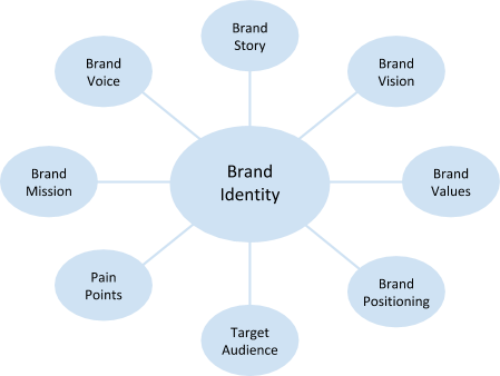
To start creating your brand identity, there are important questions you need to ask yourself. The answers to these questions will become the basics of your brand building.

How to Build a Graphic Design Brand

To start building a graphic design brand, answer these 8 questions first.

1. Why do you design?

Start with yourself. Who are you? Sure you’re a graphic designer, but everybody’s journey is different. Why did you start designing in the first place, and why did you continue to design? Think about what motivates you. And beyond that, why do you want to design for others? The answers to these questions become your brand story, and brand stories can eventually become powerful marketing tools.

2. Where do you want to go with your designs?

To make a plan, you need a goal. What do you want your design business to become? Ask yourself where you realistically want to be in 1 year, 5 years, and 10 years. This is your brand vision.

3. What is important to you?

If your brand vision is where you want to go, then your brand values describe how you get there. What are your core beliefs about design and about doing business? This might relate to your brand story from Question 1.

4. What do you do differently from others?

You have unique motivations, experiences and skills that are reflected through both the act of designing and your designs themselves. Think about what you do better than your competitors, or what you do differently from them. What makes your design process unique? What makes your designs unique? This differentiation becomes your brand positioning.

5. What kind of clients will want this kind of design?

You are not aiming to please everybody with your design services. Hitting a niche, or at least a specific segment of the population, is a lot stronger than targeting the general population. Will you focus on designing for individuals or businesses? Based on your brand story and positioning, do some research to understand the demographic that is most likely to give you design work. This is your target audience. You may even want to build a buyer persona around your ideal customer.

6. What problem do my designs solve for these clients?

Your ideal customer from Question 5 needs your design services for a reason. What is that reason? Identify the problems they have and why they want them solved. These problems are called your client’s pain points. Why can’t they solve these problems themselves, and why are other designers not able to solve these problems for them? And finally, think about how this client would benefit if you solved these problems for them.

7. What do you want your designs to do?

After your design leaves your studio or hard drive, what do you want them to accomplish? Of course you want them to help your clients resolve their pain points, but what about beyond that? This would relate to your core beliefs about design and potentially your brand story as well. Why does your brand exist at all? Answering these questions help you formulate your brand mission.

8. How do you tend to communicate?

Now that you have a good foundation for brand building, how do you want to communicate your brand to potential clients? The way you communicate includes both the channels that you most frequently use (e.g. social media, phone, etc.) and your tone of voice (e.g. friendly, professional, etc.). Now is also a good time to ask yourself why you use those particular channels and that tone of voice. Does it relate to your brand values and target audience? Your tone becomes your brand voice, so consider it carefully.

The answers to these brand building questions become your brand identity.


Now that you’ve answered the foundational questions to brand building, you’re finally ready to create the visual identity of your brand. And because you’ve done the background work, you’ll be able to portray your brand consistently and effectively. In addition, you’ll have plenty of material to work off of when it comes time to promote your brand.

To learn more on how to use our marketing products for Brand Building go to our website Blog at:https://www.printcafeli.com/blog/Print_Cafe_Blog.html


Tuesday, May 12, 2020

Etiquette Training for a New Generation

                          Etiquette Training for a New Generation

Johnny Oleksinski of the New York Post has a bone to pick with millennials and their bad manners. Consider one technology-related example:

“Last week I watched in horror as a 20-something girl carefully snapped a photo of a basket of onions,” said Oleksinski. “But we weren’t at a serene farm or the Marché d’Aligre in Paris — we were crammed into the Columbus Circle Whole Foods. Thousands of customers were streaming through the aisle trying to grab some garlic for their dinners, and Little Miss Annie Leibovitz was blocking traffic to get some artsy snaps of nightshades. Will she print out these photos? Nope. A pile of white spheres under fluorescent light is even too dull for Instagram. Next time, Annie, take a breath and think about where you are . . . Pay for your brie wrap and vamoose.”

Etiquette is Part of Your Brand


Oleksinski isn’t alone. Modern professionals are finding a suffocating relationship with technology has left them oblivious to social basics their elders took for granted.

Presentation, both personal and professional, is a key to showing who you are. And etiquette training of all kinds is making a resurgence for millennials.

“Etiquette is so much a part of your brand,” said Rachel Isgar, a Phoenix-based etiquette coach and author. “Just a few improvements can help your career.” 

People respond to people, and poor manners may mean a hindered partnership, a missed promotion, or a collapsed deal. Companies like Beaumont Etiquette, which runs a marquee “finishing program” in the Plaza Hotel of Manhattan, have recognized a unique need for social training in the modern generation.

For $125, a participant can take part in a two-hour group session that teaches courtesy gestures, personal hygiene, and a range of soft skills conducive to successful socializing.

“Even if it was not something you were taught as a child, anyone can learn to have good etiquette, and it’s up to you to teach yourself,” founder Myka Meiers said. “I think, sadly, people become very self-involved . . . and forget about others. What I wish these people could learn is that by spending just a little time each day making someone else happy and spreading kindness, even the smallest gesture, their lives could be so much more fulfilled.”

Meiers says honoring others includes everything from table manners to Twitter posts. Just as we once taught people to “think before you speak,” how much more crucial should it be to “think before you post?”

“If you don’t want your grandmother or your boss to read it, don’t post it,” Meiers said. “Once it’s on the web, it’s out there for good.”

Want to curb your own bad behavior? Consider ten smartphone tips for starters: 

 1. Never ignore those you’re with to make a call or text.


 2. Apologize to your guest if you need to respond to an important message.


 3. Never leave your ringer on in quiet places. 


 4. Never use offensive language while using your phone in public.


 5. Don’t post work-related complaints on social media.


 6. Don’t photograph everything.


 7. Never post on social media while you’re under the influence.


 8. Don’t place your phone on the table during meetings.


 9. Don’t text people about work outside of normal office hours.


10. Don’t dehumanize cashiers by using your phone while someone serves you.


Daniel Post-Senning, co-author of the 19th edition of “Emily Post’s Etiquette: Manners for Today,” says ultimately good manners are about putting others first, whether that’s online or at a dinner party. While social customs change, manners are timeless:

“Manners are really reflections of core principles,” Daniel says. “Consideration, respect and honesty.”


For more of our informative blogs go to: https://store.printcafeli.com/blog/Print_Cafe_Blog.html

Wednesday, August 29, 2018

Labels Are a Promotion that "Sticks" With Your Customers

Labels Are a Promotion that "Sticks" With Your Customers
Customers can be a difficult and fickle lot.
They're always shopping around for the "Next Big Thing," surfing your competitor's websites, and price-checking on their phones. With all the different business options available today, it can be tough to keep your business in their mind without spending thousands of dollars on local and digital advertising.

There's a smarter way to keep your customers engaged with your brand's identity without breaking the bank -- labels!

Labels are the ideal way to turn a basic and ho-hum bag or box into a full-color masterpiece that is interesting and fun. See how you can leverage labels to create a promotion that truly sticks with your customers.

Adding Excitement to Your Packaging

Basic white or kraft boxes and bags are simple, inexpensive packaging for your products, but they don't do anything for your brand identity.

When Maggie, a bakery owner, recently visited her local print shop, she was looking for a logo that could be printed on her various sizes of packaging. What she learned was that each size of packaging would require different setups to print the logo, and full-color printing on non-standard size items could get add up. After speaking with the sales team at the print shop, Maggie realized that there was a better option that would reduce the overall costs of using different packaging for her products.

Full-Color Labels in Any Size or Shape


Part of the challenge of running a bakery is that you're selling all different sizes and shapes of goods.

You may need a small bag for a donut or bagel, a nearly-square box for layer cakes, and a large rectangle for sheet cakes or a dozen baked goods. Creating a single logo for packaging that would look good on all of these sizes and shapes would be difficult. However, labels are so easy to create that you can utilize a variety of labels to make a custom-printed look that features a stunning full-color image.

Add Promotions When You Need Them


Labels are an incredibly versatile promotional tool.
You can add them to a package or leave them off to create a different mood or message for your customers. If you'd like to offer a coupon on a particular type of order -- for instance, a dozen donuts -- then you can utilize a label to attach a printed coupon to draw added attention to the offer. The label itself could become the offer, too. You could have a batch of labels printed offering "10% Off, Tomorrow Only" and then be able to pull out this promotion anytime sales are experiencing a bit of a slump.

Operational Labels

You can also use labels within your business to classify items at a glance.

For instance, a tiny sticker that denotes which day of the week a particular item was baked, or showing a 'Sell by' date. Write-on labels and waterproof labels are available based on your particular needs and are a great way to keep your business organized and running smoothly.

In this particular instance, Maggie was inspired to create a series of labels for each day of the week to indicate freshness to her customers. She also worked with a designer to envision a new look for her packaging that included a single-color package and full-color labels that added a pop of color and plenty of personality to her baked goods. Since people "eat with their eyes" it made good business sense for the packaging to be as appealing as possible!

Ready to revamp the look of your products or rev up your organizational skills see the Print Cafe of LI?

For more of our informative blogs go to: https://store.printcafeli.com/blog/Print_Cafe_Blog.html