The Print Cafe of LI, Inc.
For All of Your Marketing Needs
The Print Cafe of LI, Inc. is your Premier Long Island Printing Company.
We provide Marketing Products and Services throughout Nassau
and Suffolk Counties, as well as the 5 Boroughs. We service areas such as Mineola, Garden City, Hempstead, Lynbrook, Rockville Centre,
Westbury, Farmingdale, Manhasset.
We are the Company that comes to You !
Call for an Appointment 516-561-1468
Print Cafe of LI, Inc
Logo
Friday, August 6, 2021
The Do’s and Don’ts for Taking Better Pictures with Your iPhone
When it comes to great print marketing, high-quality images can make all the difference.
Since most people today have a smartphone they use for taking pictures rather than a digital camera, here are five do’s and don’ts for taking better pictures with your iPhone.
DO’S
1. Do use portrait mode when capturing pictures that focus on people.
Many forget to make good use of the portrait mode when capturing a friend or family member. Portrait mode will focus on the person only and blur out the background. This mimics the effect that a professional camera reflects.
2. Do keep your “live” feature on when taking pictures of moving objects or people.
Using the “live” feature comes in handy for things or people that move quickly, for instance – a busy baby or a sports game. After the live picture is captured, you will be able to go back, edit the picture, and choose which frame you’d like to be the key photo.
3. Do make sure your camera lens is not foggy or smudged.
This is something that is commonly overlooked when pulling your phone out to take a picture. Wiping off the lens with a cloth or t-shirt will make a marvelous difference in the clarity of your picture.
4. Do use the “auto” edit wand for each picture.
It’s as easy as it sounds! Clicking that auto edit wand will do wonders on your pictures if you don’t know where to start. It’ll auto-adjust the white balance, color tone, exposure, etc.
5. Do use natural lighting for better color and clarity.
Use sunlight at every chance you get. The more natural lighting you use, the less grainy your images will look. For example, standing near a window when indoors will allow natural lighting to come into your picture.
DON’TS
1. Don’t use the front camera for anything except selfies.
The front camera on an iPhone is usually a lower megapixel than the rear-facing camera. The images taken with the front-facing camera will turn out more “grainy” than images captured with the rear-facing camera.
2. Don’t stick to the default filters that Apple provides.
There are many other filters available, especially on Lightroom and for purchase, that provide better color for your pictures.
3. Don’t expect as high of quality when using iPhone pictures at a larger scale.
iPhone has a great camera, but it can’t be compared to a $2,000+ DSLR camera. If you’re looking to enlarge a picture for a canvas or banner, it’s best to rely on the use of a professional camera rather than a smartphone.
After following these tips, your iPhone pictures will be worth more than a thousand words. And, when you're ready to get those pictures out to the world through great print marketing, give us a call! Need some fresh ideas? Contact us today to get started! 516-561-1468 or FOR MORE INFORMATION ON ANY OF OUR MARKETING PRODUCTS GO TO: www.printcafeli.com
Tuesday, August 3, 2021
5 Tips for Hiring Better Talent in a Virtual World
Now that so many are accustomed to remote working, firms may face increasing demand to recruit and hire people without actually meeting them.
If you feel uneasy selecting candidates this way, here are some tips to get you started:
1. Identify the Ideal Medium to Find Candidates
It may require trial and error, but find your ideal medium and use it to streamline candidates that fit your specifications for experience, pay grade, etc.
2. Host a Virtual Career Fair or Company Presentation
To build rapport before any interviews take place, consider hosting a virtual career fair or company info session to interact with prospects.
Here you can weed out candidates you don’t want to interview or gain access to a more diverse talent pool.
3. Utilize Skill Assessments
Training can be challenging if you hire a remote workforce, so hiring competent individuals is especially important.
If you are onboarding offsite employees, you may want to add extra steps (like aptitude tests, writing samples, or mock presentations) to the interview process.
4. Use a Variety of Question Formats
Since in-person interviews offer greater nonverbal communication insights, you’ll probably need to craft more strategic questions for virtual interviews.
Start with basic questions (e.g., “tell me about yourself”), move to targeted queries that align with your company culture, and use behavioral questions that uncover character and critical thinking qualities. Finally, try assessing live performance as you ask a candidate to complete a task live (e.g., performing a technical function as they share their screen).
5. Prepare, Prepare, Prepare
To build a strong relational connection, eliminate as many distractions as possible.
It may help to send pre-interview packets to candidates to add efficiency to your meeting. Streamline the scheduling process by allowing candidates to sign up for an interview online. Test your technology 15 minutes before the call and have a backup plan if a malfunction occurs. And createa unified scoring system, so candidates receive standardized grading criteria.
Virtual recruiting will allow you to quickly and efficiently hire high-quality team members while adding flexibility. Implement a uniform system, so you have the skills you need to recruit and hire with confidence!Need some fresh ideas? Contact us today to get started! 516-561-1468 or FOR MORE INFORMATION ON ANY OF OUR MARKETING PRODUCTS GO TO: www.printcafeli.com
Friday, July 30, 2021
How to Inspire Action with Highly-Engaging Postcards
What do dentists and direct mail have in common?
New clients! Direct mail has proven to be a remarkable investment for small businesses of many kinds, especially for entrepreneurs looking to grow their client base.
Dr. Diep Truong (of Viva Dental) gave direct mail postcard marketing a try in 2011. After streamlining a process for mailer design, demographic targeting, and ROI reporting, thisIndiana-based facilityconsistently experienced a 400% ROI on their postcard campaigns, with a 50% conversion rate of inbound calls for scheduling appointments.
As 2020 kept people closer to home, attentiveness to direct mail has grown. As a result, response rates are high, and now is the time to invest in sharp, unique direct mail campaigns! Postcards are a particularly good investment, with oversized postcards garnering one of the highest direct mail response rates.
According to recent statistics, 23.4% of consumers say they would respond to relevant postcards of interest to them (compared to 7.9% for letter-sized envelopes).
Ready to wade into the water of a new postcard campaign? Here are a few steps to success in 2021:
Take a Multi-Pronged Approach
One of the biggest trends direct mail is seeing is the consolidation of online and offline advertising.
Take a multi-pronged approach to generating leads, so your social media ads prompt curiosity, but your print ads pack some punch with greater neurological impact.
Keep it Simple and Succinct
People are busy, and if they’re going to look at your mail, they’ll need a good reason.
Make sure your postcard leaps off the counter with unique imagery, splashy colors, a memorable catchphrase, or an unbeatable offer. And remember, when it comes to direct mail, less is more. Postcards that are sharp and straightforward will communicate much more than those packed with content.
If people’s hearts are in the driver’s seat, then direct mail should aim straight at this target. Research shows that the primary emotional appeals that prompt action are:
Fear
Greed
Anger
Guilt
Flattery
Exclusivity
Salvation
Experiment with Specialty Branding Features
Because postcards are so economical, there’s lots of room to add embellishments.
Try haptic coatings, embossed logos, foil-flecked accents, or even scents. When Sunsilk co-creations wanted to snag more customers, they decided to add an experiential element to their designs. Its gorgeous lime and hot pink postcards came with a tiny shampoo sample attached and a scented trial as well: “scratch to smell the new fruity fresh fragrance of this apple-coconut shampoo!” Customers may not sniff shampoo in the store aisle, but a scented postcard is irresistible!
Specialty branding makes a stronger impression on readers as they physically interact with your marketing. So build curiosity and engagement with these fresh, creative designs.
Postcards Inspire Action
Postcards are distinct, direct, and easy to read.
50.9% of people say they find postcards useful, and direct mail as a whole is especially inspiring to young people. Because many people today are glued to their phones,millennials, in particular, say that postal mail inspires them to action much more often than email (in fact, 30% say direct mail is effective in getting them to visit a website, go to a store, or make a purchase).
When you are ready to take your postcard marketing efforts to the next level, sign up for a personal consultation with one of our mailing experts. Our work-in-progress partnership will simplify each step and position your business for maximum impact!
Need some fresh ideas? Contact us today to get started! 516-561-1468 or FOR MORE INFORMATION ON ANY OF OUR MARKETING PRODUCTS GO TO:www.printcafeli.com
Tuesday, July 27, 2021
Raster Images vs. Vector Graphics – What’s the Difference and Why is it Important?
Do you ever wonder why something you printed turned out pixelated or blurry?
That’s because the image used was raster -- meaning that it’s composed of pixels that can only be scaled to a certain degree. Therefore, to achieve a crisp and clean look, a file must be vectorized. Confused? Don’t fret. Continue reading to understand what these terms really mean.
Raster Images
The most common form of raster images are digitized photographs, detailed graphics, or scanned artwork.
Raster images are pixel-based, meaning they’re composed of a grid of individual pixels in which each pixel is coded in a specific hue or shade. Because raster images are pixel-based, they suffer from image degradation (this is not a disease, rather an effect of a cause). The same way a photographic image gets blurry and imprecise when enlarged, a raster image gets rough and jagged.
In order to maximize the quality of a raster image, the resolution must be high. Meaning from the time the image was created, it must be created at a high resolution, as it becomes much more challenging to take a low-resolution image and attempt to enlarge it to a high resolution. This is nearly impossible unless you have the right equipment. The most common raster file formats include JPEG, GIF, TIFF, PCX, and BMP files.
Vector Graphics
When understanding vector graphics, think of geometric shapes such as polygons, lines, curves, circles, and rectangles.
These graphics are mostly images that have been created or designed rather than images that were captured or scanned. Examples would be a business logo, a t-shirt design, or the graphics in a catalog. Vector images are quickly and easily scalable. There is no limit as to how large or how small a vector graphic can be scaled. No matter what size, the graphic will never look pixelated or blurry. Because these graphics aren’t composed of millions of tiny pixels, they’re much more efficient and versatile when developing and printing. File formats most commonly used for vector graphics are AI, EPS, SVG, and sometimes PDF.
Both raster images and vector graphics are used for printing purposes. Neither one is better than the other. Applying the knowledge of why their differences are important will help when deciding how to create an image and the best option for printing.
Need some fresh ideas? Contact us today to get started! 516-561-1468 or FOR MORE INFORMATION ON ANY OF OUR MARKETING PRODUCTS GO TO: www.printcafeli.com
Friday, July 23, 2021
How Print QR Code Cards are Marketing Genius
Business cards, postcards, and other print marketing pieces with QR codes can be extremely effective in developing support for your business, especially when starting from the ground floor.
Utilizing the Graphic Ease of a QR Code
The QR code is ideal for an immediate and instant connection to a large range of audiences because it doesn’t require a lot of comprehension.
Instead, the technology behind the QR code uses what people are already carrying, a smartphone or image-reading mobile device. So, all that needs to be done is for your audience to use the mobile device camera and capture the QR code. Then, it automatically provides a hyperlink to the given digital information associated with the specific image.
Effective Communication
Unlike QR images on doors, posters, or websites, did you know the QR code on a card or postcard can actually be retained better?
While one QR code can easily be scanned right away, the problem is when a viewer has multiple QR codes to deal with. They start scanning and clicking, and soon enough, the first code is forgotten, and the second or third becomes the attention focus.
However, with a business card or postcard, one can store it quickly and then remember it again later when there’s more time. That retention often makes printed QR code handouts far more effective overall from a marketing perspective.
Affordable and Budget Competitive
One of the best advantages of printed QR code postcards and business cards is how cost-effective they are.
Small businesses and cost-conscious larger players can all take advantage of print orders for low market expenses and high-impact results. Need some fresh ideas? Contact us today to get started! 516-561-1468 or FOR MORE INFORMATION ON ANY OF OUR MARKETING PRODUCTS GO TO: www.printcafeli.com
Tuesday, July 20, 2021
Add Zest to Summer Designs with 10 Hot Color Combos
It has been said that color is a power that directly influences our soul.
A common obstacle for designers is choosing colors. And you should not take this choice lightly! There is great energy in certain combinations – a good color palette will be unique, seductive, and harmonious.
Warmer seasonal temps offer a great chance to color outside the lines with playful, lavish options. Need inspiration? Here are a few feisty blends for your summer design toolbox:
10 Feisty Blends for Your Summer Design Toolbox
1. Cool Gray – Neon Orange – Plum Purple
These call-to-action colors bring a sense of health and vibrancy, with an air of sophistication and an invitation to adventure.
2. Magenta – Vibrant Turquoise – Black
Fire up confidence with bright shades that bring flavor and fun!
3. Sapphire Blue – Shadow Gray – Neon Yellow
Like a bright peacock feather, this gorgeous blue-green combination brings a royal, confident air to any page.
4. Bright Green – Dark Violet – Lava Gray
Like a sunset dip in the Caribbean, these rich colors satisfy the soul in a lush, confident array.
5. Flaming Fuchsia – Black – Sandy Tan
Want to steal the stage with your design? The bold contrasts in this palette exude vibrance, feminine strength, and a rugged road for the journey.
6. Solar Yellow – Electric Blue – Charcoal
When you want to add punch to your page, the rich extremes of this triad bring a fluorescent finish that is fierce yet fun!
7. Pearl Aqua – Cyber Grape – Daisy Yellow
These colors bring a burst of energy with bright hues and an interesting, sophisticated contrast.
8. Lime Punch – Cool Gray – Tangerine
Heat up appetites with this tropical, zesty arrangement that will compel people to give your business a try!
9. Terra Firma Green – Magenta – Sunlight Yellow
Like interwoven threads of a tribal mosaic, the sharp contrasts in this palette bring a sense of depth, mystery, and variety.
10. Carnation – Dark Lilac – Peachy Rose
Like a seashell deposited on a white-washed beach, this royal blend awakens a sense of purity and opulence, projecting an air of poise and splendor.
Find Your Favorites in Nature
Still looking for just the right blend? The natural world is a great place to look.
-- The sunset is not just orange; it is apricot, bronze, mauve, and amber.
-- A tropical beach is not just blue; it is turquoise, coral, tan, and chartreuse.
-- A poplar tree is not just green; it is a mix of jungle green, lime, silver-green, light brown, cool gray, and white.
When you find a natural image that inspires you, snap a photo and take it to the drawing board. Sample distinct colors from different parts of the photo and examine which hues move you the most. Most compelling swaths from nature include a system of colors ranging from dark to light and intense to soft. Find what is unique and powerful about these grand images and replicate them in your own seasonal designs.
The psychological association of a color can often be more potent than a visual impression. So be intentional (but brave!) with your summer palettes, and let these blends sell for you!
Need some fresh ideas? Contact us today to get started! 516-561-1468 or FOR MORE INFORMATION ON ANY OF OUR MARKETING PRODUCTS GO TO: www.printcafeli.com
Can you believe that by this October, it will have been a decade since Instagram was first launched? Graphic designers, in particular, have been using this popular social media platform to promote their design services since the beginning. Over the years, however, Instagram has become saturated with talent, and now it’s a real challenge to stand out.
Countless social media gurus have taken it upon themselves to provide Instagram tips for graphic designers, but as times change, so do strategies. In our article, we’ll take some of the most outdated, clichéd Instagram tips for graphic designers and transform them into practical strategies that are perfect for standing out.
7 Clichéd Instagram Tips for Graphic Designers
Write a bio
Show off your best work
Write captions for your images
Use popular hashtags
Post often
Switch to a business account
Connect with influencers
7 Useful Instagram Tips for Graphic Designers
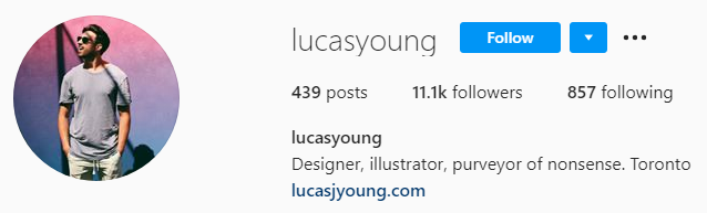
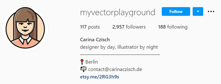
1. Write a clear bio that resonates with your audience and include a link.
It’s not about whether or not you have a bio (you should know already that you need one). Rather, it’s about what you put in it. You have a 150 character limit, and it’s the only place you’ll be able to link to anywhere. Here are the top 5 things you need for a standout Instagram bio:
Your name. If your Instagram handle doesn’t make it clear what your name is, include it in the bio.
Your services. Tell them what kind of designing you do.
Something personal. This should be something that people can relate to, or something quirky that makes you stand out.
Link to portfolio. This is preferably your website instead of just another social media account.
A city. This is becoming increasingly common because Instagram users want to know where you’re based.
Other optional things include a hashtag (no more than one) and emojis (best used as bullet points).
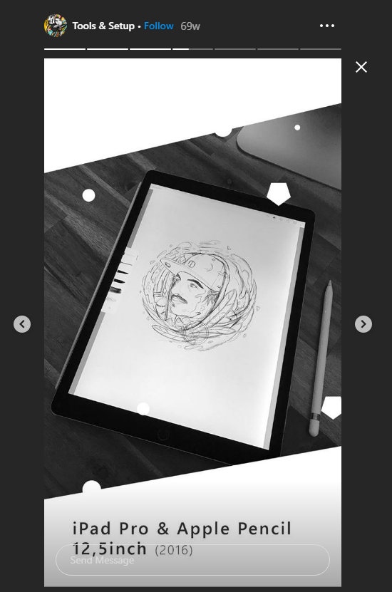
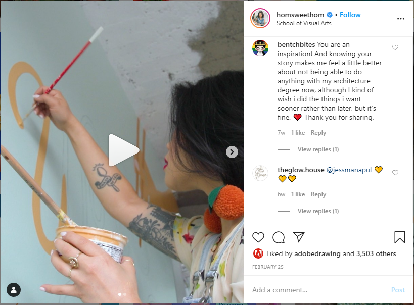
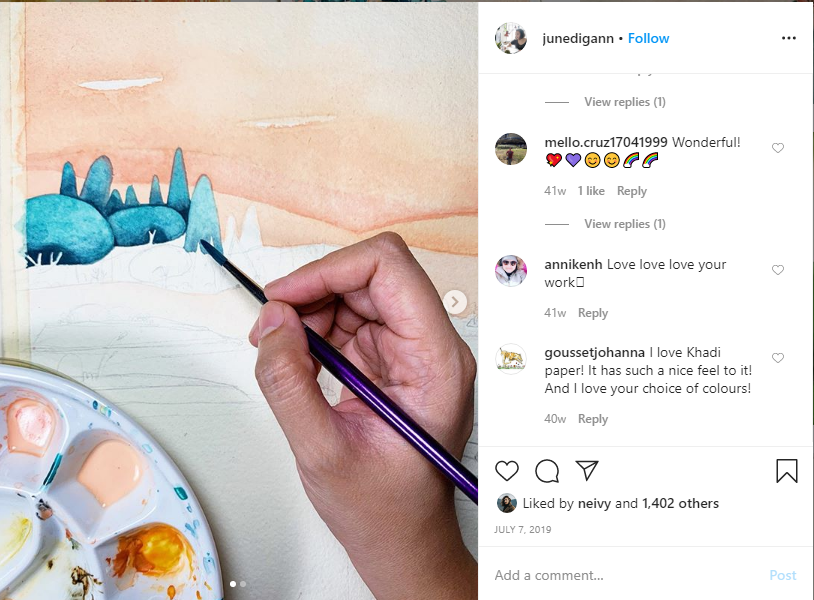
The old advice of showing your best work is good, but just like a portfolio, you should also show images and/or videos of your processes. Between your completed masterpieces, you can post other things (including Instagram stories) such as:
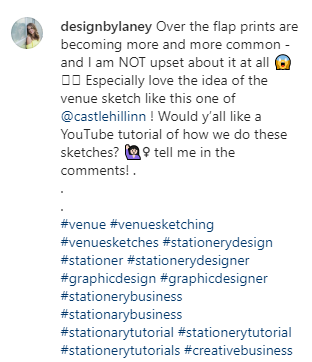
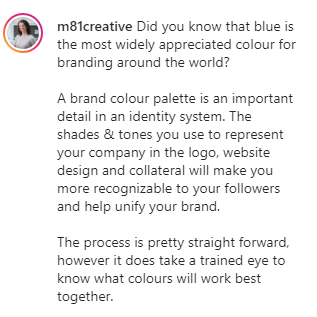
3. Write captions that bring value to your audience.
Like your bio, your captions need to do more than just exist. They need to exist for a reason.
Here are some good reasons for your caption’s existence:
Getting your audience to interact (through swiping, comments, going to bio, etc.)
Teaching your audience something that they wanted to know
Entertaining your audience so that you get more followers
Here are some bad reasons for your caption’s existence:
Explaining what the picture is (if they can’t tell, that’s not a good sign)
Telling your audience what the design is for (usually they won’t care unless it’s for a very high-profile company)
Telling everyone to follow your account (you can do this in the caption, but there should be more than just this or else nobody will bother)
There are three very important things to keep in mind when writing captions:
Keep things easy to read. This means splitting up long sentences and paragraphs, using emojis, etc. Don’t write novels because your audience will generally not read them.
Make things interactive whenever you can. Get your audience to comment when possible to build community and loyalty. Just make sure you respond to their comments too.
Keep it relevant to the picture or video. Not only is a disconnect confusing, but it also makes the audience feel like they’ve been ripped off.
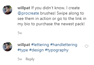
4. Use relevant hashtags that range from popular to specific.
Hashtags are ultra-important in Instagram, but that doesn’t mean you should just use as many as you can and always aim for the most popular ones. You should use both popular hashtags and ones that are more specific.
Popular hashtags help you show up on more feeds, but you’re less likely to get noticed because those feeds are refreshing regularly with hundreds or thousands of posts. Specific hashtags may show up on less people’s feeds, but they help you get noticed more because there is less competition.
5. Post regularly with a predictable schedule.
People like knowing what to expect, and when to expect it. If you’re posting daily, choose a consistent time of the day. If you’re posting a few times a week, choose the same days of the week for doing that.
Space out your posts so that it looks like you are posting regularly instead of dumping all your posts and then disappearing for three weeks. It helps you look more active, which will encourage people to follow you. It also keeps people following you because you don’t spam their feed.
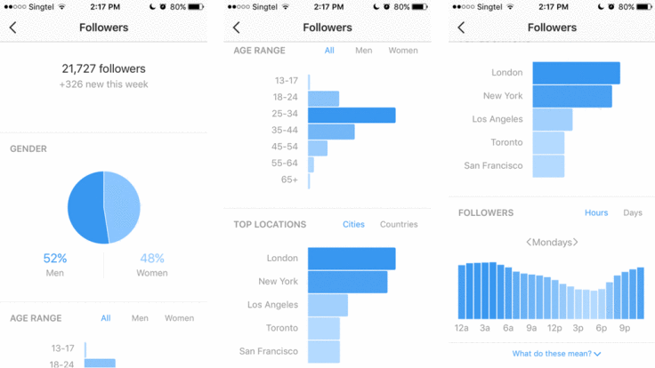
6. Track your results
If you just want to track likes, comments, and follows, you can do that without a business account. But if you’re serious about growth and track more metrics, then an Instagram business account is a must-have. It allows you to track the following:
Post reach (how many people see it)
Post impressions (how many times it has been seen)
Profile visitors (how many people visit your profile)
Link clicks (how many clicks the link in your bio got clicked)
Having this information helps you make wiser choices about which posts to promote and what kind of posts to publish in the future.
Here’s what you can expect to see from Instagram analytics.
7. Connect with relevant influencers (and think like one yourself).
Don’t just reach out to any and every influencer. Instead, ask these questions first:
Would I actually enjoy working with this person?
Would my target audience like this person?
What value can I provide to this influencer?
What value would this influencer provide to me?
And last but not least, think like an influencer yourself. Support brands and issues that you care about. Choose who you say “yes” to carefully. Think about how your audience would react to your content. You may not have the same number of followers as some of the big name influencers on social media, but you have some followers, and that means you still wield a degree of influence. Use it wisely and resourcefully.Need some fresh ideas? Contact us today to get started! 516-561-1468 or FOR MORE INFORMATION ON ANY OF OUR MARKETING PRODUCTS GO TO: www.printcafeli.com