Print Cafe of LI, Inc

Print Cafe of LI, Inc
Logo
Showing posts with label #printingservices #booklet #catalog printing #printing long island #printing new york city #advertising #design #custom labels #signs #banners #printing new jersey. Show all posts

Thursday, July 13, 2023

How to Make Your Banners 

Look Like a Million Bucks

Are you attending a trade show or job fair and need your banner to make an impact?

Banners are an incredibly popular marketing tool due to their instant message delivery, cost efficiency, simplicity in assembly/dismantling, and durability.

Ensure the maximum number of people sees your banner by designing one that looks like a million bucks.

7 Tips to Create Eye-Catching Banners

1. Lead with Your Brand

Make sure to leverage the most influential real estate by placing your logo at the top of your banner.

This is the spot your viewers will automatically look at and what they will most likely recall afterward.

Positioning your company logo and name in this area can help create an immediate connection with people who come across it, allowing them to recognize and remember you quickly!

2. Keep Your Message Brief

Use as few words as possible to attract attention and convey your message.

By avoiding excess text, you can ensure that onlookers aren't overwhelmed by an overcrowded banner.

Strive for conciseness - key phrases are all it takes to get noticed!

3. Incorporate Your Brand's Color Palette

Incorporate your company's signature colors into the banner.

Remember, sometimes simpler is better. Your color scheme should contribute to branding, not overshadow it with too many hues and saturations.

Ensure your palette complements the content while helping you communicate a consistent message across all platforms. 

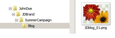
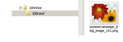
4. Utilize High-Quality Images

When designing your banner, rely on high-resolution visuals for maximum impact.

The sharper and more vivid the colors are, the easier they will be noticed by passersby.

Use a single premium image instead of overcrowding your banner with numerous lower-quality graphics for optimal results.

5. Include Your Contact Information

Prominently display your website URL, phone number, and relevant social media icons on your banner for maximum visibility.

Take your business to the next level with a QR code, enabling potential customers to instantly scan and store contact information on their smartphones.

Giving people easy access to connect with you later is essential.

6. Select the Correct Size

When selecting the right banner size for your chosen purpose, it is essential to get it right.

Oversized banners can be overwhelming and intrusive, while undersized banners may not attract the attention you seek. 

To ensure that you make a statement, choose wisely when deciding on the dimensions of your banner to create maximum impact in its appropriate setting. 

7. Use High-Quality Materials

Choose fabrics such as polyester or canvas to ensure your banner stands up against the elements and is durable enough for long-term use.

Waterproof ink is a great way to protect your banner's colors from fading, allowing you to maintain maximum visual impact and reuse your banner for subsequent campaigns. 

A cleverly designed banner helps to draw attention to your message, showcase your branding, and ensure your banner withstands the elements for years to come.

Ready to get started designing your next banner? Contact us today. We're here to help! 

Call: 516-561-1468


Thursday, July 6, 2023

8 Special Day-Themed Direct Mail 

Campaign Ideas for Summer

Summer is approaching, and along with the warm weather come dozens of opportunities for your company to connect with customers!

Creative campaigns are one of the best ways to engage customers and inspire them to purchase from you. Why not try discounts and promotions centered around unique holidays? 

Research has shown that consumers respond more positively to special day-themed products and promotions than to ordinary campaigns. So here are eight ideas for special day-themed promotions to use in your direct mail this summer!

8 Creative Summer Special-Day Promotion Ideas

1. June 2nd- National Donut Day 

Who wouldn’t be motivated by a sweet incentive?

Try mailing coupons that read “Bring in this coupon for a free donut with purchase!” to draw customers to your store. 

2. June 5th- Thank You Day  

This is a great time to reinforce connections with existing customers.

Mail out a card from your company thanking your customers for their loyalty and choosing to use your services! 

You could even add a discount code (ex., THANK-YOU-5) to nudge them toward another purchase.

3. June 11th- National Children’s Day

A day to celebrate kids should always be celebrated!

Let your customers with families know you’re supporting them and appreciate them by doing something fun for their kids. 

You could include a kids’ craft or coloring page in your mailing packet and information about a sale on any kid’s clothing, decorations, bedding, toys, or games your company might sell. 

4. June 22nd- Positive Media Day 

This is an excellent opportunity to bolster your company’s social media presence!

Mail out a flier celebrating Positive Media Day and encourage customers to follow your company’s accounts. 

You could also introduce a “challenge” for customers to make a funny or uplifting social media post and use your company’s designated hashtag along with #positivemediaday to be entered into a giveaway!

5. June 27th- National Sunglasses Day 

There are a couple of ways you could get creative with this day.

You could try offering a free pair of branded sunglasses to each customer that stops by, offering a discount for each customer that comes into your store wearing their sunglasses, or an online coupon code such as SUNNIES-10 for 10% off.

6. July 12th- National Simplicity Day

Embrace the simple things at your company with this holiday, and encourage customers to do the same by offering a sale price on the “basics.” 

A great way to do this is to create an “essentials” bundle or package of different services and products at a discounted price. Consider sending direct mail that uses the tagline “Keeping it Simple with a National Simplicity Day Sale” or something similar. 

7. July 15th- National Give Something Away Day

In honor of Give Something Away Day, you could give something away to your customers!

The Zero Price Effect has rationalized that customers perceive free products to have a high value because there’s no risk to it since they’re not spending anything. 

An easy example would be a BOGO (buy one, get one) sale or simply including a product of lesser value as a “gift” with any purchase made on that day. 

8. August 8th- National Dollar Day

A creative design for a direct mail piece celebrating National Dollar Day would be to create a rectangular postcard printed with a dollar bill-like image and advertising $1 off each product or service purchased that day.

Go ahead and use some of these ideas, or create your own, to celebrate unique holidays and engage your customers with your direct mail this summer! And when you are ready to print, give us a call. 516-561-1468


Thursday, May 25, 2023

5 Helpful Hints for Print 

Marketing with Booklets

Booklets are a powerful marketing tool for attracting attention, informing the public, or educating customers.
 
Not only can booklets capture your target audience's interest, but they also convey critical messages accurately on various topics.
 
Handing out booklets can be an excellent way to increase brand awareness and subject matter authority. 
 
If you are considering giving this useful product a try, here are some helpful tips to make your booklets successful.

5 Helpful Hints for Print Marketing with Booklets

Before you hit the publish button, consider these five valuable tips!

1. Focus on Proper Brand Positioning

Your booklet's title, brand, and logo are critical components, conveying to potential customers what the booklet is about and why it matters.

If the introductory elements of the booklet are ambiguous, then the booklet's impact will be diminished. 

Consider these additional suggestions for effective brand positioning:

  • Ensure your booklet's logo, title, and brand are loud and proud at the top of its cover page.
  • Design eye-catching font in big, bold letters to draw attention quickly.
  • Consider adding a specific image associated with your organization, event, brand, or business that readers can easily remember as an additional way to make it stand out from others. 

2. Ensure Ease of Reading and Clarity of Your Message

To ensure your booklet communicates its desired message, be sure it is both easy to read and clear to understand.
 
An essential part of ensuring ease of readability and clarity of message is taking the time to read through your work with a critical eye before sending it off for printing.

Remember that too much information can overwhelm readers, while insufficient will seem inconsistent. Thoughtfully consider what amount of content conveys just enough detail without overloading readers so they understand precisely what you want them to know.

3. Select Effective, Engaging Images

The visuals you choose to incorporate in your booklet are fundamental.

Images can capture people's attention and draw them into reading more. For maximum impact, ensure every image in your booklet is of excellent quality. Grainy photos just won't cut it!
 
Since booklets provide more room than other media types, such as brochures or leaflets, take advantage of the added space by including graphs and charts, which will help clarify information for your readers.
 
This lets your potential customers understand exactly what you're trying to convey quickly and clearly. 

4. Employ Vibrant, Eye-Catching Colors

The design of your booklet matters!

The colors selected should be captivating, engaging viewers while creating a visually pleasing experience.
 
Utilize vibrant and appealing hues to attract people to your content.

5. Display Your Contact Information Prominently

Your contact information must stand out to ensure that your booklet is successful.
 
Whether you are advertising for a business or event, including multiple points of contact should be a top priority!
 
Consider adding contact information, such as an email address or website URL, at the end of your booklet, so readers know where to reach you if they have any questions or comments about what was covered.
 
These five valuable tips equip you with all the tools necessary for success!

Are you considering booklets for your next print marketing initiative? We can help! Contact us by phone or email to get started. Phone:516-561-1468 Email: theprintcafe2@verizon.net


Thursday, May 18, 2023

 7 Creative Folding Ideas for 

Your Printing: An Inspiration Guide

By Haidan Dong

Folding is not just for brochures and greeting cards. These are the most common folded print products because folding is often seen as simply an effective way to present a lot of content within a limited space. While this is true, folding can do much more than that. It can make a big impact through the way it interacts with design, stock, and product function.

Here are 7 folding ideas to inspire you and your clients, whether you’re a printer, a designer, or anybody else who works with printed products.

1. Fold something that’s not usually folded.

Folded brochures and cards are usually easier to take with you than bulkier print items, so what if you took the content on those bulky items and designed them for folding?

You could, for example, take the contents of a wall calendar and turn it into an accordion-style folded card, like this example.

Impact: Makes content more versatile without losing function.

2. Leave a tab.

You don’t always have to fold your products so that the edges line up. Leaving a tab or a lip can get the user curious about what’s inside the fold.

In this example, the promotions on the tab encourage the user to see what’s on the menu inside.

Source:SK Print Design

Impact: Shows only part of the content to generate curiosity.

3.  Fold a die cut piece.

Die cutting can cost a lot, but it makes a big difference if you want your folding to create a unique, creative effect. The cut shapes layer over each other when folded to add a new dimension to the design.

Here’s an example of a die cut brochure that combines this idea with intentionally uneven folding, which creates layers.

Source:Print It

Impact: Generates interest and makes the item stand out through uniqueness.

4. Create an unusual shape with folding.

If you’re looking to customize the shape of print products without die cutting, folding can do this as well. You can do this with foldable print product to turn its regular rectangular shape into something more unusual.

In this example, the folding turns a standard shaped flyer into a parallelogram and even back into a rectangle.


Source:Noelle Mullins Design

Impact: Presents the information in an unconventional, eye-catching way.

5. Make a folded label.

This idea combines the adhesive properties of roll labels with the functionality of brochures. Leave one panel or just an edge blank so that once it’s folded, you can apply the adhesive and attach it to the surface of a product.

Booklet labels are a common example of this. You can often see them on hazardous, pharmaceutical, and cosmetic products.

Source: JH Bertrand

Impact: Folds a large amount of information into a small space.

6. Fold signage.

Folding signage turns 2-dimensional products into a 3-dimensional ones. Some materials such as coroplast require scoring before you can fold them, but the end result is functional, versatile, and sturdy when done correctly.

Here’s an example of folded signage in the form of bollard signs. While these are less popular in North America, the idea can be applied to signage in places where yard signs aren’t feasible.

Source:Universal Banners

Impact: Allows signs to be viewed from multiple directions at once.

7. Use folding to mimic your design.

Design and folding should work together instead of limiting each other. If you know that a piece will eventually be folded, you can design the piece intentionally so that the folding will imitate an element of the design.

In the example below, the door in the design opens with the gate fold of the brochure.

Source:Real Marketing

Impact: Lets users interact more physically with the design.

Preparing the print file for folding

Working with folding can get tricky, especially when you’re preparing the file for printing. The Print Cafe has file Templates for the most common types of folding that you can modify for more complex designs and folds. It’s a good idea to start with simple folded print products first. For Information on this Subject and others Call: 516-561-1468


Tuesday, May 16, 2023

What is BOPP? And Why 

Make Labels From It? By:  

What is BOPP exactly?

BOPP stands for biaxially-oriented polypropylene. It’s a variant of polypropylene (PP). Polypropylene a thermoplastic polymer, alternately known as polypropene. It’s an ideal printing surface and can be made into labels and stickers, as well as textiles and a host of different plastic parts and materials.

BOPP is essentially polypropylene that’s stretched flat. BOPP is oriented with a system that stretches it in two directions. This is where the “biaxially-oriented (BO)” part of BOPP comes from. The three most common processes for making BOPP are the tenter frame sequential process, simultaneous tenter frame orientation, and the double bubble process. This technical document from Brueckner-Maschinenbau, one of the oldest BOPP manufacturers, explains these processes in more detail.

BOPP parent material, PP, is the world’s second most produced synthetic plastic, after polyethylene (PE). It’s economical to produce while offering incredibly useful performance characteristics.

Common applications for polypropylene and BOPP include:

  • Packaging labels
  • Food containers
  • Plastic ropes
  • Medical-grade plastics
  • Laboratory items
  • Performance textiles

What are BOPP film’s qualities?

BOPP shares the properties of other PP plastics, including ruggedness, fatigue resistance, moisture resistance, very low toxicity, flexible finishing options, as well a controllable transparency (manufacturers can make BOPP clear, nontransparent, or any translucency in between). Also, while they make long-lasting labels and stickers and easily printable, most off-the-shelf adhesives have trouble attaching themselves to the material. These qualities are perfect for long-lasting, food-safe labels and other common BOPP film applications.


Why is BOPP such a great material for labels?

BOPP film can be white, metal-colored, or clear. The ability to make clear BOPP film allows the creation of transparent labels to show off the contents of clear containers. With the appropriate inks and adhesives, BOPP labels can also be waterproof. BOPP labels immersed in ice-water or subjected to high-humidity without deteriorating. Labels made from BOPP are extremely tough. The material offers exceptional resistance to fatigue compared to other common label materials and has an unusual resistance to common solvents, bases, and acids.

For food labels, BOPP film offers significant advantages. It’s non-toxic. The material’s also resistant to solvents and acids. Many food and beverage items, such as those containing tomatoes, citrus, or coffee, are quite acidic. Even when the items don’t directly touch the labels, there can be some off-gassing or limited contact during the manufacturing process that can stain or cause deterioration in other label materials. Using BOPP film for your labels can help mitigate this issue. These same properties make BOPP well-suited for bottle labelsjar labels, and canning labels.

For More Information on any of our Label Products Call or Visit Our Website at: www.printcafeli.com


Tuesday, May 9, 2023

3 Fresh Color Combinations 

to Shake Up Your 

Next Flyer Design

Did you know the colors you select for your flyers can be the difference between them getting noticed or not?

If you're planning your next flyer design, we have a few combos (and the theory behind them) to help you get more eyes on the page. 

Why It Matters 

Brands don't have much time to make an impression. Most people judge products or services within 90 seconds, and up to 90% of that assessment is based solely on color. If people have limited bandwidth to absorb a flyer, you can't neglect how the colors come across to them. 

3 Fresh Color Combinations to Shake Up Your Next Flyer Design

Baby Blue & Peach 

Light colors have a way of lifting people's spirits by introducing some softness to the eyes.

Pastels have been a significant design trend as of late, mainly because bold and brash colors can be hard to look at for too long. They might attract some notice immediately, but the effects can be offputting with more than a minimal glance. 

Light blue and peach look beautiful together because they play off each other's natural tones, and their beauty throws the focus on the text without diminishing the design's visual appeal.

As your brand likely already has preferred colors, consider how a different color palette could be used for whatever you want to advertise. For instance, if you're having a soft launch of a new product, this could be a perfect selection. 

Gradient Green to Purple 

Gradient designs are excellent for making your flyer eye-catching without being too obvious.

The blend of colors in different hues draws your sight into a specific direction and prompts people to read the words too. So in much the same way as you'd want to stare at a rainbow, the color theory is that your eye is intrigued by how one shade harmonizes with the next. 

While you can pull this off in various combinations, green and purple are complementary colors. The high contrast will pop, and you can use the intermediate section to lessen the intensity of the colors.

With the two brightest colors at opposite ends of the spectrum, you can imagine that the words in the middle will stand out even more. 

Cherry Red and Gold 

Red and gold colors are typically associated with luxury and are typically standouts wherever they're placed.

Highly recommended for flyers that will be posted in crowded spaces, this energetic and passionate combo would be excellent for brands that are passionate and ready for action. 

If you want to play with this color combination without overwhelming the view, consider how a stark white background and hints of cherry red and gold could make an impression. This option still plays up the luxury angle but may have more impact if used sparingly. 

Flyer color combinations should, in part, reflect the overall branding sensibilities you've already chosen. However, just because your logo, fonts, and graphics are always in the same color scheme doesn't mean you can never mix things up.

If you want to experiment with a new flyer design, use these color combinations to inspire people to take a fresh look at what you can do for them. Or contact us to help you develop a unique color combination that perfectly fits your brand! Call Today! 516-561-1468


Tuesday, May 2, 2023

Attract More Qualified Leads 

Using Print Marketing


Print media can be an effective tool for generating leads and capturing the interest of potential customers.

With 73% of all consumers showing a preference for print advertising, it's easy to see that print media is still an excellent business initiative today!

How to Attract More Qualified Leads Using Print Marketing

Both affordable and accessible, print marketing can be leveraged to increase your lead generation and capture. Here's how:

1. Identify Your Target Audience

To create effective print materials that will speak directly to your target audience, it is essential to clearly understand who they are, their needs and interests, and how they prefer to receive information.

2. Determine Your Print Materials

Once you have pinpointed your target audience, the next step is determining which print materials will be most effective for reaching them.

This may include business cards, brochures, flyers, magazines, newsletters, or postcards.

3. Design Your Materials

Having determined what materials you will use to reach your target audience, the design process can begin! 

The right images, colors, and fonts will resonate with your target audience and help reinforce your brand.

4. Select Quality Print Supplies

When printing your materials, don't overlook the importance of high-quality paper and ink to produce an eye-catching result.

Our expert team can advise you on the perfect products for your project! 

5. Track Your Success

After launching your print campaign, it is vital to track its success so you can determine what is working and where improvements need to be made.

This critical business strategy could include tracking website visits, social media engagement, and direct contact with your leads.

Capturing Leads Through Printed Materials

Integrating traditional and online marketing methods could prove invaluable in attracting more leads than either strategy alone. Consider these suggestions:

Personalized Mail

Using personalized letters to reach customers is a foolproof way to increase response rates.

To create an immediate bond with readers, tailor your direct mail campaigns to each region by incorporating local landmarks or events.

Response Cards

Direct mail campaigns are a great sales booster.

Your direct mail campaign can create incredible conversion rates with the right incentives and attractive offers.

Maximize this opportunity by creating attractive brochures and including order forms that can be sent back via the mail.

Consider using this for customer feedback surveys to identify areas where your business could grow.

Promote Online Resources with Print Products

Enhance your social media competitions by asking customers to post images of your product or store and include a unique hashtag only available through direct mail, postcards, or posters.

This is an effective way to ensure that participants have seen your print materials and are engaged in the promotion.

Business Cards

Exchange business cards with potential customers in a professional setting to ensure that your lead-generation efforts are successful.

You can ensure each party gains contacts or leads by taking the initiative and exchanging cards during networking events.

You could print specialized cards for trade shows or events demonstrating how your business fits in with the exhibition to stand out and make a lasting impression.

This will create an unforgettable memory of you and your brand - plus, quick follow-ups are an excellent way to rapidly grow your network of connections and possible sales opportunities.

Are you looking to increase the reach of your print marketing materials? We can help. Contact us for print media that is sure to make an impact! Call Now! 516-561-1468


Tuesday, April 4, 2023

A Graphic Designer’s Guide 

to Better File Naming

Haidan Dong By Haidan Dong 

Ever had trouble looking for the right file? You tried to run a search but couldn’t because the file name was irrelevant to the project. Or you opened your file logofinalfinalupdated.ai when the correct file was actually logofinalfinaledited2.ai. Needless to say, having an organized file naming structure is important for graphic designers.

Why should I have a file naming structure?

Having a file naming structure helps you in a number of different ways.

  • It helps you stay organized, so that you can save time
  • It reduces the chances of mistakes
  • It makes communicating with clients easier
  • It makes working with team members easier
  • It makes files and folders easier to search for
  • It improves SEO
  • It improves the readability of the file names
  • It elevates your professionalism as a graphic designer

How should I name my design files?

There are many different file naming conventions and there isn’t a “right” way, but you need to include the elements that are important to your own workflow. The following list contains some elements that many graphic designers find helpful in file names. Pick the ones that you think would help you identify the file more easily:

  • Client name, initials or last name (e.g. JohnDoe)
  • Client’s brand (e.g. JDBrand)
  • Name of client’s campaign (e.g. SummerCampaign)
  • Channel within that campaign (e.g. blog)
  • Component needed for channel (e.g. image)
  • Date (e.g. 2019_05_30)
  • Version number (e.g. v01)

You will very likely not need all the elements. For example, maybe you only work on one project per client, and you specialize in business cards. In this case, you probably won’t need the name of your client’s campaign. Or maybe you tend to finish a project in one day, so you need the version number more than the date. Choose the elements that meet your unique work needs.

Now string these elements together to create your file name. If it looks too long, check out the next section below.

How long should my file name be?

If your file name is too long, it tends to get truncated when displayed. This truncation varies between operating systems and devices, so there isn’t a set number of characters. Your goal then is be as concise as possible.

With shorter names, you will be able to see the full file name easily. They are easier to type when you’re communicating with clients or team members, and faster to scan when you’re in a hurry. With shorter names, however, you will likely need more project folders and folder levels to provide the additional information not included in the file name.

Example: JohnDoe > JDBrand > SummerCampaign > Blog > JDblog_01.png
Example: JohnDoe > SummerCampaign > Blog > JDblog_01.pdf

Longer names, on the other hand, already have plenty of identifying information in them, so they don’t require a very complex folder structure. They also make it easier for you to run a search because they likely include details about your project. Unfortunately they tend to get truncated so that you can’t see the full information. Long names also slightly increase the file size.

Example: JohnDoe > JDBrand > summercampaign_blog_image_v01.png
Example: Blog > JohnDoe > summercampaign_blog_image_v01.pdf

Examples of File Naming

Here are some examples of file names so that you can see different file naming structures. You will notice that some contain more information than others. Again, it should be need-based.

  • Doe_Blog_image_2019-05-30_V01
  • blog_banner_2019-05-30-v01
  • doe_blog_banner01
  • jdoe_blog_20190530_v01
  • JD_blogbanner_v01
  • jd_blog001_v1
  • jd_banner_01

Tip: If you have a large volume of projects to archive, use a project number instead of a project name. Just make sure you have a record of which numbers correspond with which projects.

File Naming Do’s and Don’ts

Do’s

  • Do name files with SEO in mind if it’s going on the web (use keywords)
  • Do use 0’s in front of single digits to preserve chronological order (e.g. 01 instead of 1)
  • Do save changes as new files
  • Do stay consistent with your naming structure
  • Do use international standard date notation (e.g. 2019-05-30)

Don’ts

  • Don’t use spaces or special characters except underscores and dashes
  • Don’t name files that only differ between upper and lower case
  • Don’t use words such as final, new, updated, fix, or edited

Conclusion

Naming your files in a structured manner can look like more work in the short run but in the long run it saves time, reduces mistakes, and elevates you professionally as a graphic designer. It makes working with a team easier and increases your productivity, so that you can focus on growing your design business instead of opening and closing the wrong files. For More Information on this Blog or any of our Marketing Products Call: 516-561-1468


Tuesday, February 21, 2023

4 Tips for Getting More People 

to See Your Direct Mail

Direct mail is naturally advantageous when getting people to notice your business. 

85% of consumers open their direct mail, and 62% act after receiving direct mail, according to a recent report. However, your business can take action to increase further the number of people opening your direct mail. 

1. Use a Call to Action in Your Direct Mail 

The best call to action, or CTA, follows the format “Do something simple, get something great.” 

In this scenario: 

  • Do something simple = open the envelope.
  • Get something great = receive a credit card, special discount, or a gift or sample.

Creating a sense of scarcity works exceptionally well when prompting people to act. For example, try advertising a limited-time offer or a special discount while supplies last. Fear of missing out or not being enough gets the customer to act soon. However, don’t create a false sense of scarcity.  

2. Send Your Direct Mail in a Unique Envelope 

The envelope is the first thing people see when they take the mail out of the mailbox. 

Whether to open your mail or not relies heavily on the impression the envelope provides. 

Get your envelope to stand out and generate curiosity by switching up the characteristics of the envelope like… 

  • Size. Larger envelopes stand out but can be more costly. Smaller envelopes create a sense of casual and friendly correspondence.
  • Style. Use a color that catches the target audience’s attention, such as silver, gold, neon, or bold colors. Try changing the texture by using a matte or a glossy finish.
  • Font. Using a handwritten style font will make your envelope seem more personal.
  • Format. Including a see-through window lets your business prominently display products or enticing offers. 

Switching up the standard white 4 ⅛” by 9 ½” envelope will make potential customers more likely to open the envelope. 

3. Personalize Your Direct Mail Marketing 

If the direct mail recipient feels that the mail is truly meant for them, they will be more likely to open it. 

Research your target audience so you can better personalize your direct mail. Create target market subgroups based on their interests, potential questions, geographic area, and products or services most interesting to them. 

Often, businesses will have better luck advertising to their local target market because there’s a greater desire among consumers to support local businesses as opposed to non-local ones. 70% of consumers support local businesses because they want to keep money local, connect with the community, support local creators, and have better service. 

4. Track Direct Mail Statistics 

Finding out what methods work for you and what don’t will help you generate a higher return on investment or ROI. 

Track cost per 1000 impressions (CPM), open rates, response rates, and conversions. Impressions are the number of people who see your direct mail, and conversions are the number of recipients who follow your call to action. 

Remember that those who have interacted with your business are more likely to engage again. Also, sometimes it takes multiple direct mail deliveries before the customer acts. 

Once you find a high ROI strategy, scale up your marketing. 

We’re here to help you stand out to potential customers through direct mail. From the design to the mailing itself, we’ve got you covered! For More Information Call 516-561-1468 or Visit Our Website at: www.printcafeli.com